The Geography of Marriage & Divorce: Rates by Quartile for the U.S.
Family Profile No. 08, 2020
Author: Krista K. Payne and Wendy D. Manning
Although marriage and divorce have been undergoing rapid transformations in the U.S., little is known about the geographic concentration of marriage and divorce, particularly at the county level. National and state-level trends mask important spatial differences in marriage and divorce (Lesthaghe & Neidert, 2006). These maps showcase variation within states and point to the importance of county rather than state level data. In this profile, we present county-level maps of the adjusted marriage and divorce rates in the U.S. for 2010. The numerator for these rates is from administrative data amassed with funding provided by NIH and can be found on the NCFMR webpage here: https://www.bgsu.edu/ncfmr/resources/data/original-data/county-levelmarriage-divorce-data-2010.html. More details and analyses were published in Manning, Payne, and Stykes (2017).
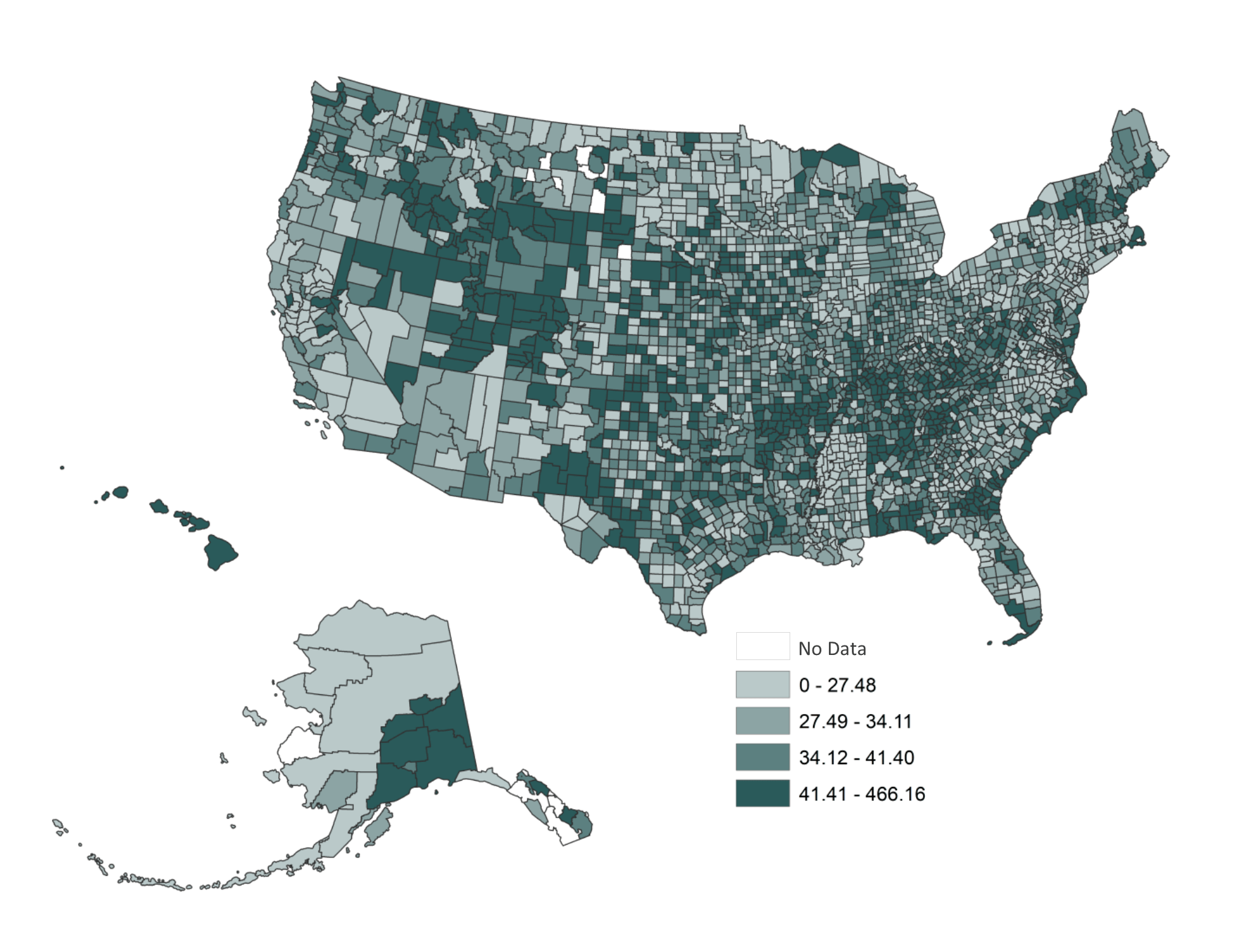
Figure 1 presents county-level adjusted marriage rates per 1,000 unmarried persons by quartile in the U.S. in 2010.
- The lightest shade of green represents the U.S. counties with the lowest 25% of marriage rates (e.g., the first quartile). Marriage rates in this quartile fall in the range of less than one to about 27 marriages per 1,000 unmarried persons.
- The next darkest shade identifies the counties with the next highest 25% of adjusted marriage rates (e.g., the second quartile). Marriage rates in this quartile fall in the range of anywhere between about 28 to 35 marriages per 1,000 unmarried persons.
- The third darkest shade identifies the counties with the next highest 25% of adjusted marriage rates (e.g., the third quartile). Marriage rates in this quartile fall in the range of nearly 36 to 42 marriages per 1,000 unmarried persons.
- The darkest shade identifies the counties with Counties with no data are white and are different from those with zeros. Some very small populated counties did not have a marriage occurring in 2010. The same can be said regarding divorces (see below).

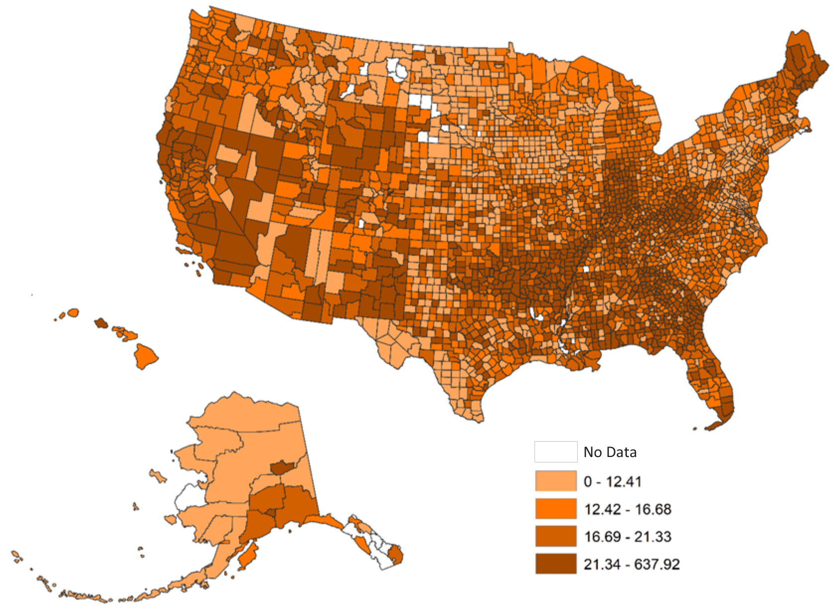
Figure 2 presents county-level adjusted divorce rates per 1,000 currently married persons by quartile in the U.S. in 2010.
- The lightest shade of orange represents the U.S. counties with the lowest twenty-five percent of divorce rates (e.g., the first quartile). Divorce rates in this quartile fall in the range of less than one to about 12 divorces per 1,000 currently married persons.
- The next darkest shade identifies the counties with the next highest twenty-five percent of adjusted divorce rates (e.g., the second quartile). Divorce rates in this quartile fall in the range of anywhere between about 13 to 16 divorces per 1,000 currently married persons.
- The third darkest shade identifies the counties with the next highest twenty-five percent of adjusted divorce rates (e.g., the third quartile). Divorce rates in this quartile fall in the range of nearly 17 to 21 marriages per 1,000 currently married persons.
- The darkest shade identifies the counties with the highest twenty-five percent of adjusted divorce rates (e.g., the fourth quartile). The counties in the highest quartile had more than 22 divorces per 1,000 currently married persons.

Data Source
- BGSU Data Compass, County-level Database. (2016). County-level marriage and divorce counts, 2010 [Data File]. Retrieved from http://www.bgsu.edu/ncfmr/resources/data/original-data/county-level-marriage-divorce-data-2010.html
References
- Manning, W. D., Payne, K. K., & Stykes, B. (2017). Counting marriages in the United States: The value of county-level administrative data. Statistical Journal of the IAOS, 33(3), 719-725. DOI: 10.3233/SJI-160338
Suggested Citation
- Payne, K. K. & Manning, W. D. (2020). The geography of marriage and divorce: Rates by quartile for the U.S. Family Profiles, FP-20-08. Bowling Green, OH: National Center for Family & Marriage Research. https://doi.org/10.25035/ncfmr/fp-20-08


This project is supported with assistance from Bowling Green State University. From 2007 to 2013, support was also provided by the U.S. Department of Health and Human Services, Office of the Assistant Secretary for Planning and Evaluation. The opinions and conclusions expressed herein are solely those of the author(s) and should not be construed as representing the opinions or policy of any agency of the state or federal government.
Updated: 04/06/2021 01:32PM

