
Graphic Elements
The University Seal is the most formal and distinguished symbol of Bowling Green State University. As the official mark of the institution, it represents the University's history, authority and academic tradition. To preserve its significance, the seal should be reserved for ceremonial, presidential and institutional applications.

Usage Standards
- The seal should be used only when an elevated level of institutional authority or formality is required.
- Use approved seal artwork without modification.
- Maintain adequate clear space around the seal to preserve prominence and legibility.
- Reproduce the seal using approved brand colors or authorized one-color versions.
- Ensure the seal remains a focal element when included in a design.
Appropriate Use
- Commencement and graduation materials
- Presidential communications and initiatives
- Academic regalia and ceremonial applications
Avoid
- Stretch, compress or distort the shape.
- Modify the curvature or create custom variations.
- Using on unapproved materials

The Bottom Curve Seal Shape is a signature brand asset intended to create memorable, recognizable layouts while maintaining a visual connection to the University's seal and institutional identity.
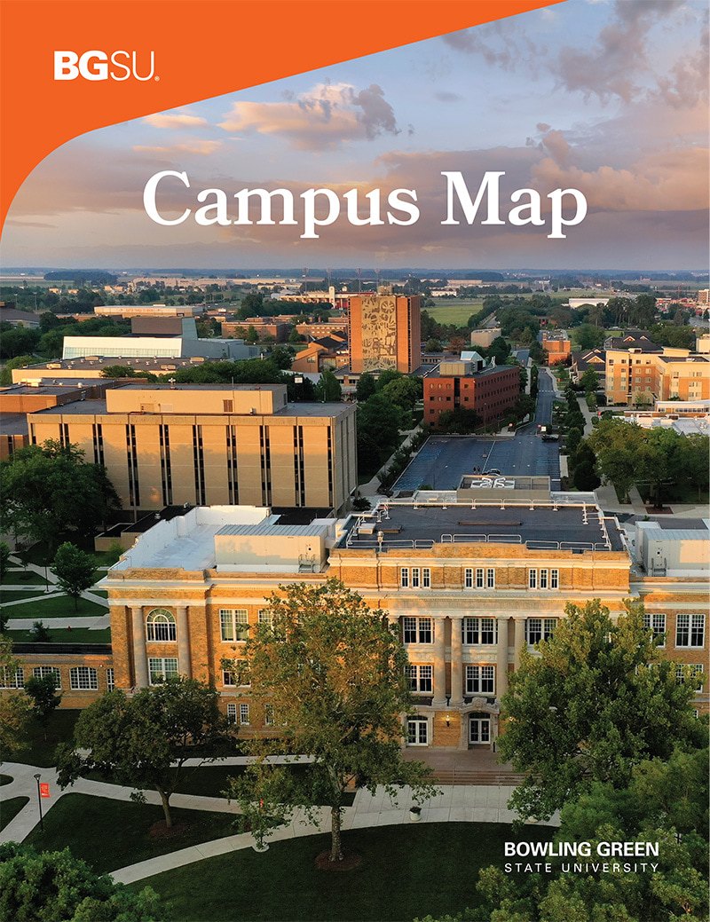

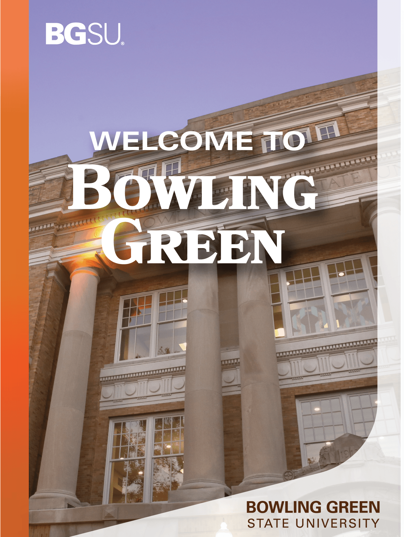
Usage Standards
- The shape may be used as a photo mask, color block, content container or standalone graphic element.
- The approved curve must be maintained and may not be altered or redrawn.
- The shape may be used in its standard orientation or horizontally reflected to best support the layout.
Appropriate Use
- Covers of print materials
- Clipping mask for images
Avoid
- Stretch, compress or distort the shape.
- Modify the curvature or create custom variations.
- Use more than two shapes within a single design.
- Overlap multiple shapes in a way that creates visual clutter.

Cards should be used intentionally to highlight important content and create visual distinction. Limiting their use preserves their effectiveness and contributes to a cohesive brand experience.
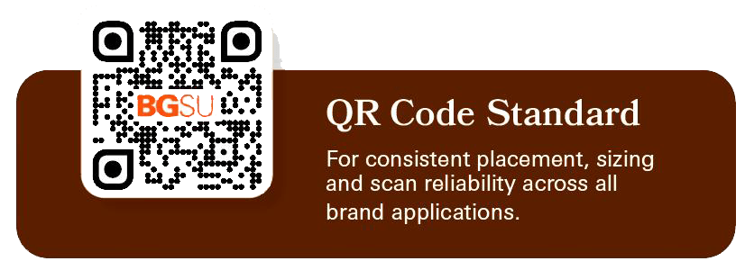

Cards
A supporting brand element used to soften layouts, create visual hierarchy and highlight key content.
Specifications
- Border Radius: 0.1875 in (3/16 in)
Designed for standard 8.5" × 11" layouts and scaled proportionally for larger formats.
Digital
- Border Radius: 16px
Adjust for visual consistency on smaller components
Appropriate Use
- Round all visible corners.
- Use for photography, QR codes and featured content.
- Use selectively to create emphasis and visual hierarchy.
- Maintain the approved corner radius across print and digital applications.
Avoid
- Do not round every element within a design.
- Do not apply rounded corners to body content areas unnecessarily.
- Do not mix multiple corner radius sizes within the same piece.
- Do not use rounded corners as a decorative treatment without purpose.
- Do not apply the treatment to logos, wordmarks or the University seal.

As one of the University's most distinguished visual assets, the 2x2 Seal Collage should remain a rare and intentional brand expression, reserved for moments of exceptional institutional importance.
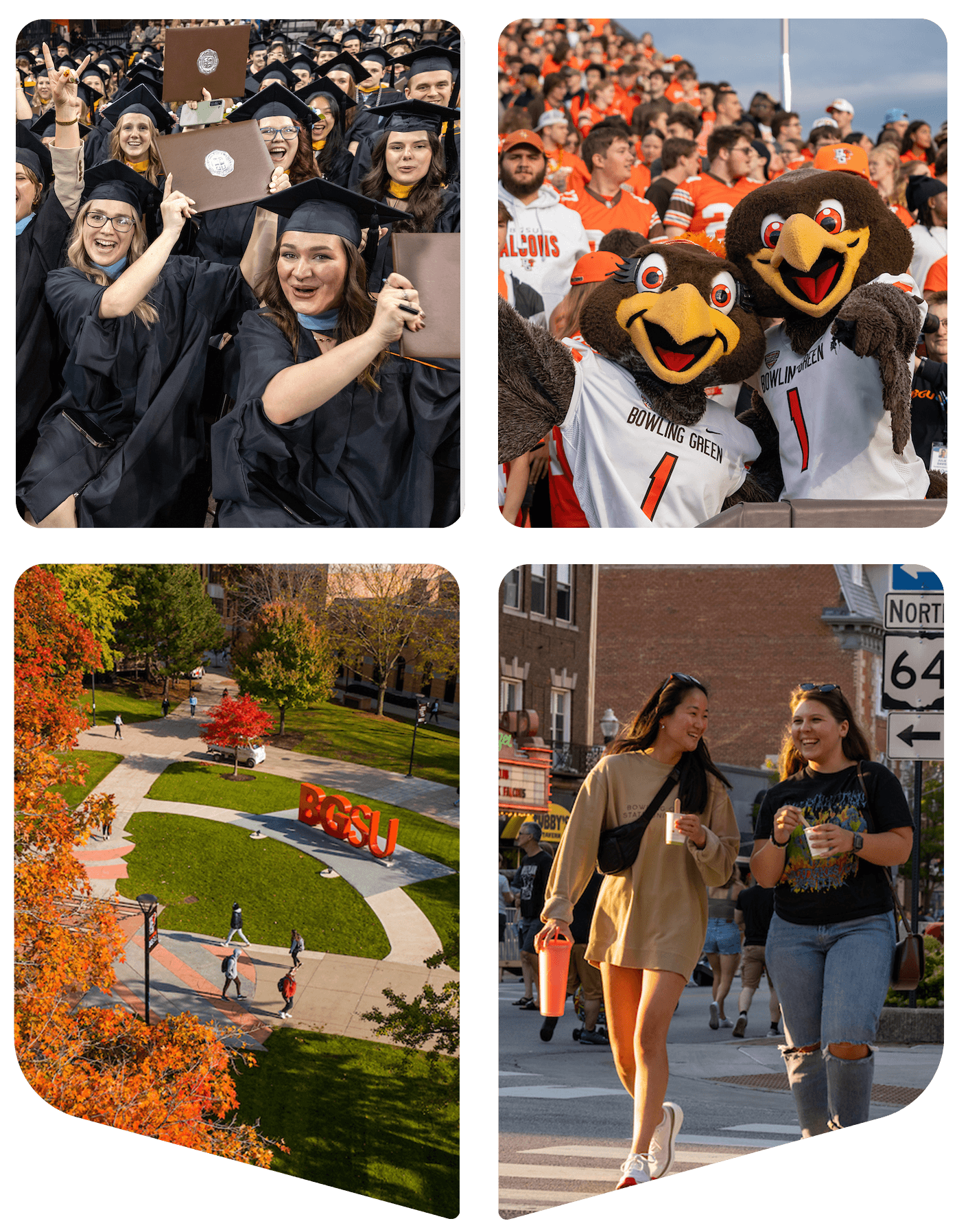
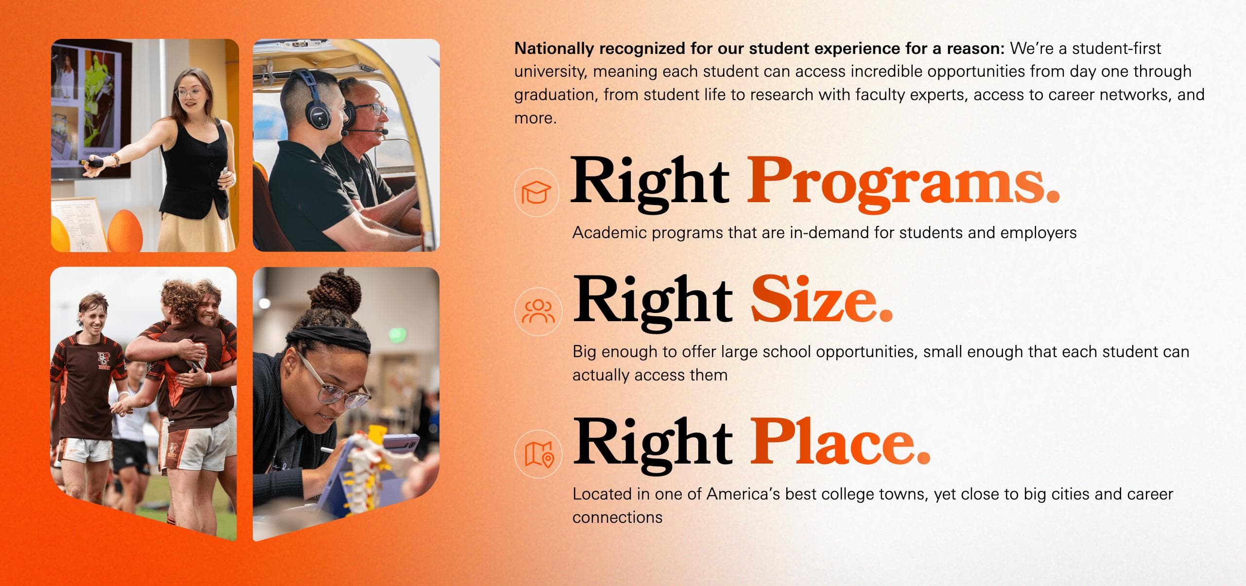
Usage Standards
- Use sparingly to preserve its impact and exclusivity.
- Feature as a primary visual element rather than a recurring design motif.
- Maintain adequate clear space around the collage to ensure visibility and prominence.
- Preserve the approved arrangement, proportions and orientation of the collage.
Appropriate Use
- High level university-wide campaigns and strategic initiatives ONLY
Avoid
- Routine marketing materials
- Repetitive use across multiple pieces within the same campaign
- Decorative purposes without institutional significance
The Bowling Green State University Wordmark Arc is a custom graphic treatment derived from the typography and curvature of the University seal. It provides a distinctive institutional design element that reinforces brand recognition while offering greater flexibility than the official seal.

The Bowling Green State University Arc is intended to be a bold institutional graphic element that adds energy and recognition to communications while maintaining a clear visual connection to the official seal.
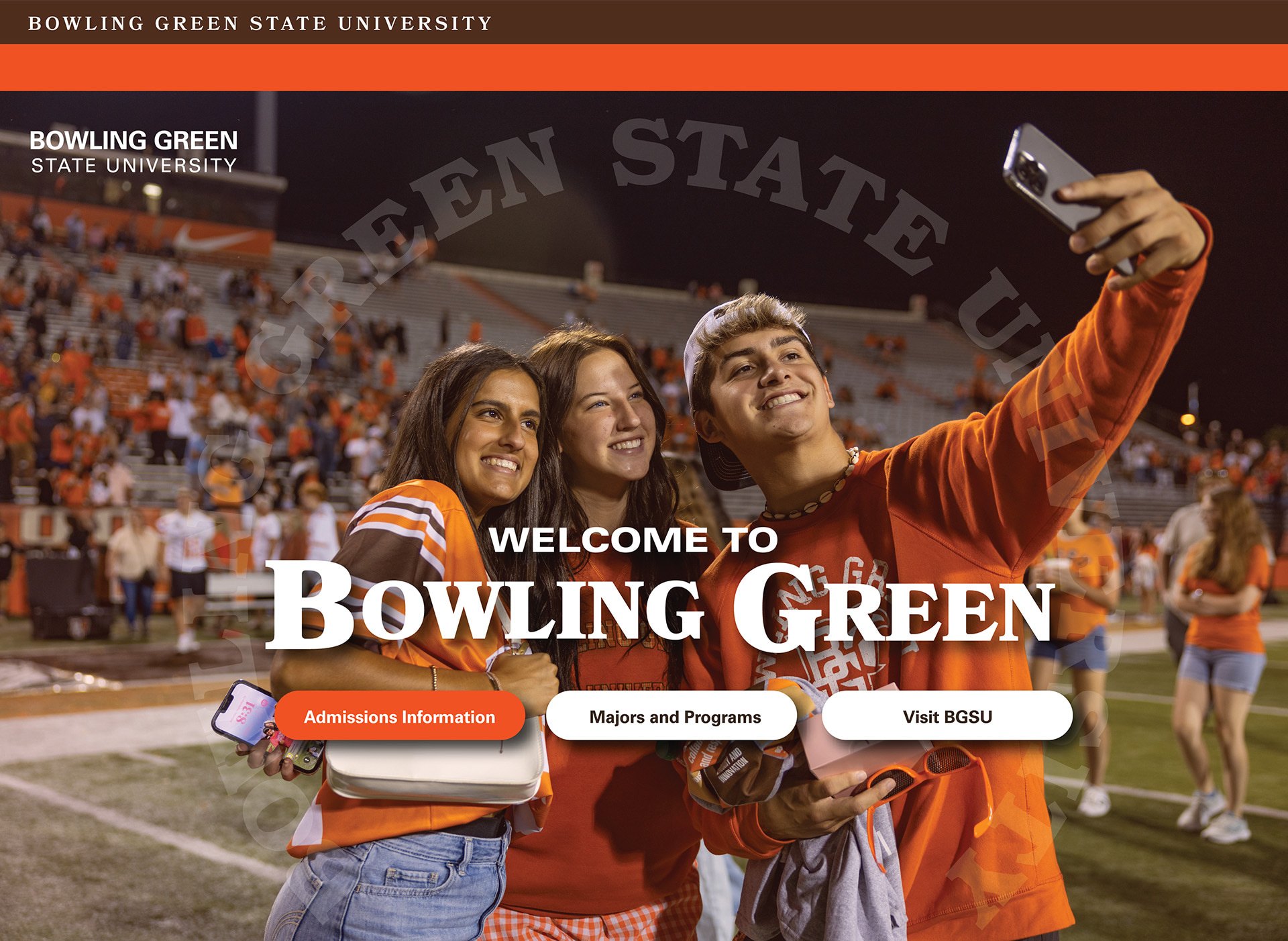
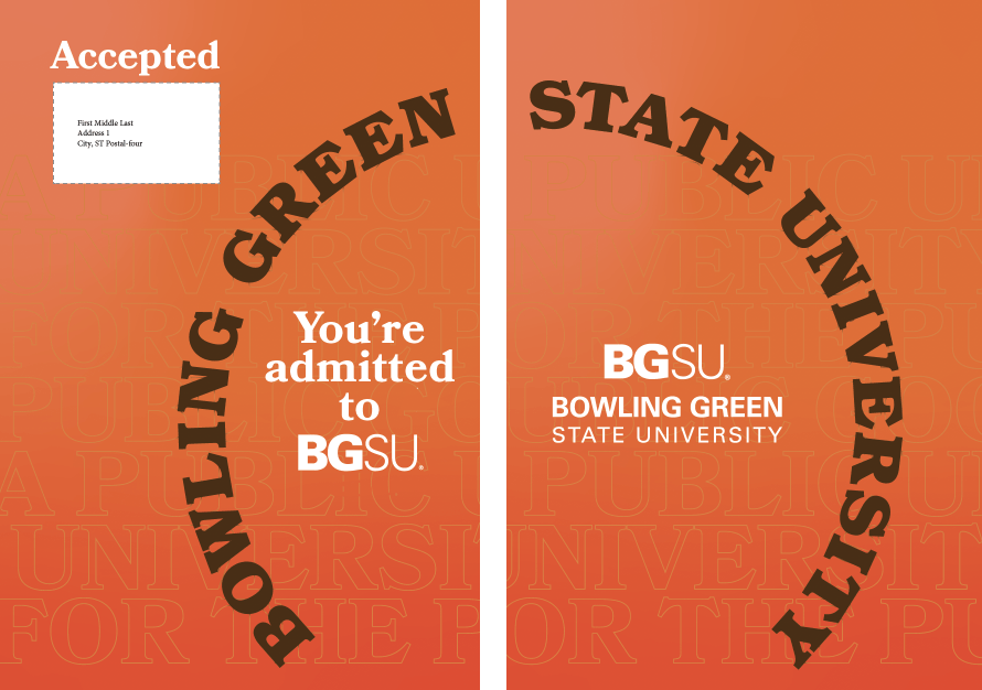
Usage Standards
- Selectively used for high-level enrollment or unversity-branded pieces
- Must maintain the approved curvature and overall circular form derived from the University seal.
- The wordmark may appear as a complete arc or be divided into multiple segments, provided the original curvature is preserved.
- The arc can be across a spread.
- Scale proportionally and maintain legibility at all sizes.
Appropriate Use
- High level university-wide campaigns and strategic initiatives ONLY
Avoid
- Stretch, condense, or distort the arc.
- Only use one arc per piece.
- Rearrange letter spacing or typography
- Combine the arc with the official seal in a way that creates confusion between the two brand assets.
A graphic treatment that integrates text with photography by positioning typography both in front of and behind a subject. This technique creates depth, energy and visual interest while strengthening the connection between messaging and imagery.
Layered Typography should be used as a feature design element that creates depth and engagement. When applied thoughtfully, it reinforces storytelling while maintaining clarity, readability and visual impact.

Usage Standards
- The subject should remain the primary focal point of the composition.
- Text should interact naturally with the image and appear intentionally placed rather than obstructed.
- A portion of the text should remain fully visible to maintain readability and brand recognition.
- Use high-quality photography with clearly defined subject edges to ensure clean layering.
- Typography should be limited to short phrases, headlines or key messages.
- Use large, bold typography that can withstand partial obstruction.
- Ensure sufficient contrast between text and background imagery.
Appropriate Use
- Creative student-centered marketing materials
Avoid
- Do not obscure a subject's face or important identifying features.
- Do not hide so much of the text that the message becomes difficult to read.
- Do not use layered typography for body copy or lengthy messaging.
- Do not create complex overlaps with multiple subjects and multiple text layers.
Breakout Images are a photography treatment in which a subject intentionally extends beyond the boundaries of a photo frame, shape or container. This technique creates depth, movement and visual engagement while drawing attention to key subjects and stories.
Breakout Images are a signature storytelling device that adds energy, dimension and personality to communications. When used strategically, they create memorable visual experiences while keeping the subject at the center of the story.

Usage Standards
- The breakout subject should be the primary focal point of the composition.
- Subjects should extend naturally beyond the image boundary without appearing forced or artificially cropped. Maintain clean and precise cutout edges.
- The majority of the subject should remain within the original image frame to preserve context and readability.
- Use high-quality photography with strong contrast and clearly defined subject edges.
- Use breakout images to create depth and visual hierarchy.
- Feature people, objects or mascots with clearly recognizable silhouettes.
- Use the effect sparingly to emphasize important content.
- Combine with Layered Typography when it enhances storytelling and readability.
Appropriate Use
- Creative student-centered marketing materials
Avoid
- Do not use breakout effects on every image within a piece.
- Do not allow breakout elements to interfere with headlines, logos or critical content.
- Do not crop subjects in a way that appears awkward or incomplete.
- Do not use low-resolution images or subjects with indistinct edges.
Updated: 09/08/2026 07:22PM