
Gradients and Textures
Gradient backgrounds and text create emphasis and visual impact. It should be reserved for content that benefits from increased attention and emotional engagement.
Gradient Text
Gradient text should be limited to short headlines, elevated creative treatment and should not exceed 10% of the content within a single layout.
Usage Standards
- Short headlines or titles only
- For creative elevation only
Avoid
- Paragraph copy or lengthy text
- Overusing, should be used for emphasis only
Gradient Backgrounds


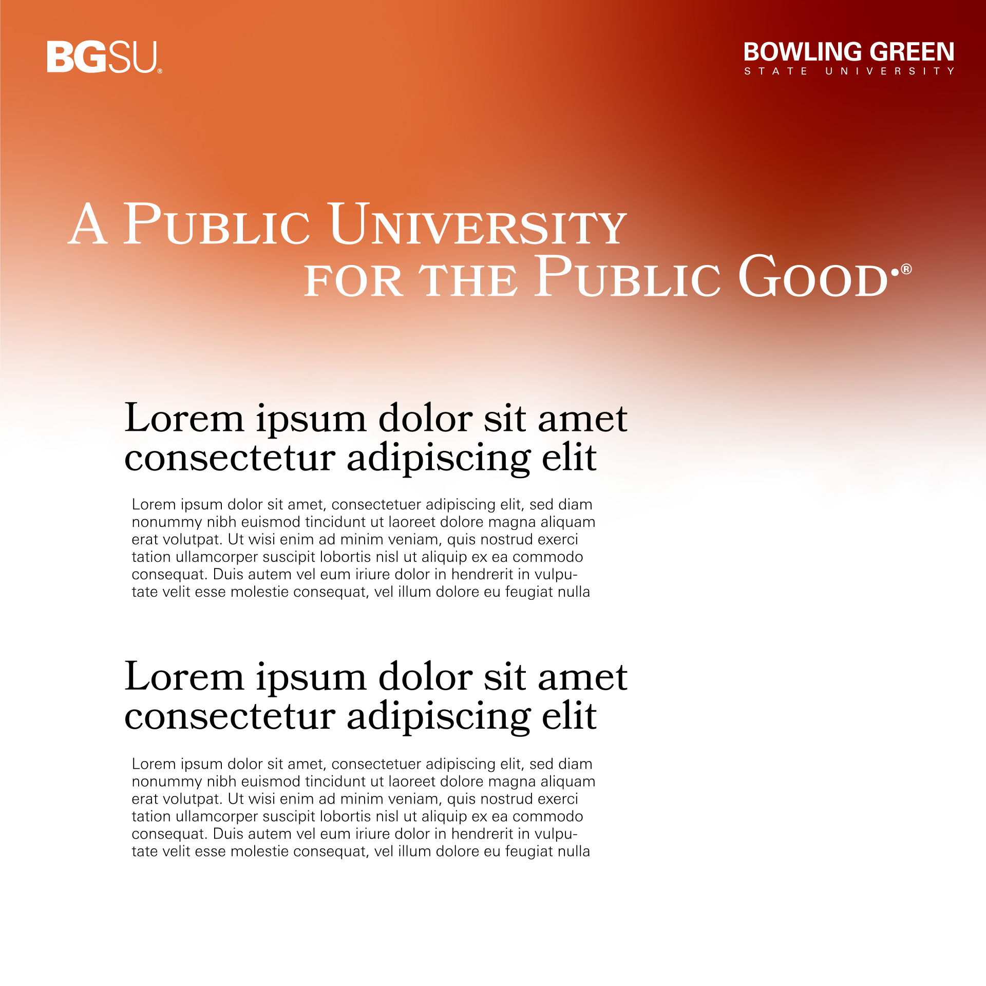
Usage Standards
- For print and digital background
- Replaces static orange
- Allows for smooth section transition
Avoid
- Using extreme gradients on priority university materials
Textures reflect the physical and visual character of BGSU, incorporating cues from campus architecture, natural environments and institutional traditions.

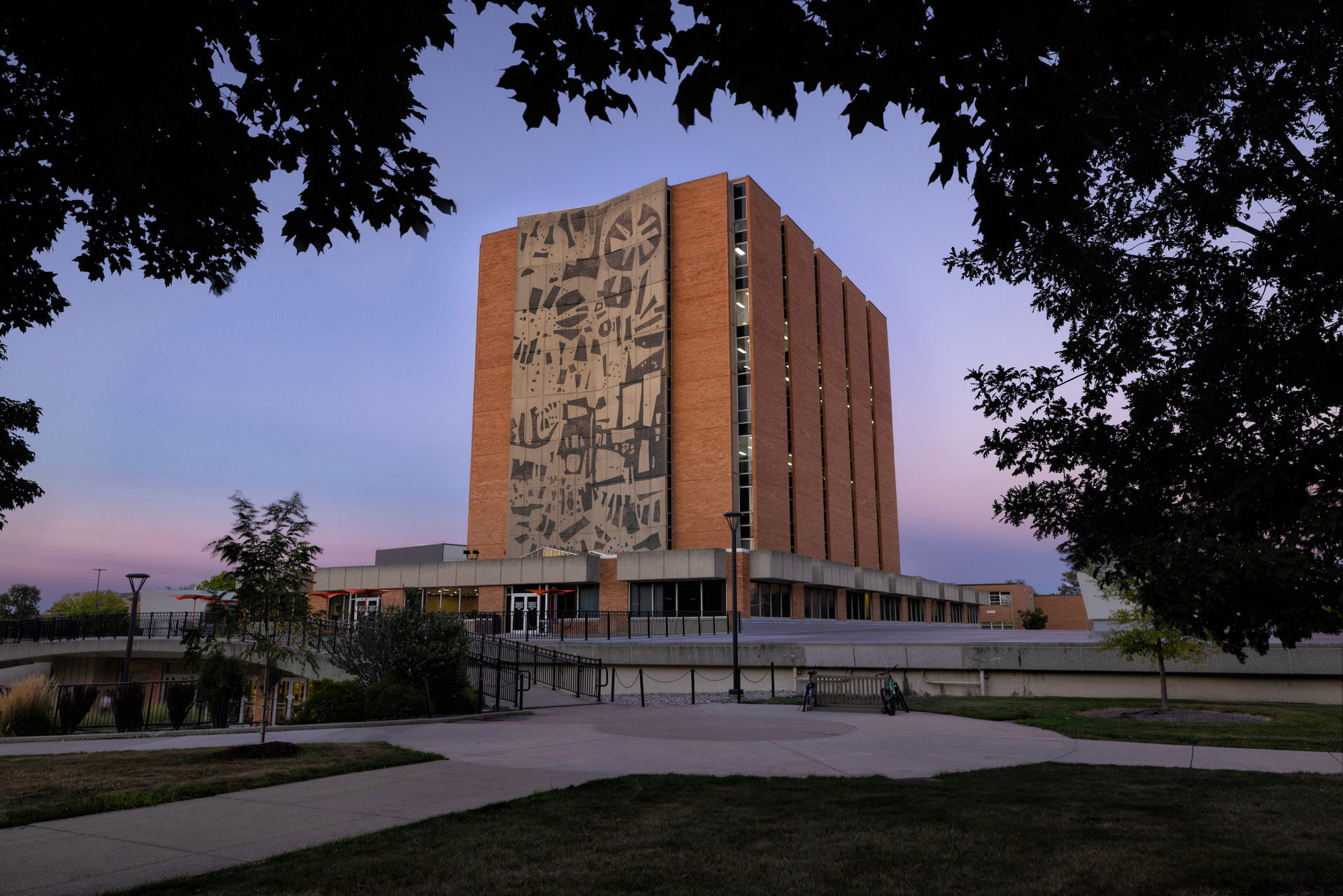
Library Mural
Inspired by the Jerome Library mural, this texture introduces layered depth and visual character while celebrating a recognizable element of the university experience. Its abstracted forms create a sense of history, creativity and discovery without competing with primary content.

Innovation and Connection
Inspired by the the Icosahedron Glass Sculpture in the McLeod Building, this form reflects innovation and connection through its flowing, interlocking shape—symbolizing the exchange of ideas and the dynamic relationships that drive Bowling Green.

Transitional Gradient
A transitional gradient background that softly shifts between tones, creating depth, movement and visual continuity while supporting content without distraction and reinforcing a modern, fluid brand experience.

BGSU Topography
A topographic-inspired layout, most recognized on our shuttle buses and applied across the other commuter and parking materials, drawing on layered contour forms to organize information clearly while reflecting movement, navigation and the everyday flow of campus access.

Outlined Typography
A typography-inspired background that layers letterforms and spacing as a visual texture, reinforcing hierarchy, rhythm and clarity while echoing the brand’s voice through structured, intentional composition.

BGSU Campus Architecture
Inspired by the architecture of Bowling Green’s campus, this treatment reflects the rhythm of th structured forms to create a grounded visual language that connects campus identity with place and tradition.
Updated: 09/08/2026 07:23PM