Text Based Components
Accordion
Click on the orange titles below and watch as the details expand and collapse. This component is very useful for "Frequently Asked Questions" sections on a webpage.
There are 2 types of accordions:
- Accordion Dropzone allows you to put other components within the hidden area
- Accordion Item only allows text to go in the hidden area
The accordion dropzone component creates another dropzone for other components to exist within the accordion. So you can use the background area component, like this, to add a cool texture to the background.
Accordion Item Details

In the list component you can create a list of items based on different criteria. Below the list is built using the tag "News" and is displayed as news, so the list items include the headline, description, and on Time date of the most recent three articles tagged with "News"
-
How do Bowling Green State University students gain real-world experience before graduation? Jul 24, 2026 11:03 AM As the No. 1 public university in Ohio for career preparation, BGSU ensures students are equipped with the skills employers demand.
-
Two BGSU alumni thrive as NHL play-by-play broadcasters Jul 24, 2026 8:00 AM Everett Fitzhugh and Steve Mears took their first steps into the NHL broadcast booth by calling BGSU hockey games at Slater Family Ice Arena.
-
Avride delivery robots to debut at BGSU, Grubhub to become new ordering platform Jul 23, 2026 2:11 PM BGSU to expand and optimize deliveries as students, faculty and staff can now use Grubhub to order food on campus.

Format:
The sole purpose for headings is to designate a hierarchy of importance, so that human readers, search engines, screen readers, and more can easily determine which content is most critical (Heading 2) and least critical (Heading 6).
Heading 2
Heading 3
Heading 4
Heading 5
Heading 6
Paragraph content
BLOCK QUOTE is a format that should be used for lengthier quotes to differentiate the quote from the other text in the text component.
Style:
[None]
Intro Text
Button Gray
Button Orange
Gray H1-H6 - Heading 2
Gray H1-H6 - Heading 3
Gray H1-H6 - Heading 4
Gray H1-H6 - Heading 5
Gray H1-H6 - Heading 6
Footnote Disclaimer
Pull Quote Right
For a PULL QUOTE RIGHT, you are able to style text to look like a quote and align it to the right side of the text component. When used correctly it is very effective. It also allows text to wrap around the quote just like this, making the flow of the writing very easy to follow.
Pull Quote Left
For a PULL QUOTE LEFT, you are able to style text to look like a quote and align it to the right side of the text component. When used correctly it is very effective. It also allows text to wrap around the quote just like this, making the flow of the writing very easy to follow.
Orange Highlight
Brown Highlight
This component allows you to organize information into different sections where the content will be hidden until the user clicks on the accompanying tab
Tab one information
You can also put any component you want inside of the tabs component. For example, the image component is used below.

Tab two information
You can also put any component you want inside of the tabs component. For example, the accordion component is used below.
Accordion Item Description
Tab three information
You can also put any component you want inside of the tabs component. For example, the dropdown component is used below.
This component is allows you to create a container for multiple components and apply a title. This is frequently used to organize long areas of text.
Title for Container
The nice thing about this component is that it will group all components inside and make them very easy to move around.
Orange Background
Brown Background
 CMS-Guide.pdf
For accessibility reasons, you should always provide a description as to what the file is if the title is not descriptive enough.

News Slideshow
This component allows you to build a rotating slideshow of Callout Boxes. If you want to learn how to make them, please watch the Picture/Page Banner/News Slideshow Tutorial on our Training Videos page.
-
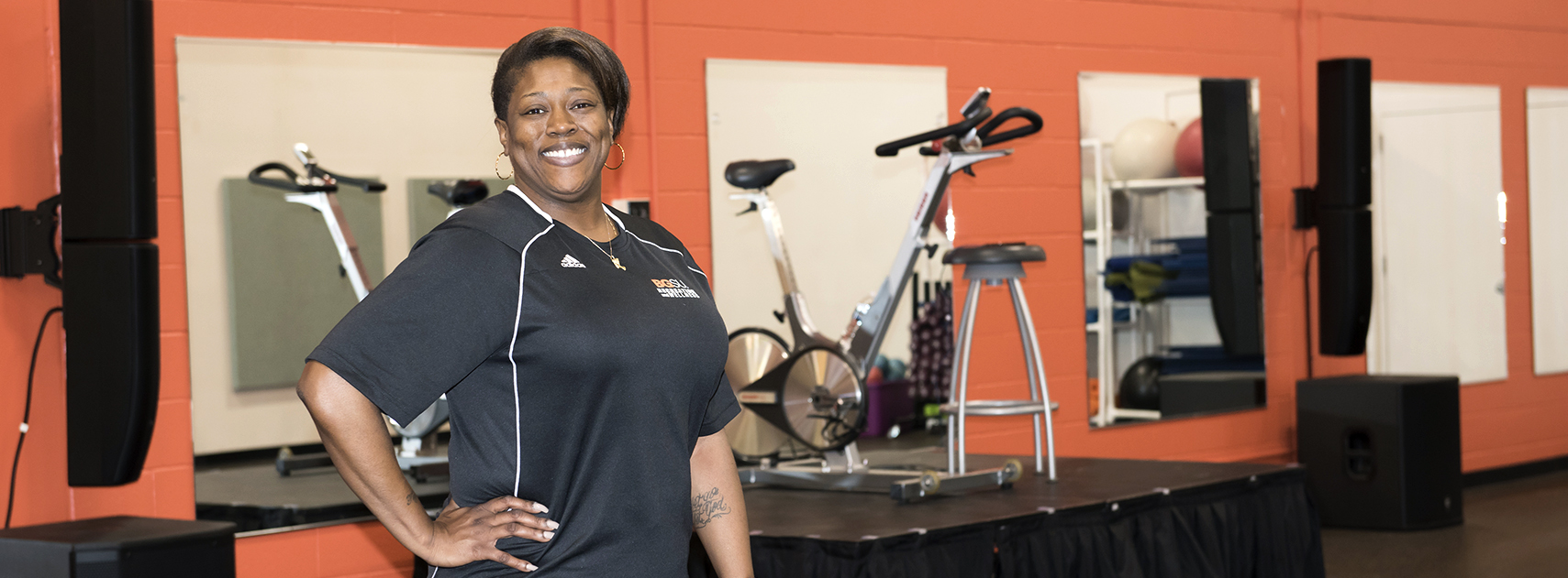
Demetria's Story
Demetria Graham is dedicated to helping others achieve their fitness goals through Group X.
Read More -

HIV TESTING
Testing service is completely free and confidential at the Wellness Connection.
Read More -
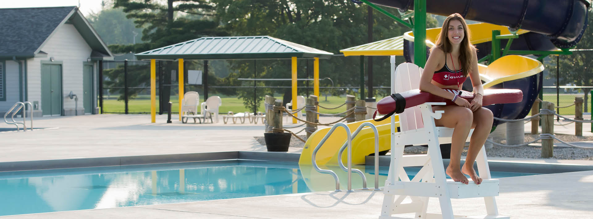
Larissa's Story
Larissa Leck, Recreation and Wellness Lifeguard Class Participant, shares her success story.
Read More

Demetria's Story
Demetria Graham is dedicated to helping others achieve their fitness goals through Group X.
Read More
HIV TESTING
Testing service is completely free and confidential at the Wellness Connection.
Read More
Larissa's Story
Larissa Leck, Recreation and Wellness Lifeguard Class Participant, shares her success story.
Read MoreUpdated: 10/09/2025 09:12PM