Media Based Components
This component allows you to add a collection of photos that users can slide through. If you want to learn how to make this slideshow, watch the Picture/Page Banner/News Slideshow Tutorial on our Training Videos Page. Also make sure that all of the images are the same size, we frequently use the dimensions 840x311.


This component allows users to download a specific file.
 CMS-Guide.pdf
For accessibility reasons, you should always provide a description as to what the file is if the title is not descriptive enough.


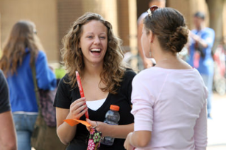


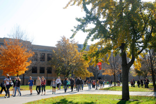
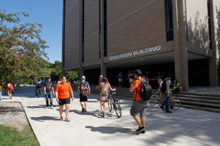
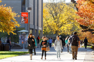
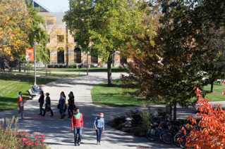
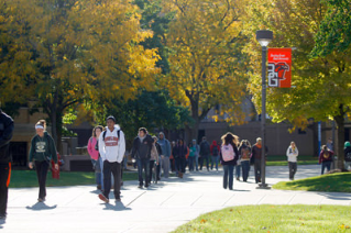


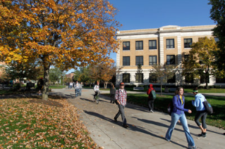


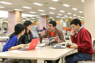

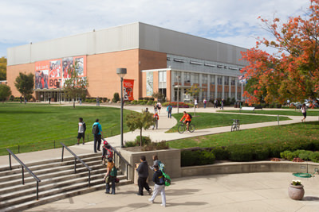
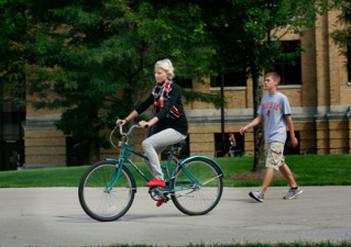
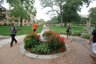


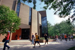


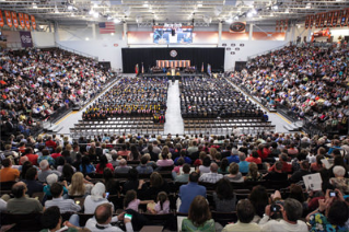


Image Styles:
The text component is extremely versatile and allows you to add images into the mix. Along with being able to use images, you can also apply styles to an image to achieve a certain look.
Image with no styles

Remove Margins on Image is applied to the image below and you can see that there is equal spacing between the image and the edge of the gray background area.
Text caption for "Image Caption LeftImage Caption Left is applied to the image below and you can see that the image has shifted to the left and text below the image is a smaller, thinner, and aligned to the bottom left of the image. To apply this, highlight both the image and caption then apply the style. The nice thing about this style on an image is that the rest of the text is still able to wrap around it.
Text caption for "Image Caption Right"Image Caption Right is applied to the image below and you can see that image has shifted to the right and the text below the image is a smaller, thinner, and aligned to the bottom left of the image. To apply this, highlight both the image and caption then apply the style. The nice thing about this style on an image is that the rest of the text is still able to wrap around it.
Image Caption Full is applied to the image below and you can see that the image has now gone full width and the text below the image is a smaller, thinner, and aligned to the bottom left of the image . To apply this, highlight both the image and caption then apply the style.
Text caption for "Image Caption Full"

This component allows users to add Youtube or Vimeo videos to the webpage without slowing down the webpage. Watch the Video Player Tutorial on our Training Videos Page to learn how to use the component.
This component allows you to build a rotating slideshow of Callout Boxes. If you want to learn how to make them, please watch the Picture/Page Banner/News Slideshow Tutorial on our Training Videos page. Also make sure that all of the images are the same size, we frequently use the dimensions 840x311.
-
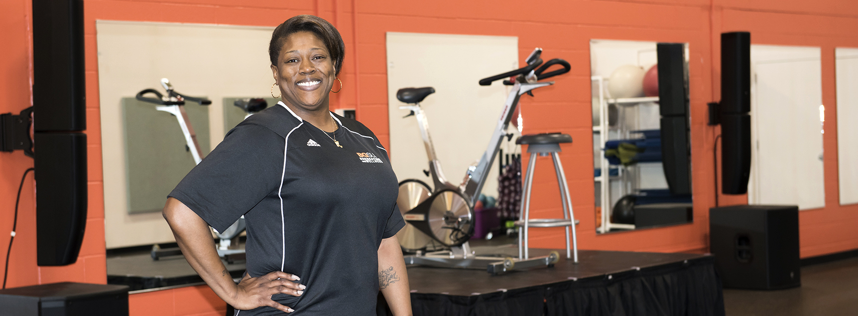
Demetria's Story
Demetria Graham is dedicated to helping others achieve their fitness goals through Group X.
Read More -

HIV TESTING
Testing service is completely free and confidential at the Wellness Connection.
Read More -
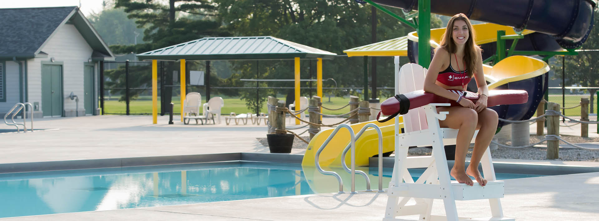
Larissa's Story
Larissa Leck, Recreation and Wellness Lifeguard Class Participant, shares her success story.
Read More

Demetria's Story
Demetria Graham is dedicated to helping others achieve their fitness goals through Group X.
Read More
HIV TESTING
Testing service is completely free and confidential at the Wellness Connection.
Read More
Larissa's Story
Larissa Leck, Recreation and Wellness Lifeguard Class Participant, shares her success story.
Read MoreUpdated: 10/09/2025 09:09PM