
Adobe Touch UI Training
This training will be a step-by-step tutorial to the Adobe Touch UI Web Content Management System (CMS). There will be required activities in which you will be uploading images and creating your own web page that the Marketing and Brand Strategy Web team will be checking after you complete this training. You must submit an additional form upon completion of the bridge training materials and activities.
If you have questions or need help during any part of this training, please email mcwebteam@bgsu.edu.
Before You Begin
This Online CMS Touch UI training is split into two parts. The first part is to learn the fundamentals of Touch UI so that you are able to make edits to the website with limited to no assistance. The second part is for you to understand the importance of web accessibility.
In order for you to gain access to the BGSU website, you MUST complete Part I and II.
Please note: Part I has 29 activities, you are able to pause in the training at any moment and if you have any questions or need help please email mcwebteam@bgsu.edu.
- You will need to be on a desktop or laptop for this training. A mobile device will not work.
- Use Mozilla Firefox when using AEM. Google Chrome and Safari will work, but with bugs and you will not be able to complete a few instructions in the training. Internet Explorer will not work.
- You will need to download training materials before you begin. Inside, you will find the images that you will need to build your webpage as well as two example screenshots of what your training pages will look like when you're done. Please unzip the file and save it to your desktop.
Reasons we use AEM
Responsive Design
Responsive Design means that as a window changes size, the content is able to adjust accordingly, scaling up/down buttons, pictures, and menus in order to make the website more user-friendly for the device it’s being rendered on. Example: Visit www.bgsu.edu and experiment by resizing the window. You will notice that the menu will collapse on itself, and the picture will get smaller if needed.
Edit Anywhere
With this CMS, users can edit web pages no matter where they are by logging in to the Adobe CMS as long as there is an internet connection.
Logging In
How to log in to AEM:
- Go to aem.bgsu.edu/
- Log in using your BGSU credentials
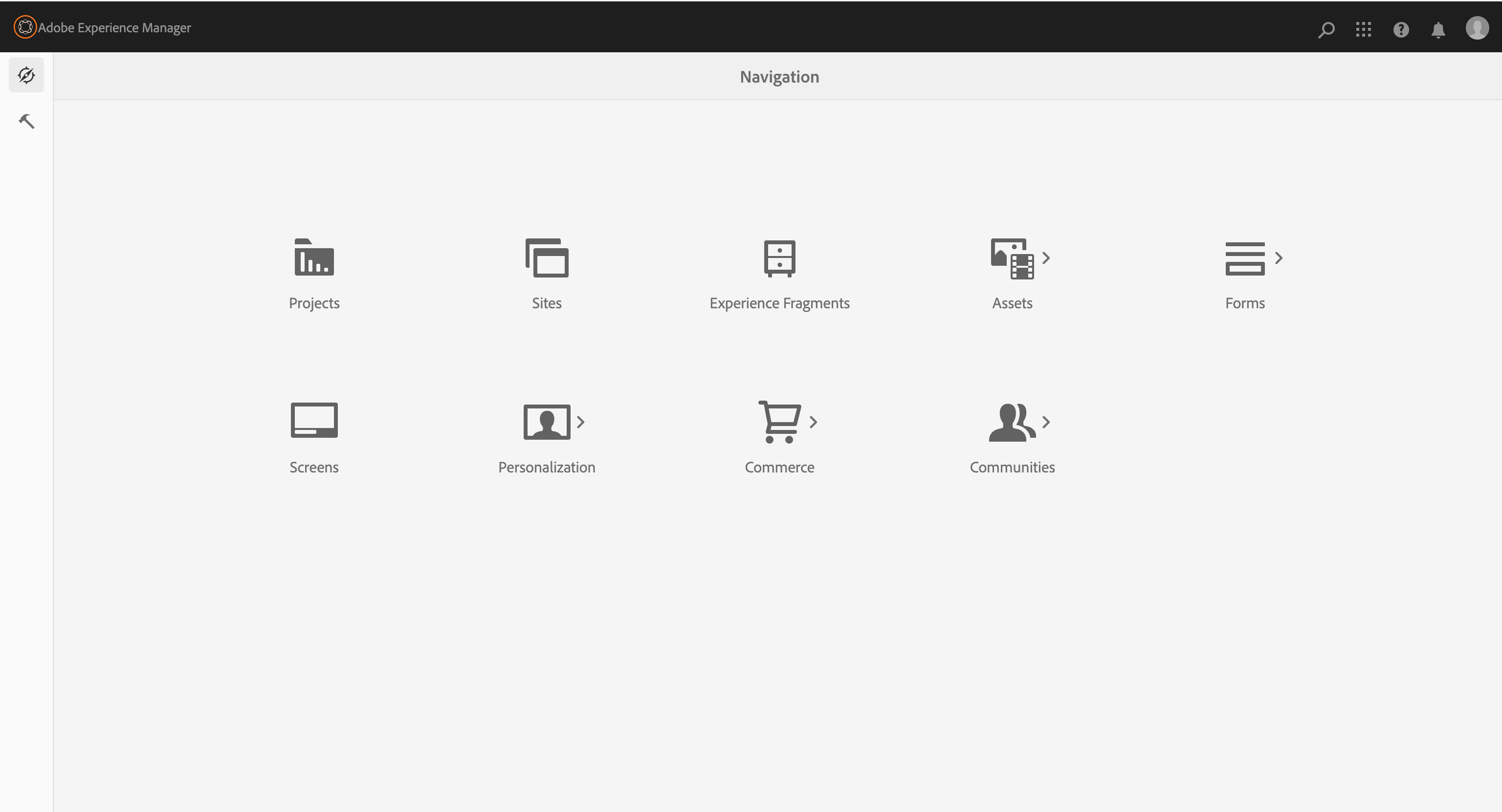
This will bring you to the "Navigation" screen within AEM, as shown below:
Digital Asset Manager (DAM)
The DAM (Digital Asset Manager) is where users manage images used on the website. The DAM layout is similar to the web content manager. The folder structure appears in the left pane, and the contents of the selected folder display in the right pane.
Images should always be uploaded to the appropriate Images folder within the DAM. Only image assets are supported for upload.
You may see folders labeled Documents within the DAM. These folders are managed by the Web Team and are used only for approved, accessible content.
Users are only permitted to upload image assets to the DAM. Documents such as PDFs or Word files must not be uploaded.
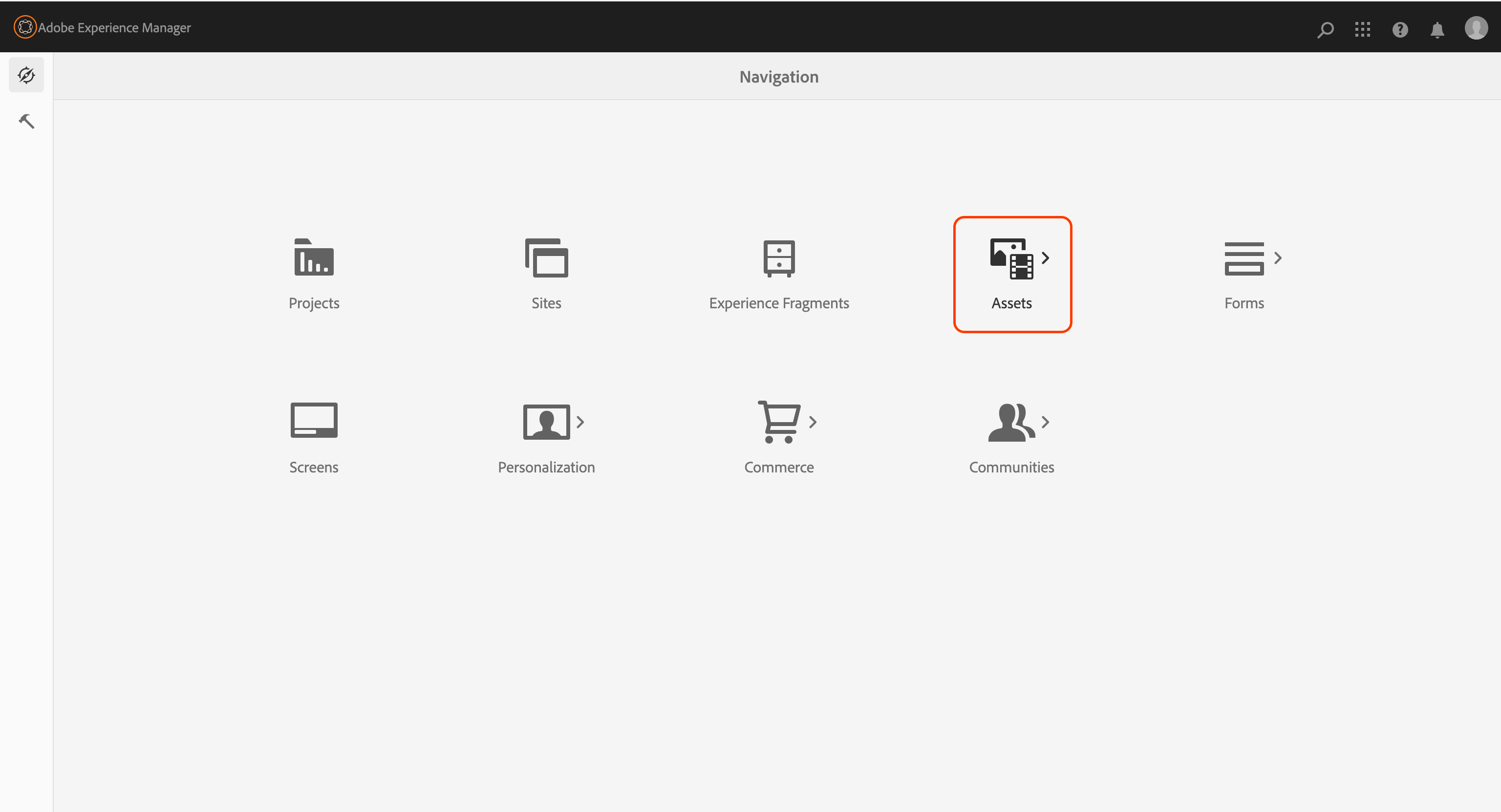
- To access the DAM, click the Assets icon in the main navigation.
Activity 1: Creating a folder in the DAM
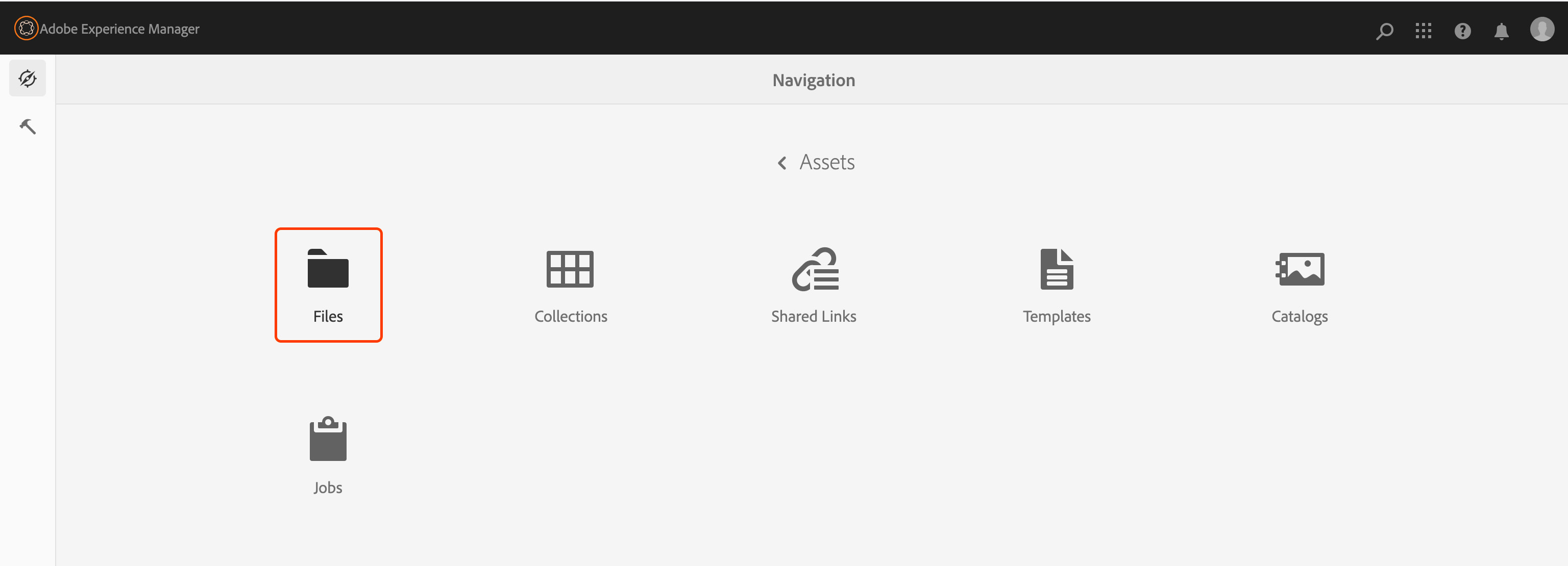
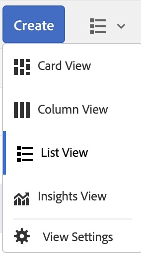
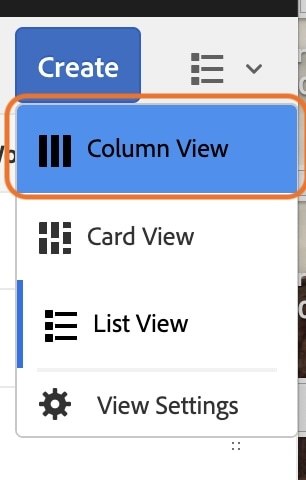
- Navigate to Assets > Files - from here click on the icon pictured below and make sure Column View is selected.
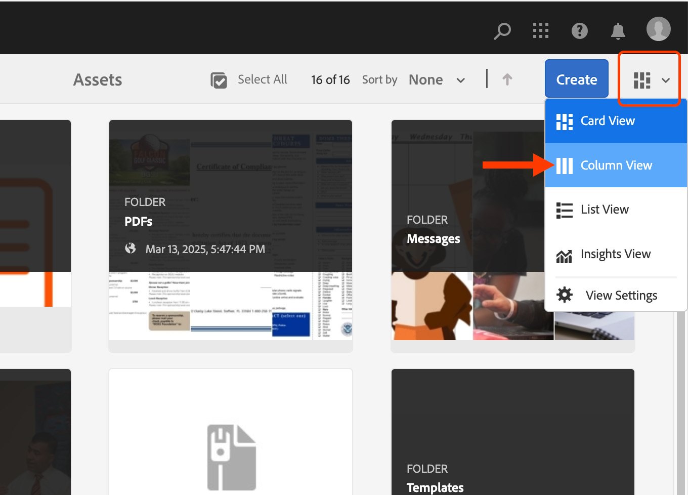
Card view
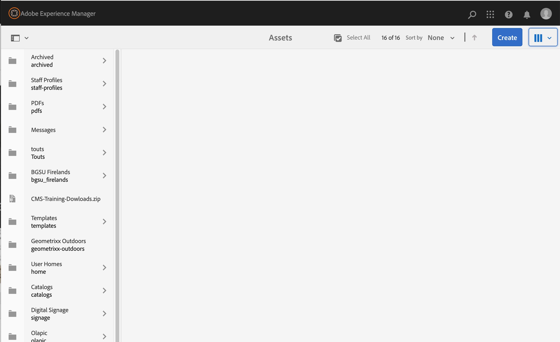
Column view
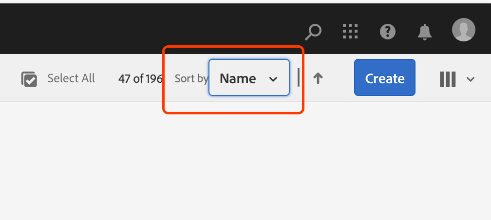
Make sure to sort by: Name
This will put all the folders in alphabetical order.
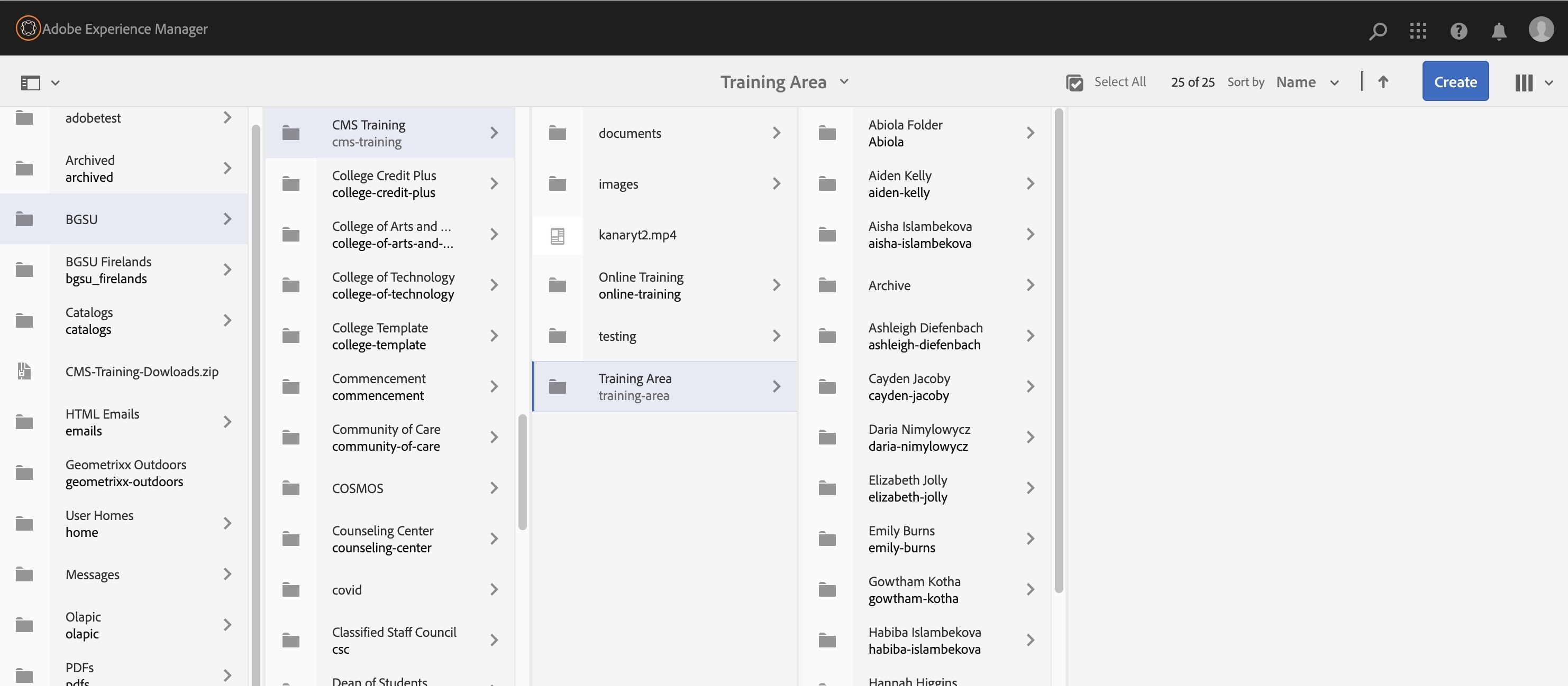
- Navigate to BGSU > CMS Training > Training Area - click on the title of the Training area so the right pane updates. You should see folders with the names of users who are also taking this training (ex. Josie Jonckheere).
- Click on the blue "Create" button at the top right corner.
- Select "Folder". A dialogue box will appear.
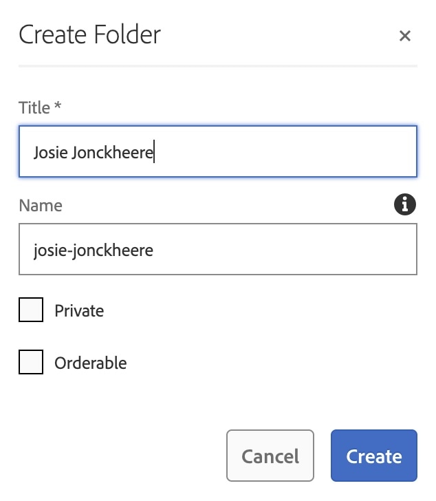
- Type your first and last name in the "Title" field. Example: Josie Jonckheere
- As you type your name in the "Title" field, you should have noticed that your name was also generated in the "Name" field.
- Remove all uppercase letters, spaces, or special characters that may have been generated in the "Name" field. Replace spaces and special characters with dashes. Example: josie-jonckheere. The name used will form the URL structure.
- Click "Create".
Activity 2: Adding Assets
- Locate the folder you just created, with your name on it, in the Training Area.
- Click once on the title of your folder to highlight it.
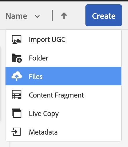
- Click the blue "Create" button in the top right corner.
- Choose "Files" in the dropdown menu.
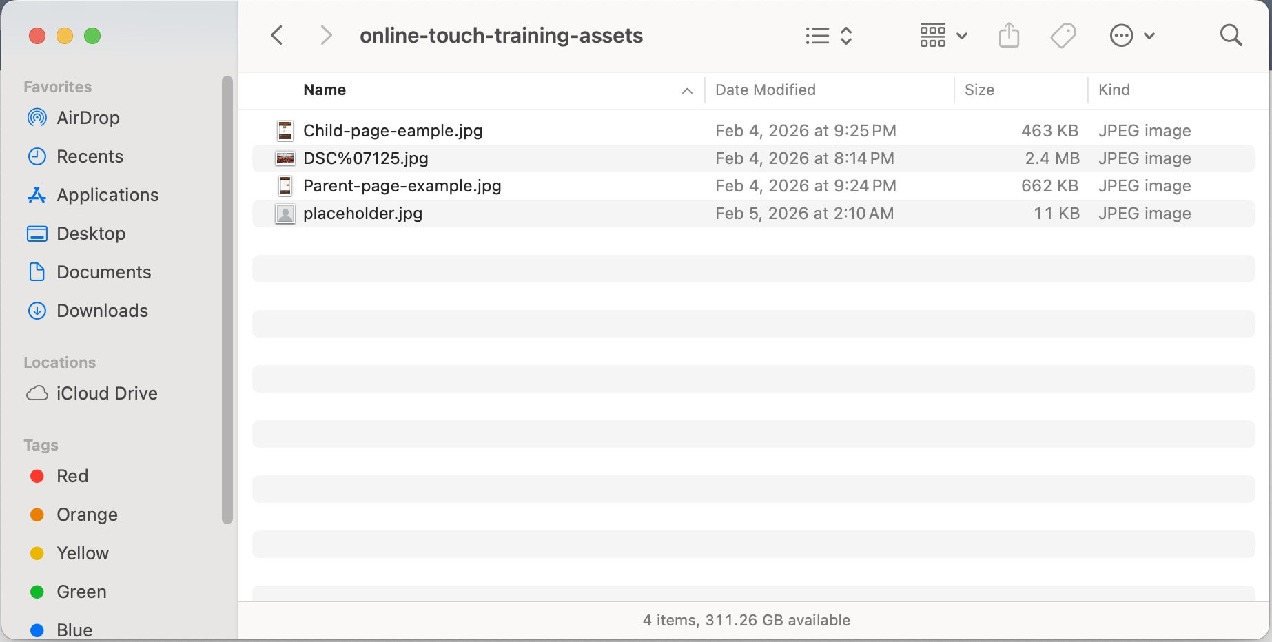
- Navigate to the folder you downloaded for this training on your computer.
- Select all of the files in the folder (Cmd + A for MacOS OR Ctrl + A for PC).
- An "Upload Assets" screen will pop-up after selecting the files.
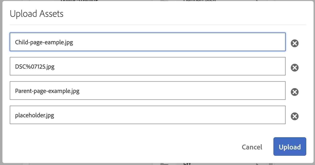
- Click "Upload".
- You should see one of the assets you attempted to upload highlight in red. This is because that file is containing a character that is not allowed in a file name.
(Example characters - * / : [ \ ] | # % { } ? & )
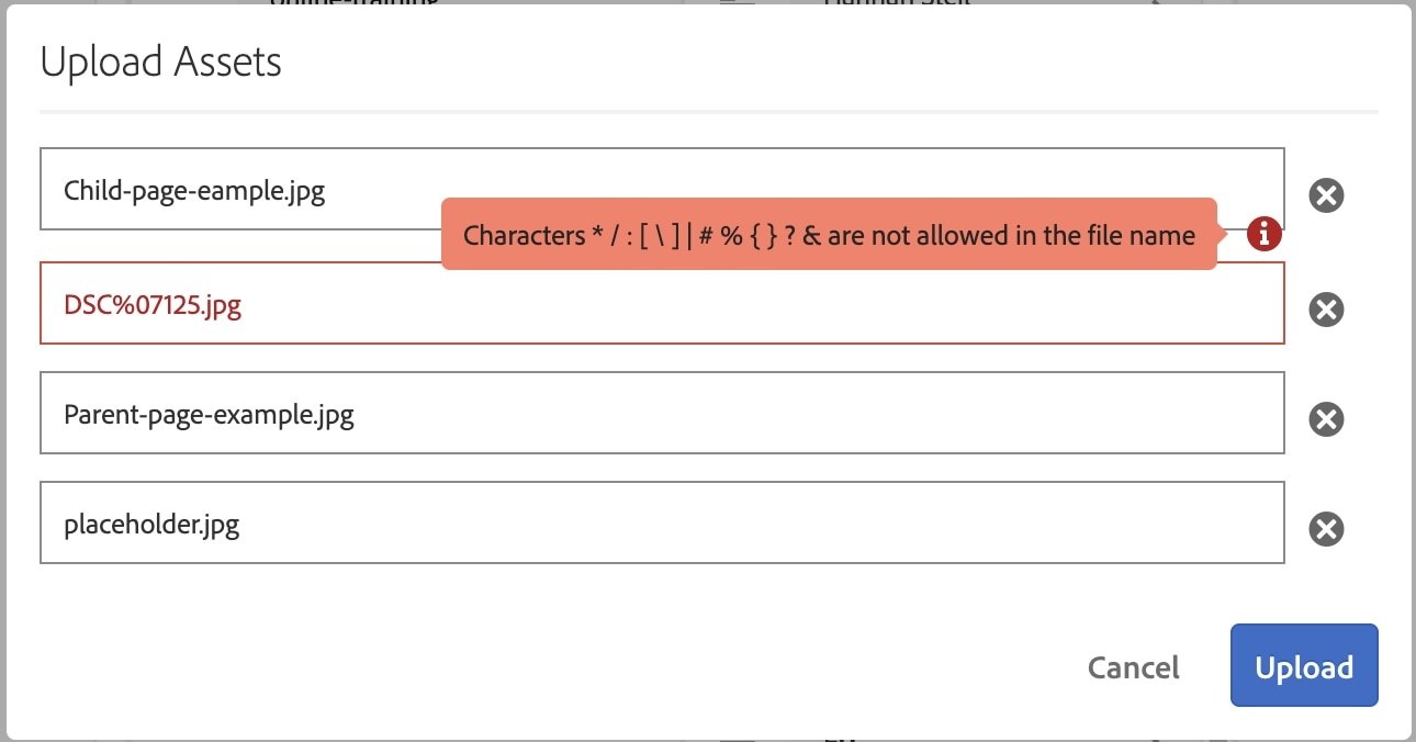
- Click in the red highlighted box and rename the file from DSC%07125.jpg to "mascots-at-football-game.jpg". The box should turn from red back to black.
(If it does not change immediately, click in the box below it.) - Click "Upload". It should now start uploading the files an dyou should be able to see the images in your folder.
Activity 3: Activating Assets
- After you upload your assets to the DAM, click on the view icon again and choose List View.
You will notice in the "Published" column, you will see "Not Published". This means that the assets are in the system but are not yet viewable on the public-facing site.
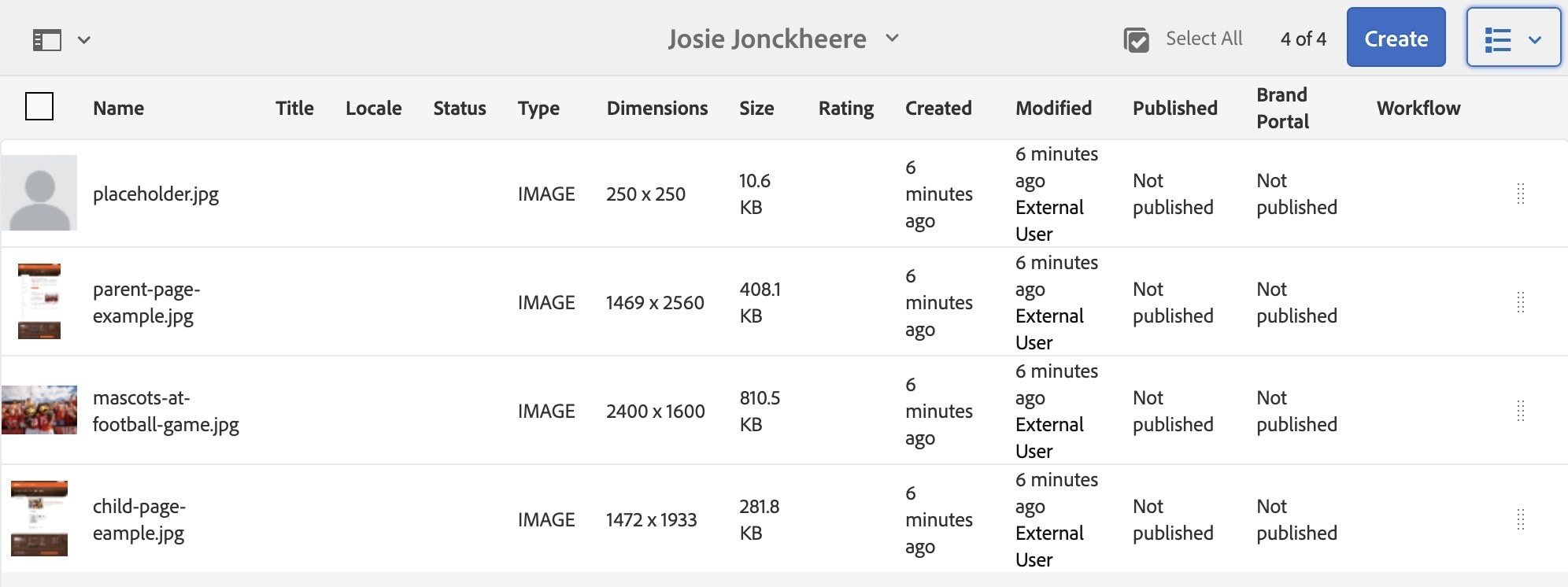
- To publish a file in the DAM you will have to click on the icon of the image so it will turn blue with a checkmark.
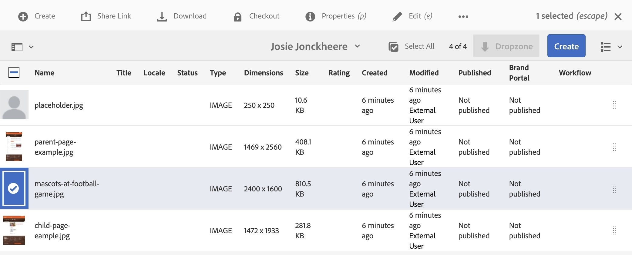
- Once the image you want to publish has the blue overlay with the checkmark, go to the toolbar at the top and click the icon with the three dots.

- Click on Manage Publication
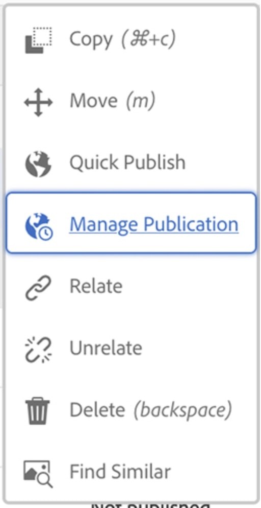
A popup window will appear with the options to "Publish" or "Unpublish".
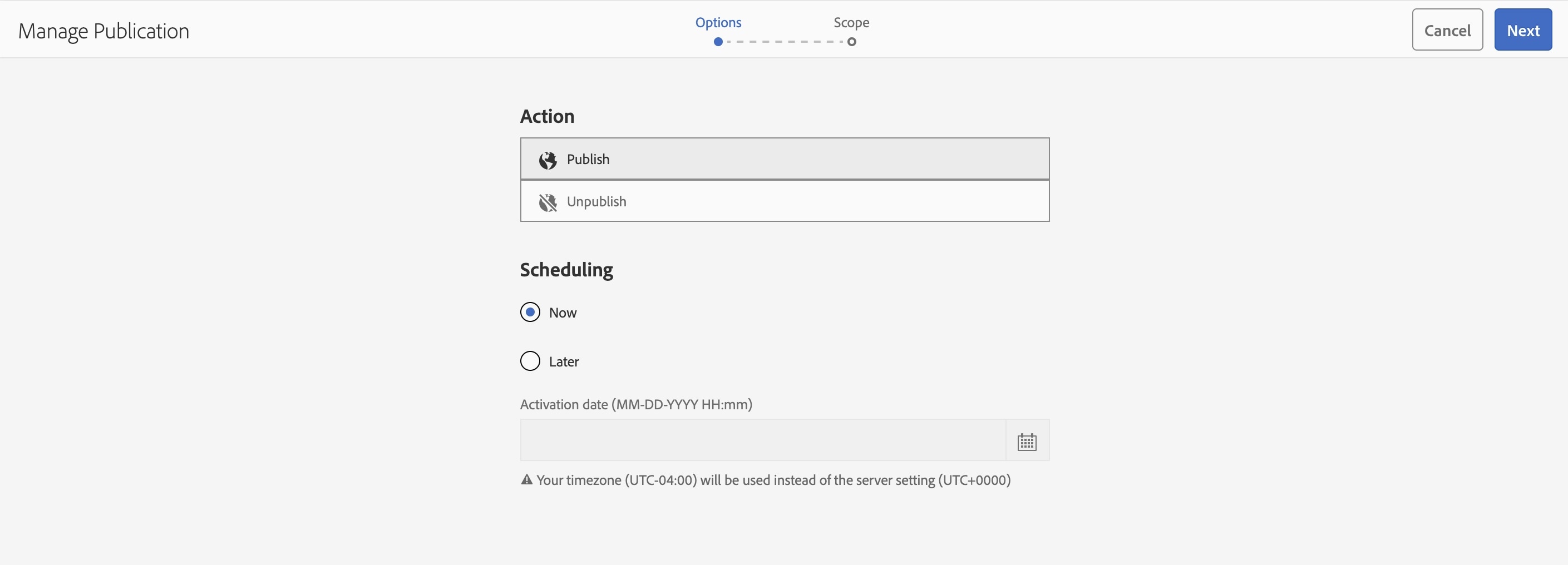
- Choose "Publish"
- Under Scheduling in that same pop-up, leave it set to "Now".
- Click the blue Next button in the top right corner.
- This will take you to another window.
- Click the icon of the image you are wanting to publish, so the blue overlay with a check mark appears.
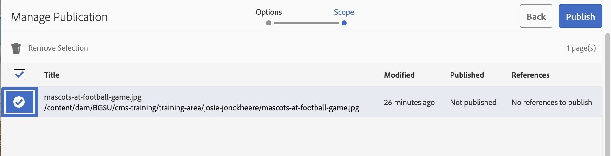
- Click Publish in the top right corner.
You should now see under the "Publish" column, that the image is now published and who it was published by.
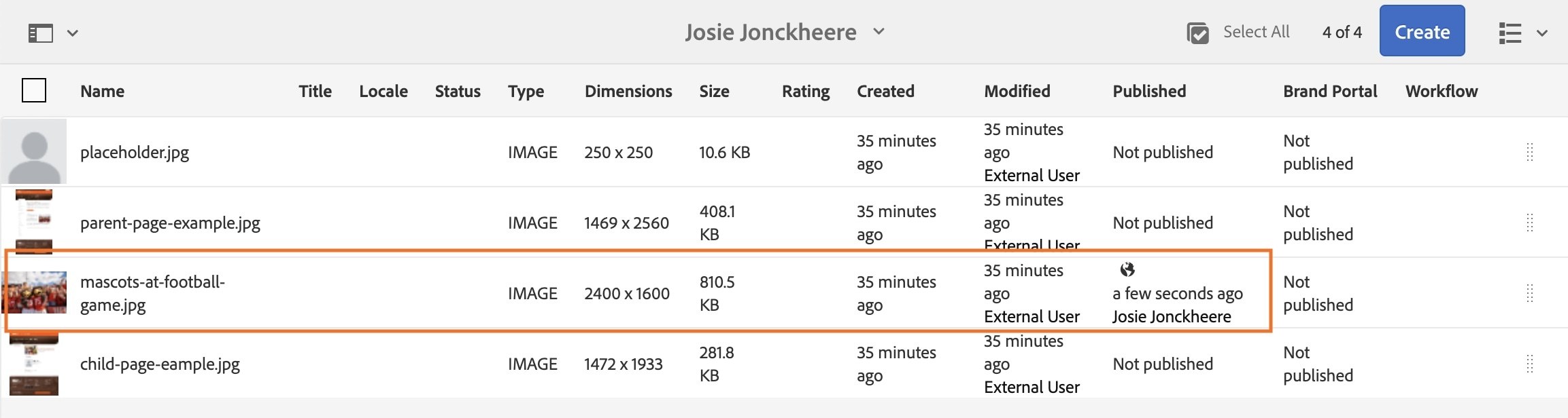
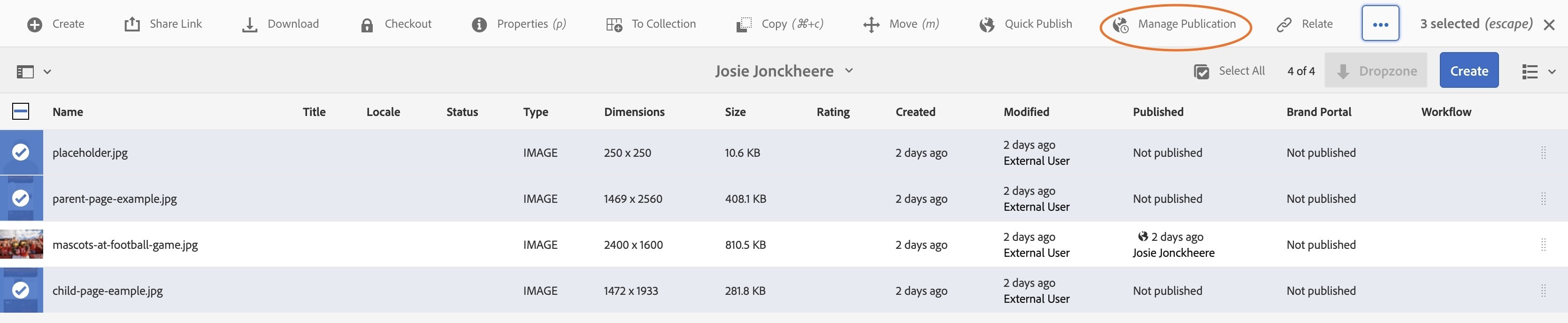
You can also activate/publish more than one asset at a time.
- Click on the icon of the first asset you want to publish, press and hold Command (Mac) or Control (PC) and select the icon of the other assets you want to publish.
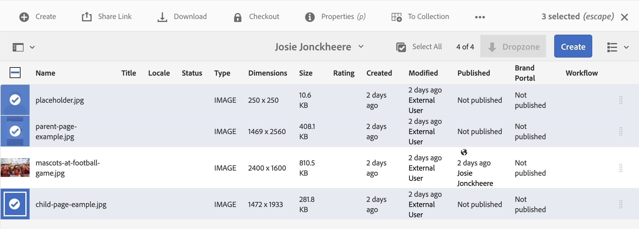
OR
- Click "Select All" in the top right-hand corner next to the blue "Create" button.
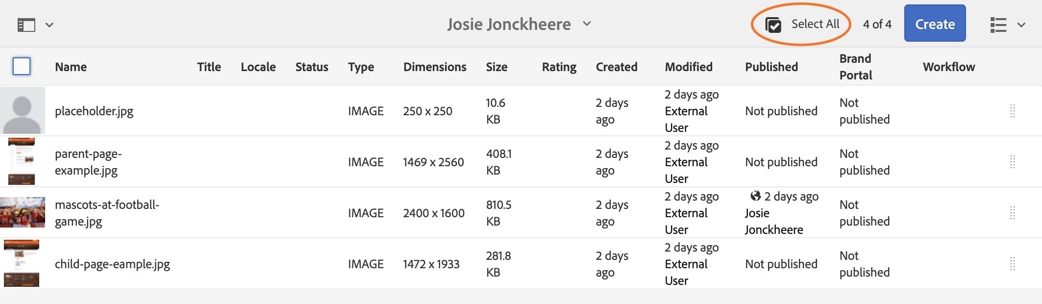
- Click "Manage Publication" in the toolbar at the top. If you don't see it, click the three dots in the toolbar and it will be in the dropdown menu.
- Click "Publish" under Action then click the blue "Next" button in the top right-hand corner.
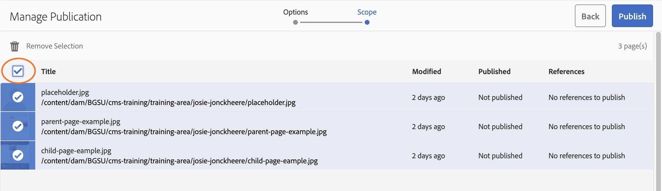
- On the next screen, select the checkbox above your asset icons to select all the available assets, then click the blue "Publish" button. Your assets are now activated.
Activity 4: Deactivating Assets
- Navigate to your images folder.
- Click once on the icon next to the image titled child-page-example.jpg, so the blue overlay with the checkmark appears.
- Click the three dots at the top right-hand corner.
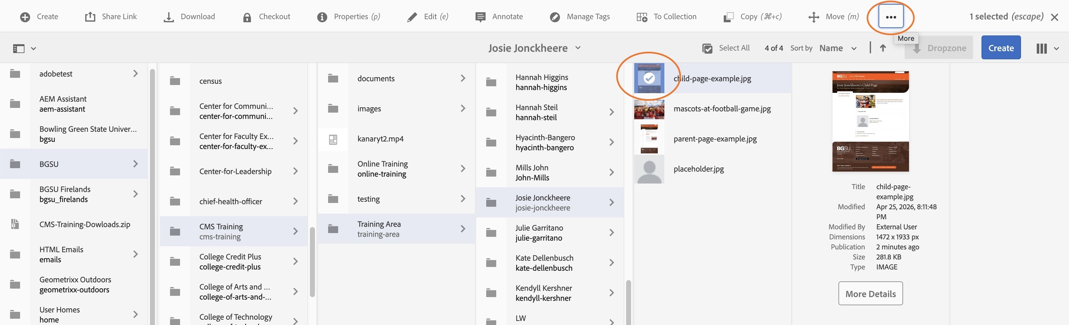
- Navigate to "Manage Publication".
- Under Action, select "Unpublish" then the blue "Next" button.
- Once again, click on the icon of the image you want to deactivate so the blue overlay with the checkmark appears, then click the blue "Unpublish" button.
- You should now see a Success message at the top in green.
Activate/Deactivate Later
There is an option to schedule the activation/deactivation of an asset.
*You do not need to do this for this training. Please still familiarize yourself with the process below.
- To do this, follow the steps in Activity 5.
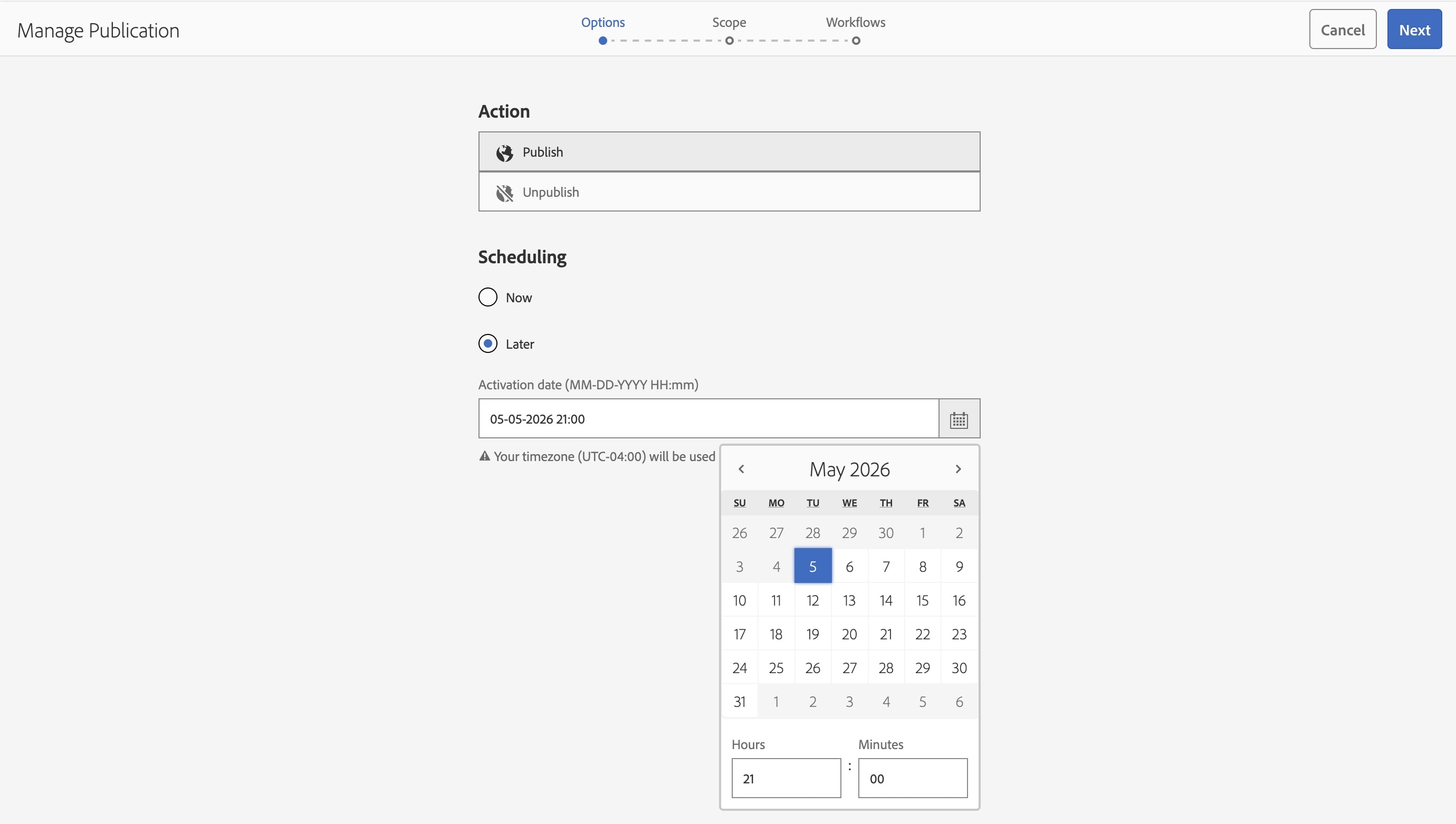
- Once you reach the "Manage Publication" page, choose if you want to Publish or Unpublish the file in the "Action" section.
- You will then see a "Scheduling" section under the "Action" section.
- In the "Scheduling" section you will see two activating options, Now and Later.
- If you want to Publish or Unpublish Later you will click the radio button for Later and choose an Activation date in the format of (MM-DD-YYYY HH:mm). There will be a calendar icon next to this box to make it more convenient.
- Once you choose a date and time, click the blue "Next" button.
- On the next screen, you once again need to select the image by clicking on the icon before the title so the blue overlay and checkmark appear, then select the blue Next button.
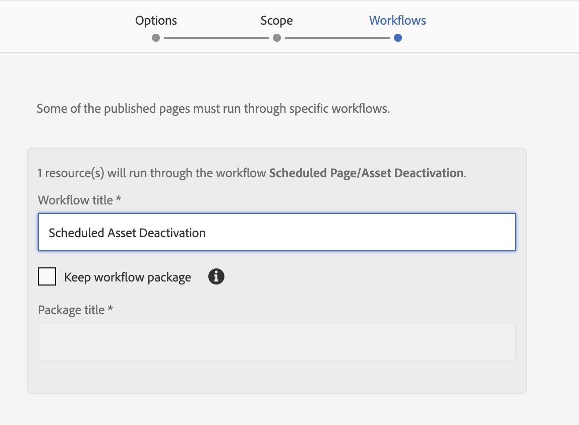
- You will then get to the Workflows page. In the Workflow title field, type either "Scheduled Activation" or "Scheduled Deactivation" depending on what you are doing with your asset.
- Select the blue button in the top right corner (Unpublish Later or Publish Later).
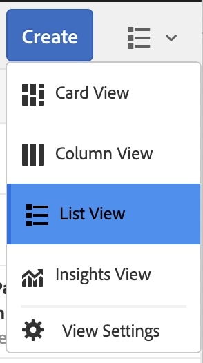
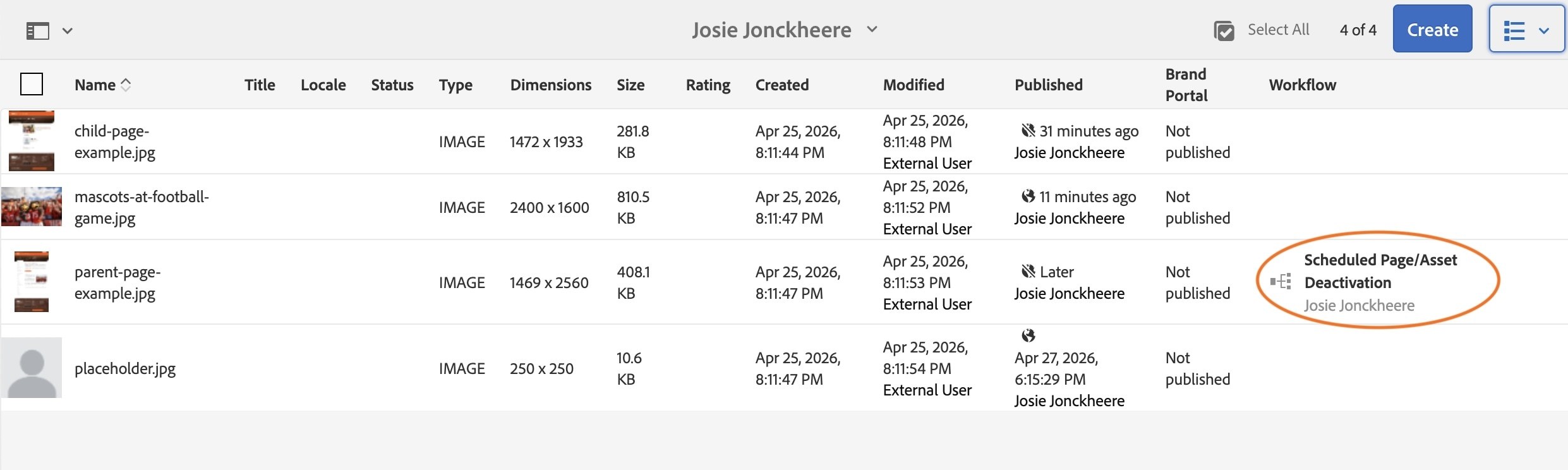
- Finally, switch your assets into List View in the top right corner.
- Once you are in list view, you will see the status of all the assets in your folder, including the scheduled deactivation in the workflow column.
Activity 6: Deleting Assets
If you need to delete an asset, you need to first check the references of the asset. References will show all of the pages that an asset is on across the website. If an asset is deleted or deactivated and still referenced on a page, it will create a broken link.
If you see that an asset has a reference, please submit a ticket to the web team so the asset can be properly deleted.
The second thing you must do before you delete an asset is to deactivate/unpublish it.
- To deactivate/unpublish follow the steps in Activity 5.
Once an asset's references have been checked and it does not remain anywhere on the website, and the asset has been deactivated, it is safe to delete.
- Click the icon before child-page-example.jpg so it highlights blue with a checkmark.
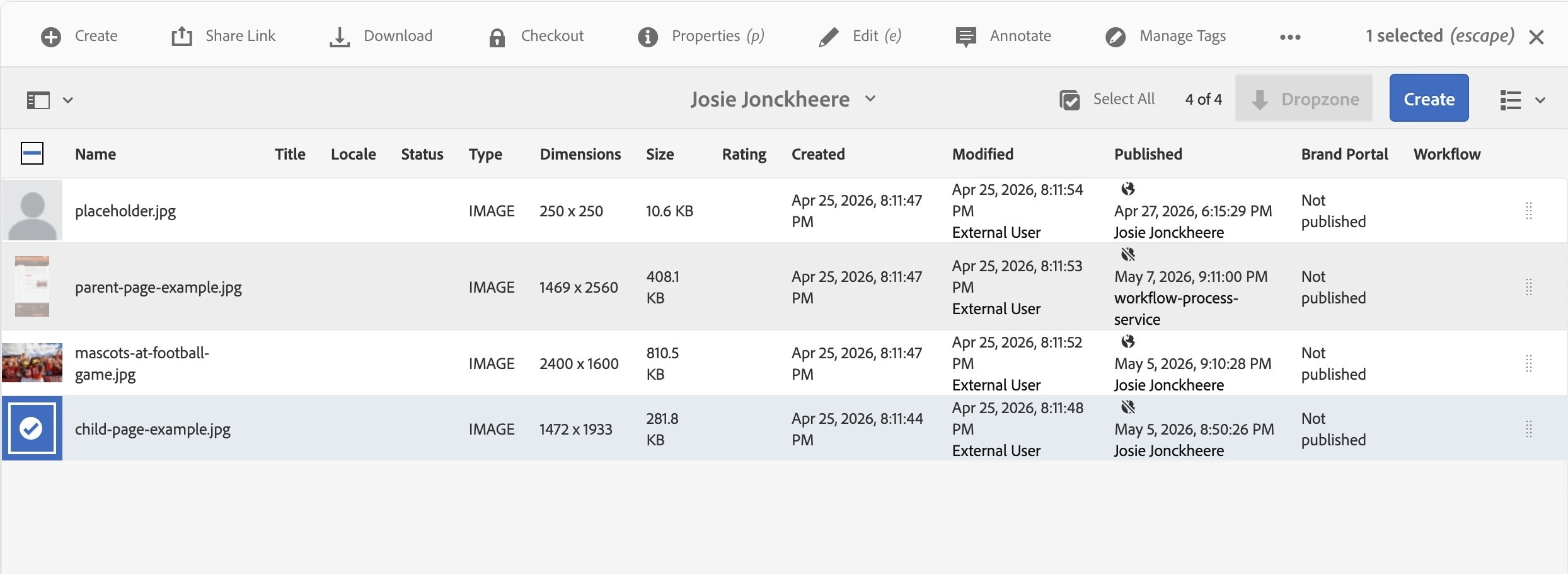
- Click on the three dots in the top right-hand corner.
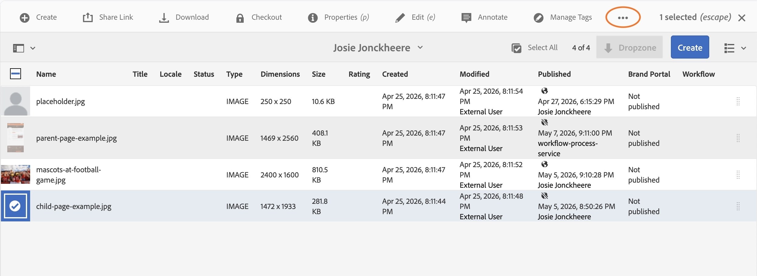
- Select "Delete" in the dropdown.
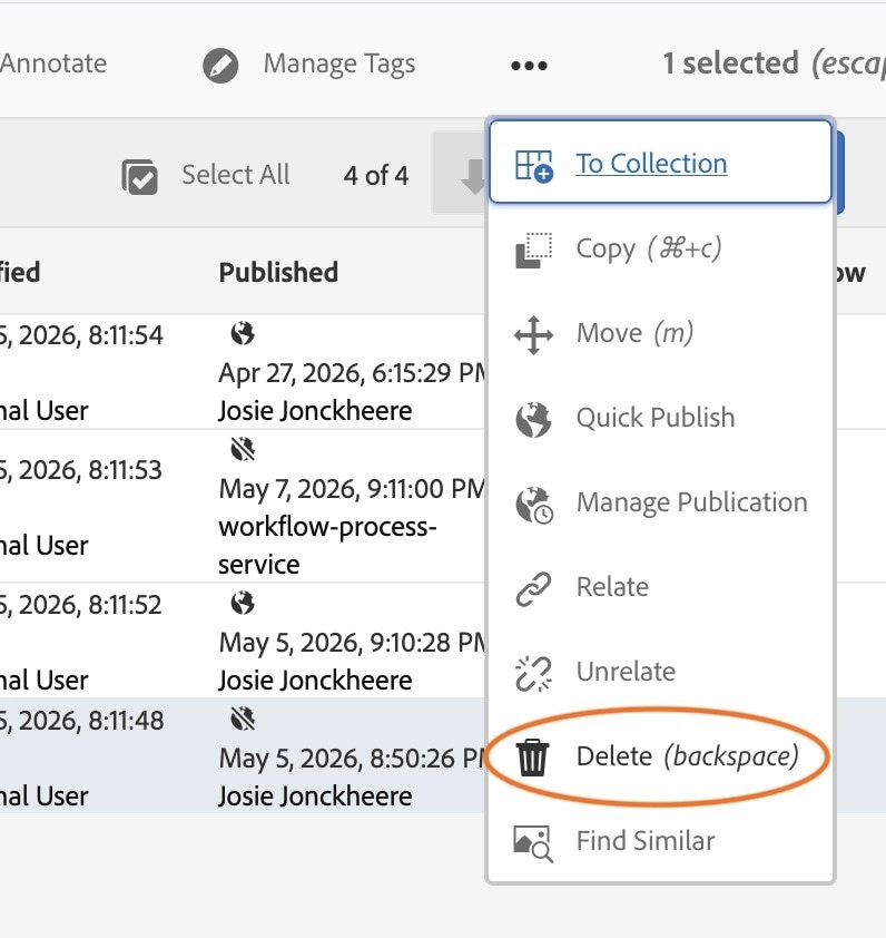
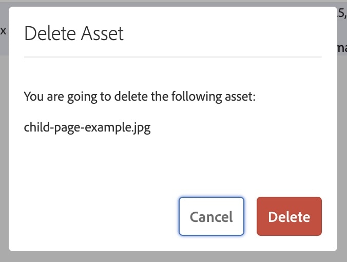
A popup will appear that says, "You are going to delete the following asset: child-page-example.jpg"
- Select the red "Delete" button.
The image is now deleted.
Once you click delete, wait until it disappears. DO NOT CLICK DELETE AGAIN or you may delete items unintentionally.
Web Content Manager (WCM)
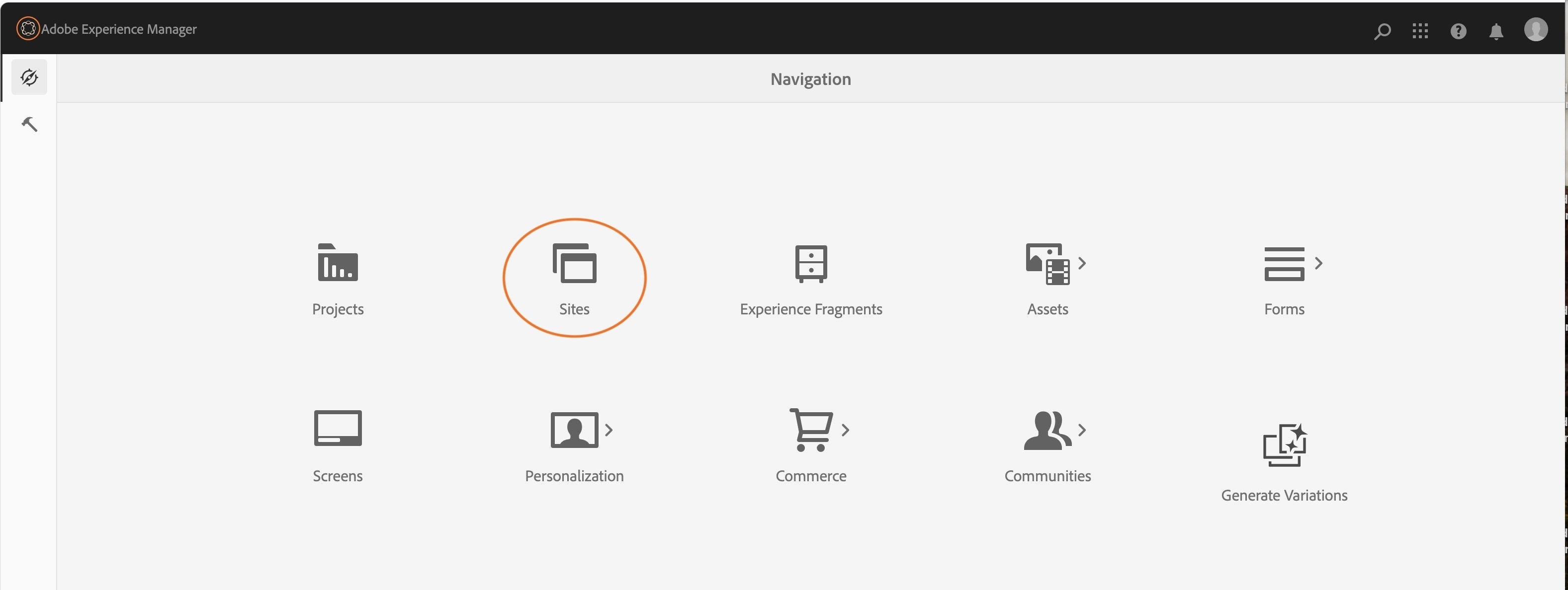
The Web Content Management (WCM) system is where all of the websites are housed. To navigate to the WCM, select the "Sites" in Adobe Experience Manager https://aem.bgsu.edu/aem/start.html.
Activity 7: Creating a Page
- Once you are in "Sites", navigate to Bowling Green State University > Bowling Green State University > CMS Training > Online CMS Training > Training Area.
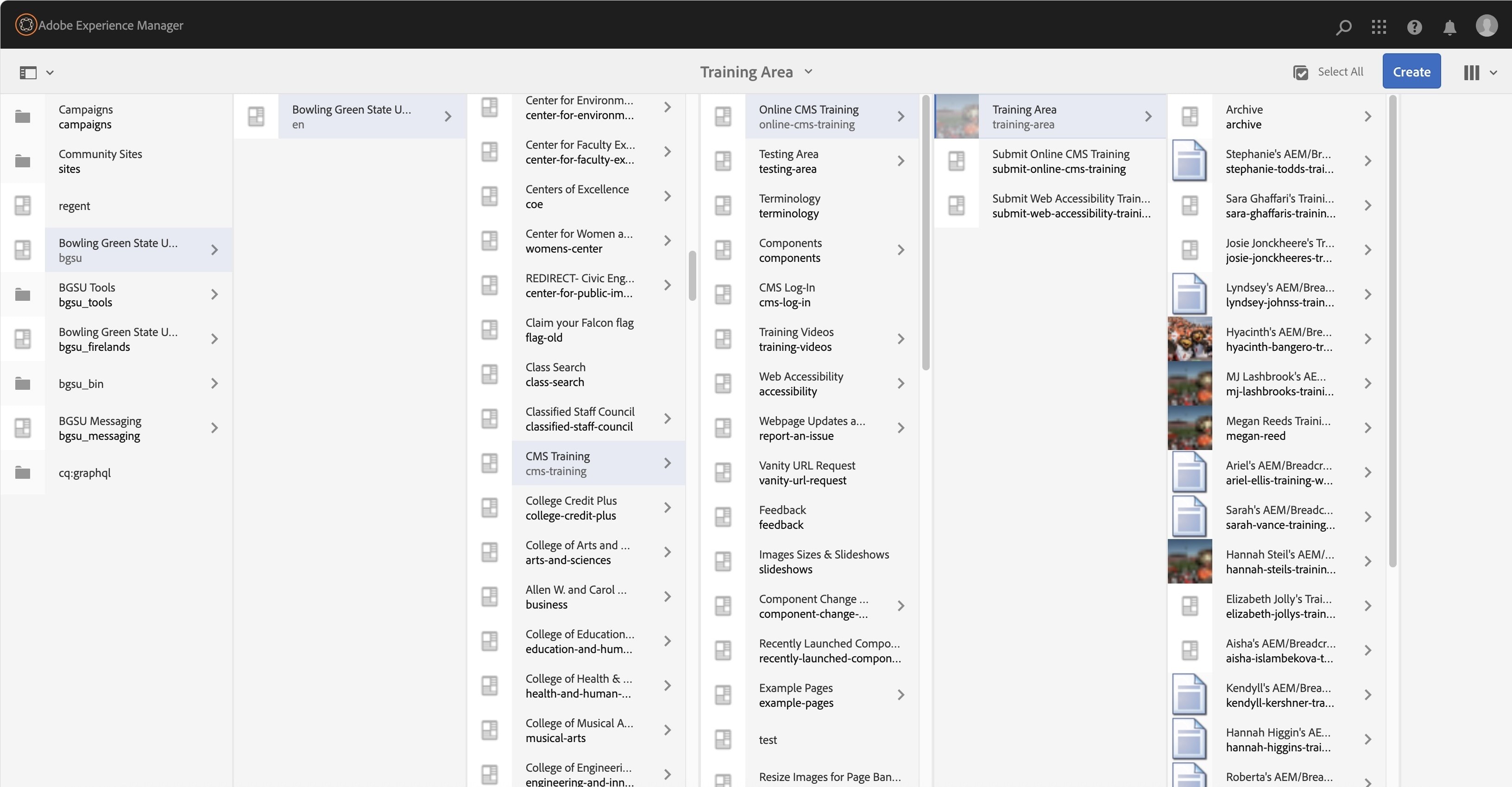
- Click once on the icon next to "Training Area", it will highlight blue with a checkmark.
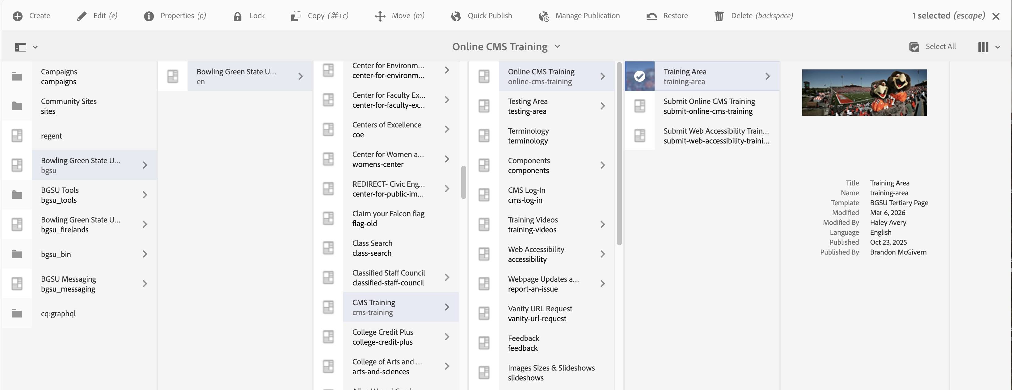
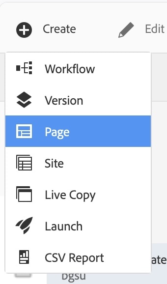
- Click "Create" in the gray toolbar at the top of the screen.
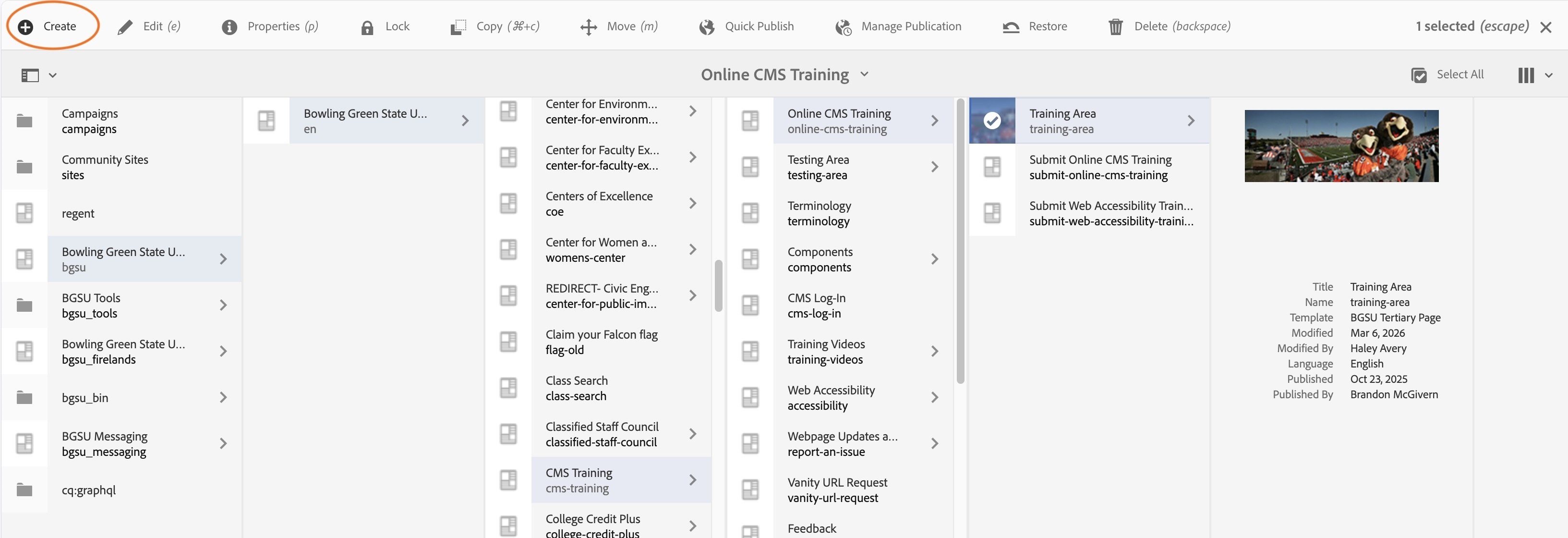
- In the dropdown that appears, click "Page"
- Click BGSU Tertiarty Page, so the icon outlines blue with a checkmark overlay. This template is used for child pages and contains the left navigation.
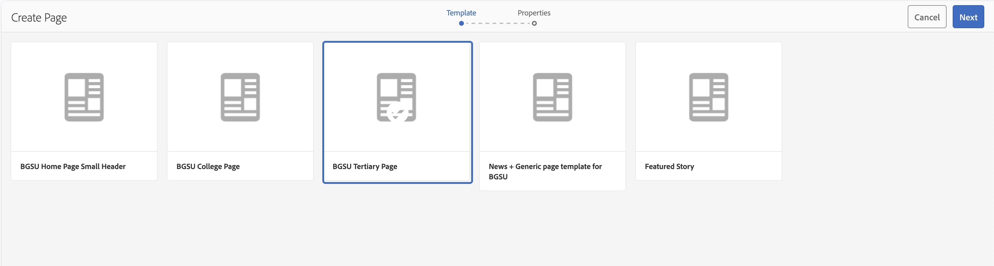
- Click the blue "Next" button in the top-right corner.
- You are now prompted to the "Title and Tags" page.
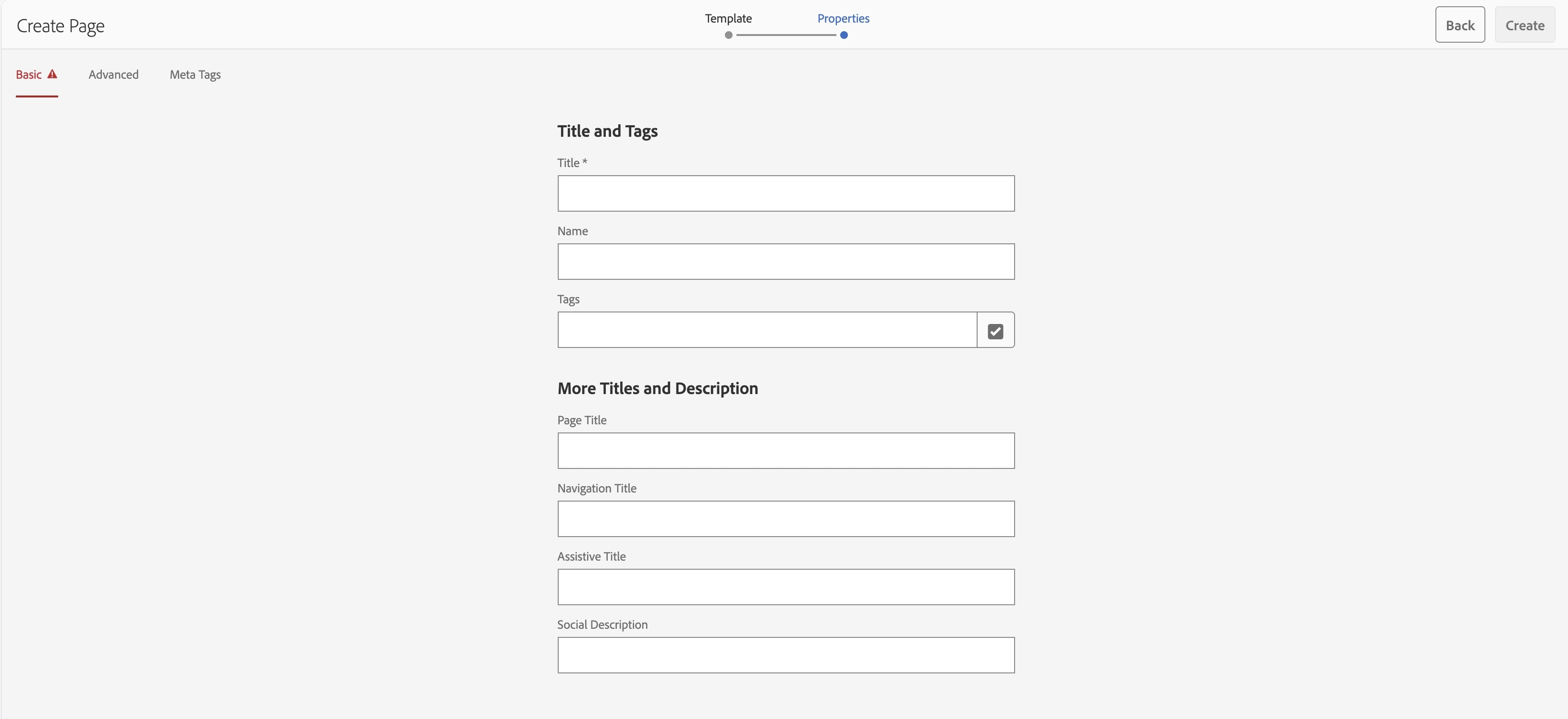
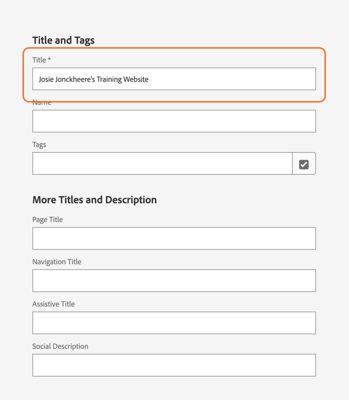
- Under Title, Name the page your first and last name followed by 's Training Website. Ex. Josie Jonckheere's Training Website
*You can use spaces, capital letters and/or special characters in the title.
- Click the blue "Create" button in the top-right corner.
- A pop-up box will appear saying, "Success, Your page has been created", with two-button options: Done and Open.
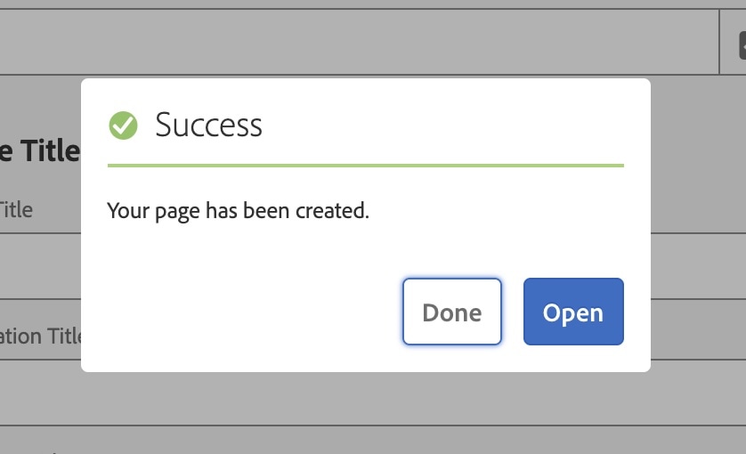
- Click "Done".
- Your screen should now take you back to this window:
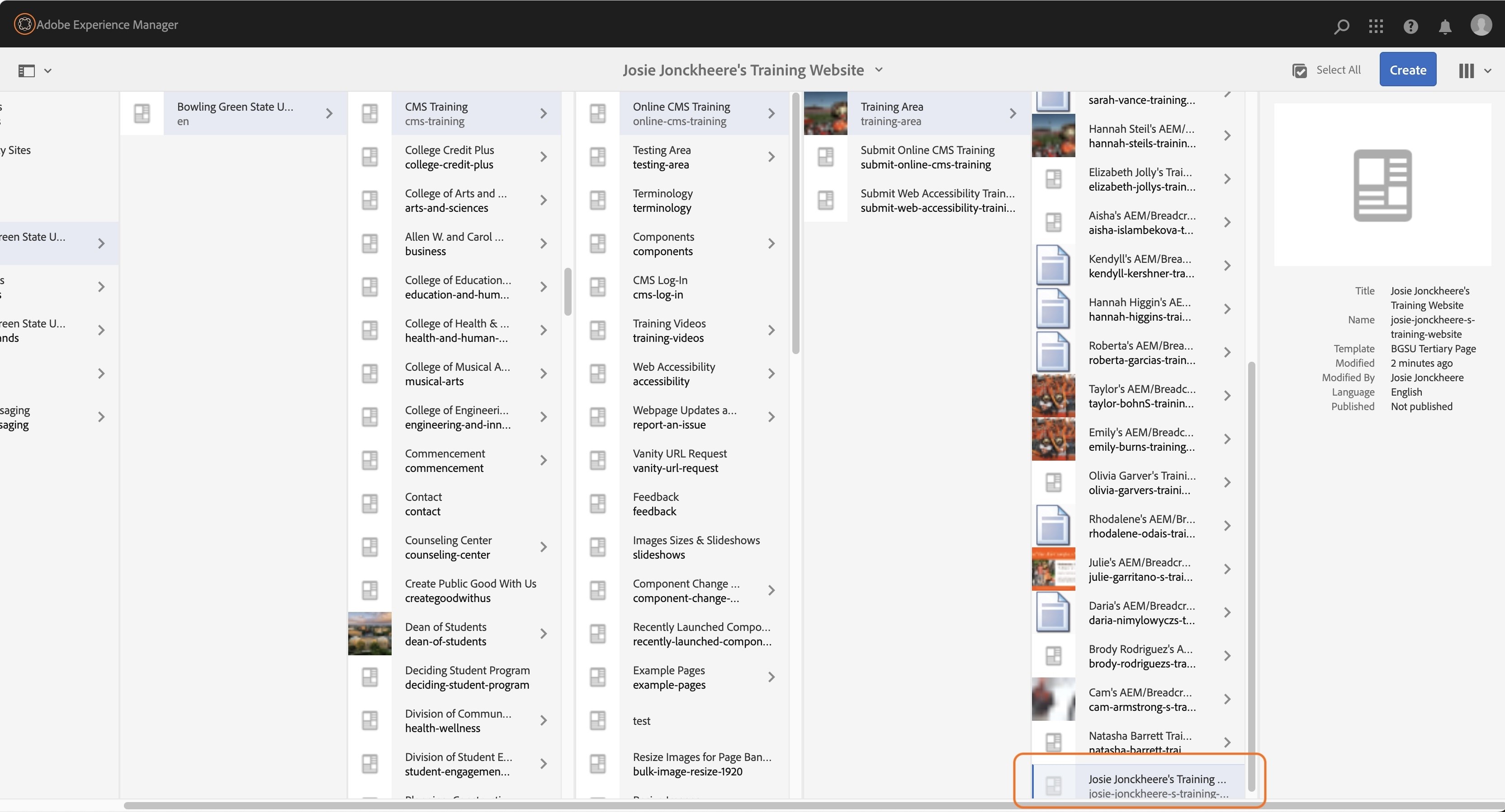
- The page that you have created should now be in the "Training Area".
* To locate your page, look in the far right column, you may have to scroll to the bottom.
- Follow the directions above to create another new page titled, "First Name Last Name's Child Page",
Ex. : "Josie Jonckheere's Child Page", using the tertiary template.
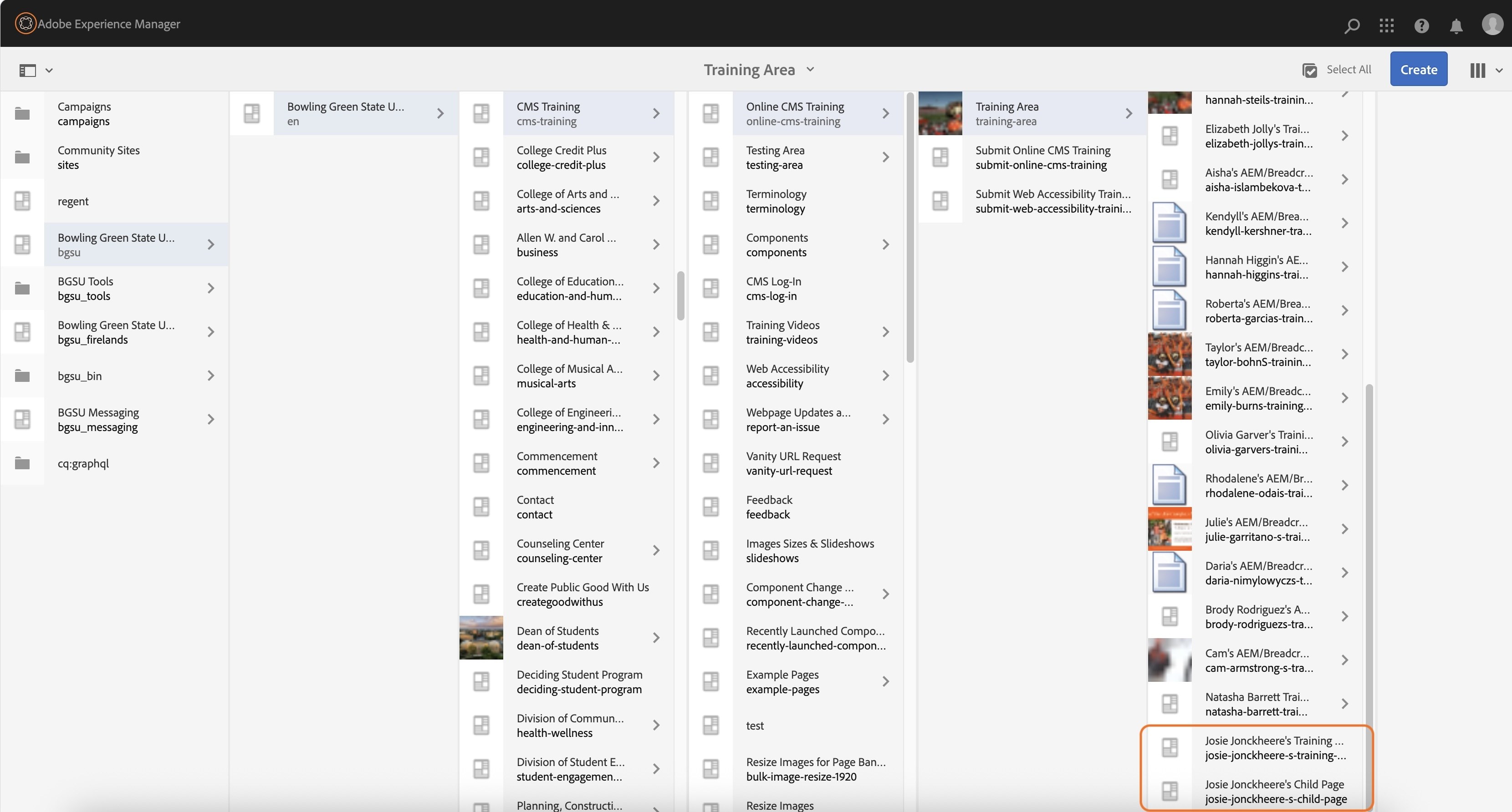
- The new page you created, "Josie Jonckheere's Child Page", should now appear in the far right column.
- There should now be two pages in the "Training Area" that contain your name.
Activity 8: Renaming a Page
Special characters used in the title of a page will be translated as dashes for the page name (url).
Example: Josie Jonckheere's Training Website = josie-jonckheere-s-training-website.
Extra dashes should not be used in the name of a page. So we will remove the extra dash in this activity.
- Select your training website page.
(click the icon before the name so the blue overlay and checkmark appear)
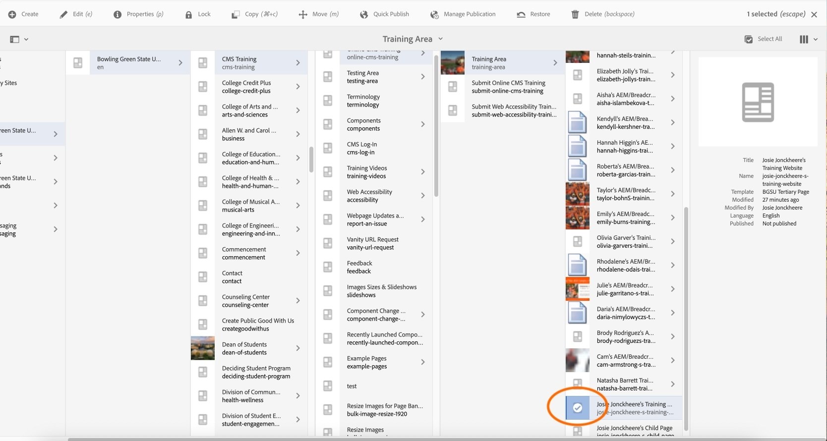
- Click "Move" in the toolbar.
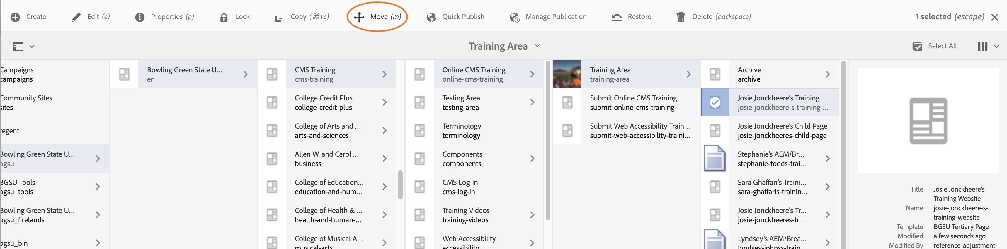
- You would be prompted to the next screen, which will be "Move Page".
- Under "Page name after move*, delete the extra dash in between your last name and the letter s.
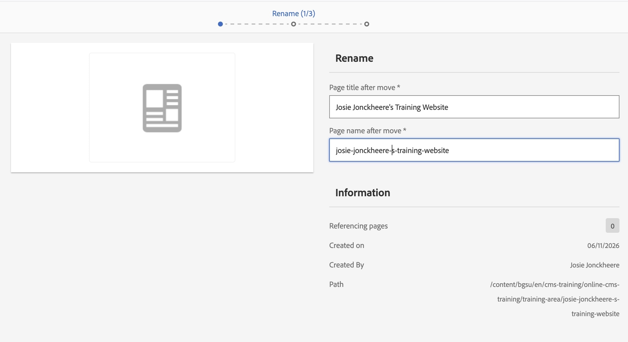
- After you deleted the extra dash in between your last name and the letter s. Click the blue "Next" button in the top-right corner.
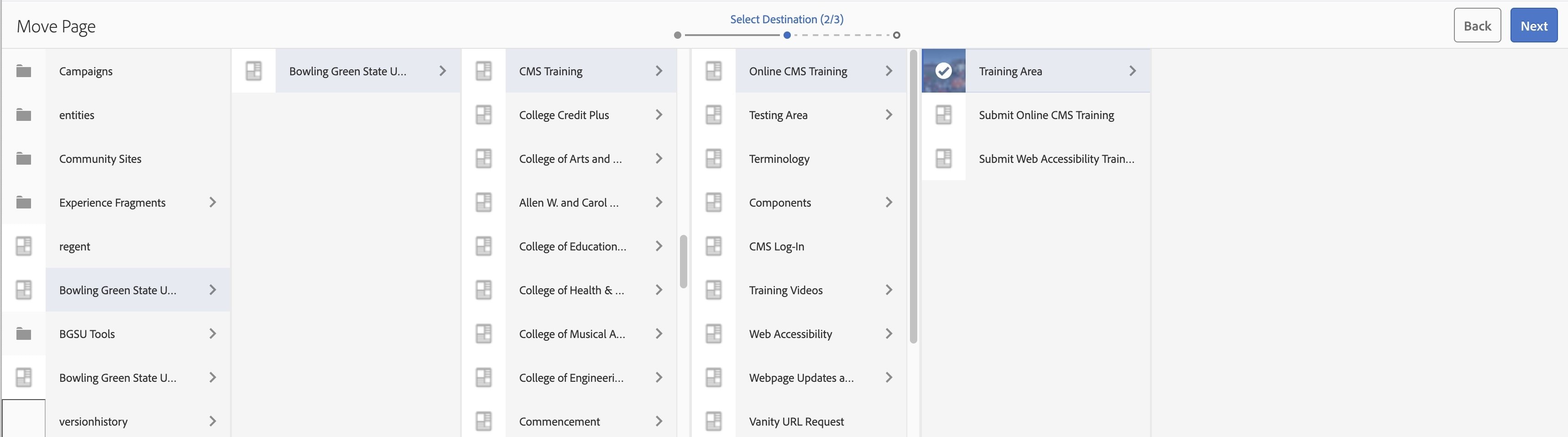
- The next prompt screen is "Select Destination".
- Click "Training Area" so that it is highlighted blue with a checkmark overlay.
- Click "Move" in the top right-hand corner.
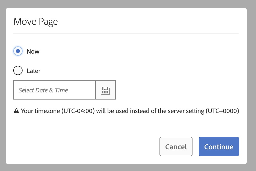
- Make sure "Now" is selected on the next prompt page. Click the blue "Continue" button.
- The screen should update back to the Training Area, and the "Page Name" will be updated.
- Repeat with the child page title to remove the extra dash in the URL.
- Now both of the files should be updated.
Activity 9: Moving a Page
Just like we moved assets in the DAM, it is also possible to move pages.
- Select your training website Child Page.
- Click Move in the top toolbar.
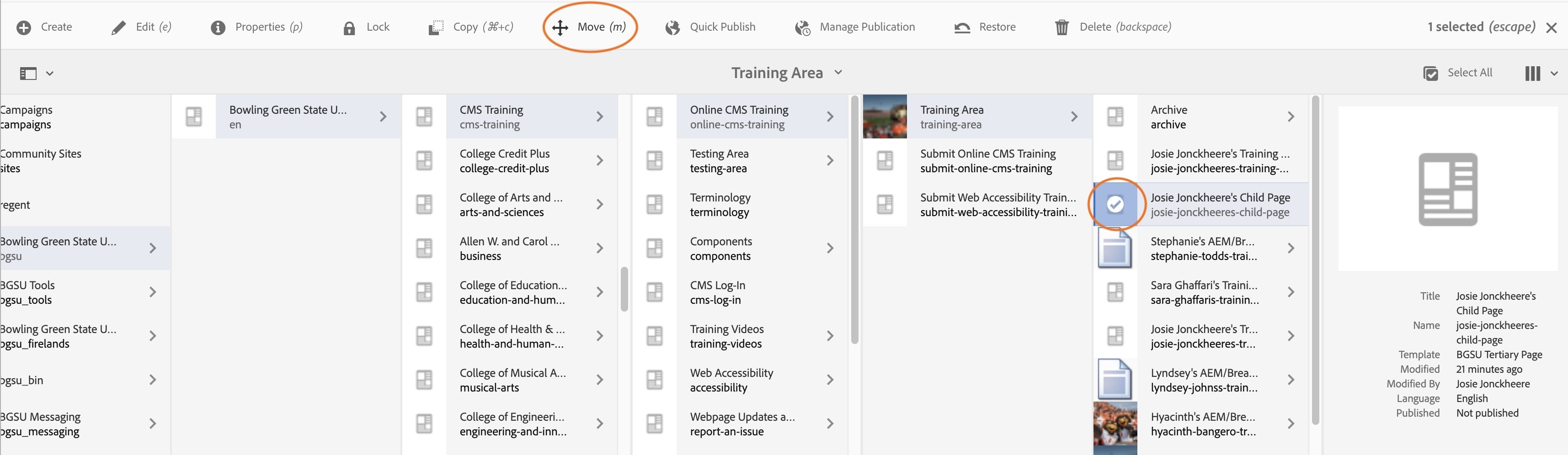
- You will be prompted to the next screen, which will be "Move Page".
- Don't change any of the information on this page, click the blue "Next" button in the top right corner.
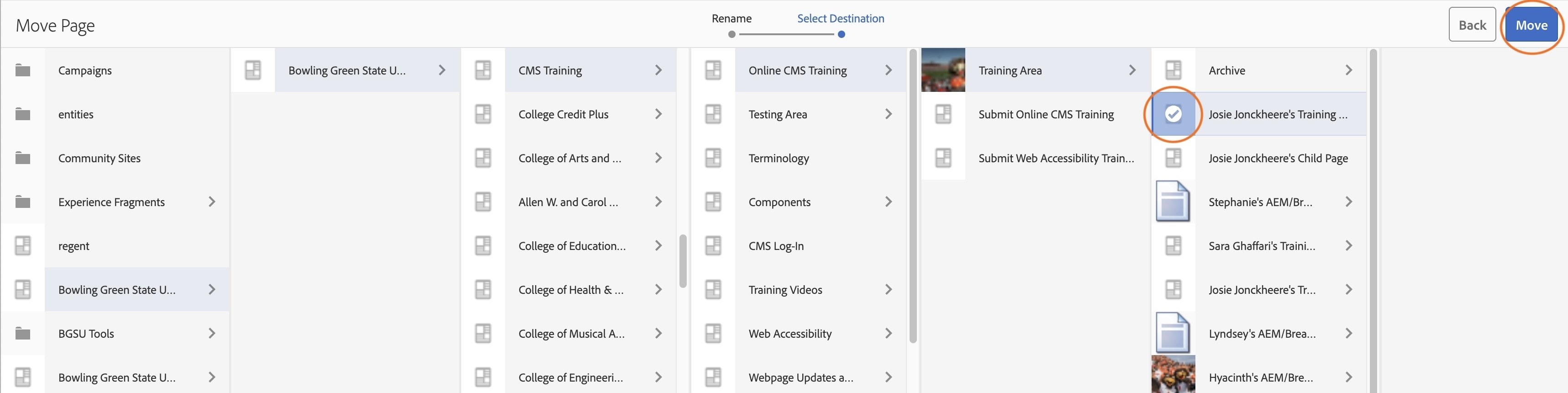
- You should now see the "Select Destination" screen.
- Click on your main Training Page, Ex. Josie Jonckheere's Training Page, so that it is highlighted blue with a checkmark overlay.
- Click "Move" in the top right-hand corner.
- Make sure "Now" is selected on the next prompt page. Click the blue "Continue" button.
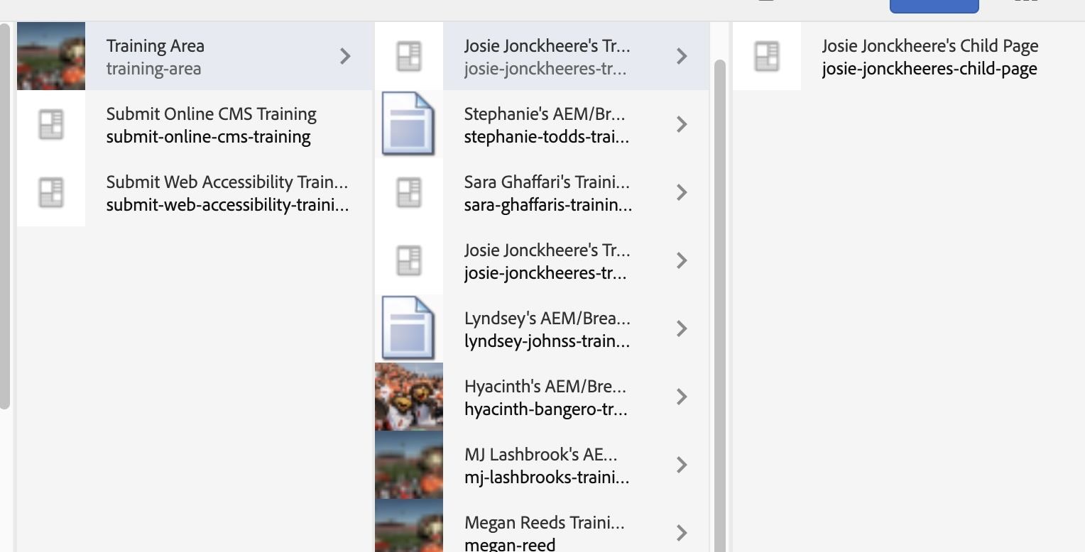
There should now be an extra column on the right side when you click on your training page, that is where you will find your child page.
Activity 10: Author Mode
To access Author Mode, go back to Column View. Choose the icon next to the blue 'Create" button.
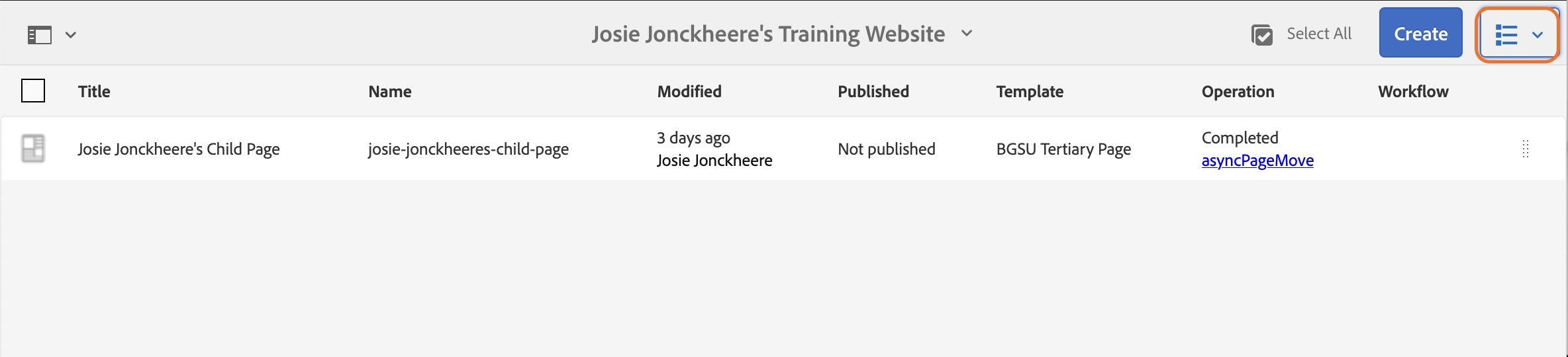
In the dropdown, choose "Column View".
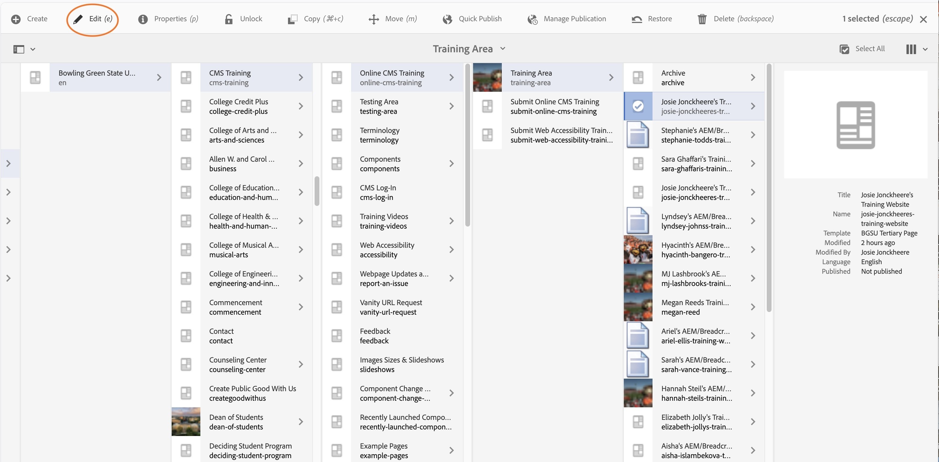
- Navigate to your Training Page: Bowling Green State University > Bowling Green State University > CMS Training > Online CMS Training > Training Area > Your First and Last Name Training Website
- Click the icon before the title, so that it highlights blue with a white checkmark overlay.
- Click "Edit" in the toolbar.
You will be prompted to your Training Parent Page
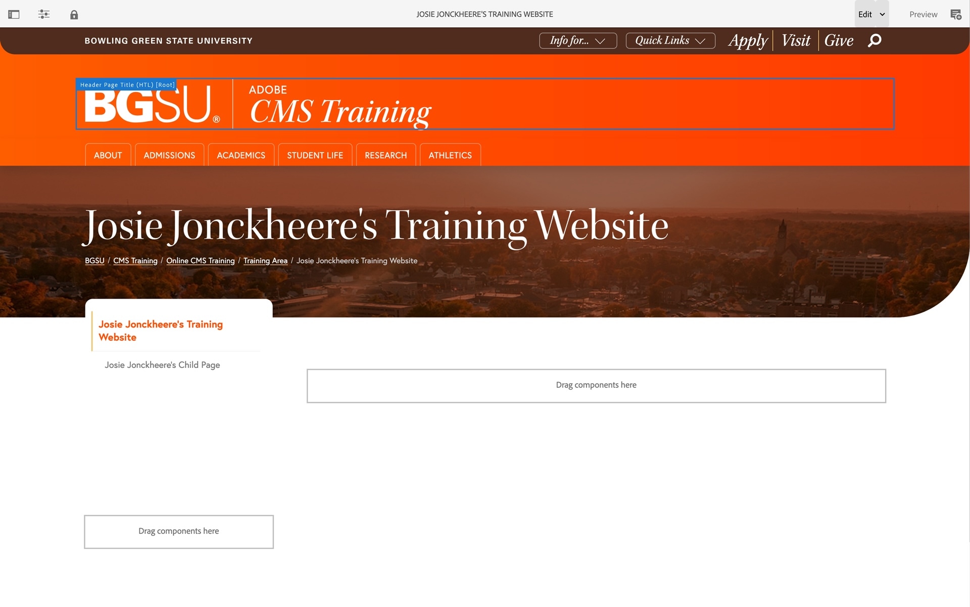
If your Training Page DOES NOT look like the screenshot above. Check the URL of the page.

The URL should be:
https://aem.bgsu.edu/editor.html/content/bgsu/en/cms-training/online-cms-training/training-area/josie-jonckheeres-training-website.html
if you are seeing:
https://aem.bgsu.edu/cf#/content/bgsu/en/cms-training/online-cms-training/training-area/josie-jonckheeres-training-website.html
The cf# in the URL needs to be changed to editor.html
After you complete that change, the page should look like the screenshot above.
Content Finder
The content finder in the Side Panel is located on the far left of the page in the toolbar.
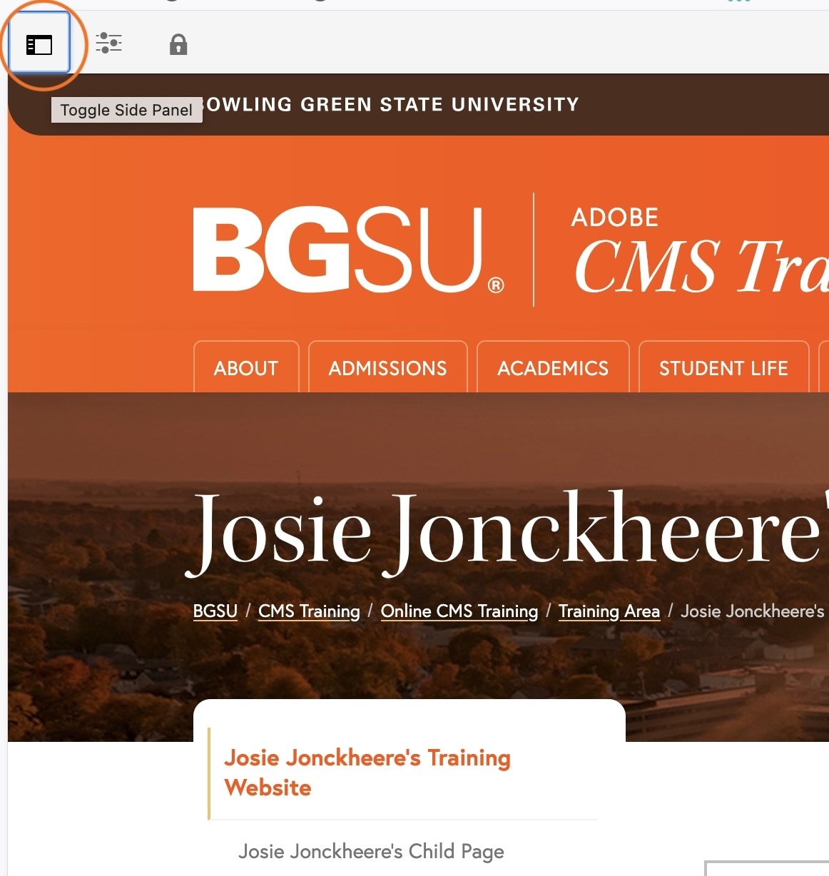
This is where you can find assets to use on the page. The first icon appears to be a photo film on a photo. Once clicked, the assets showing currently are the assets that have been most recently uploaded into the DAM. There is a search tool at the top that will search all images of the DAM as well.
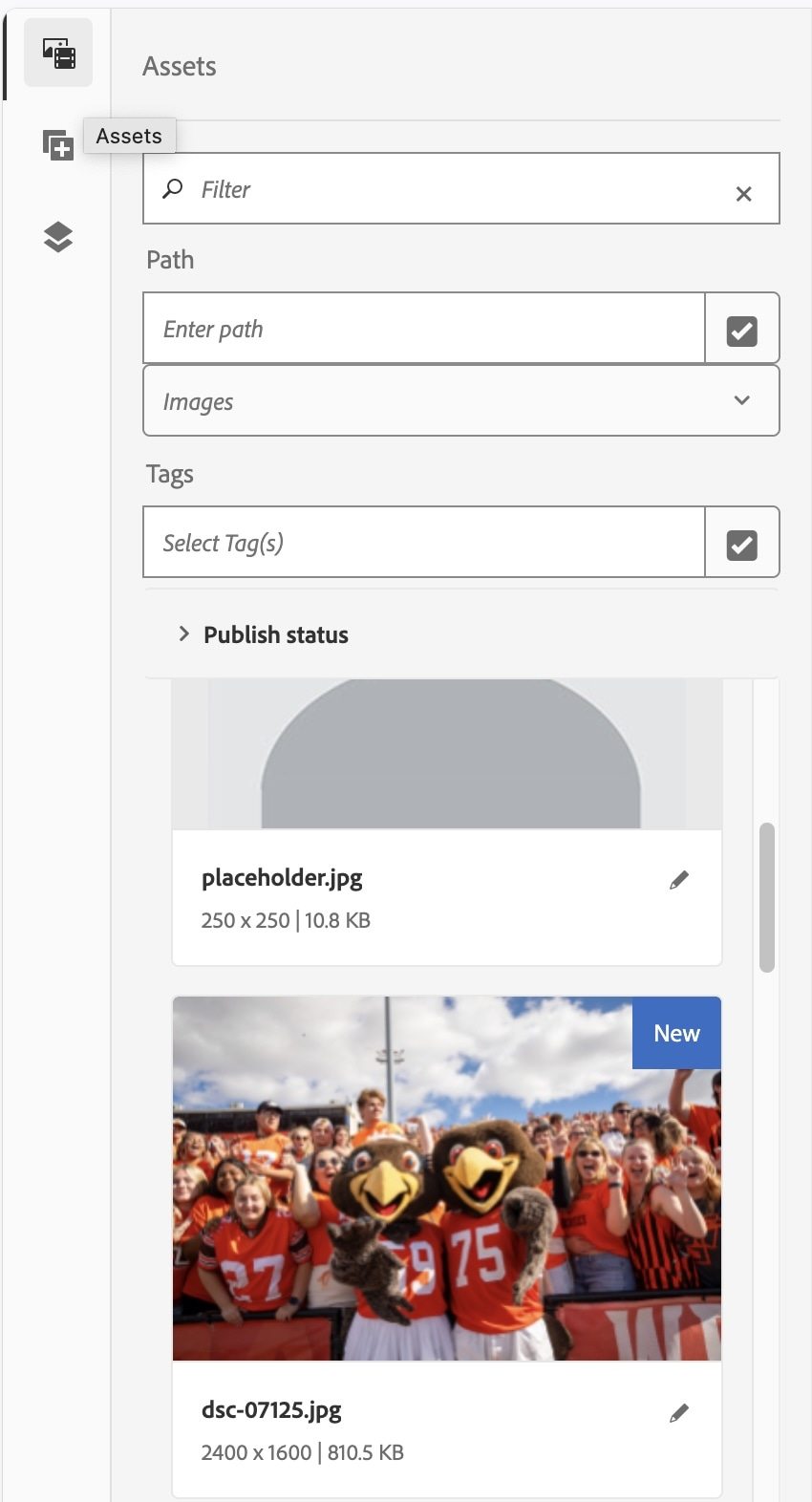
Later in the training, you will learn how to access other assets in the DAM through the content finder.
Page Information
Click the "Page Information" icon that is located next to the "Content Finder".
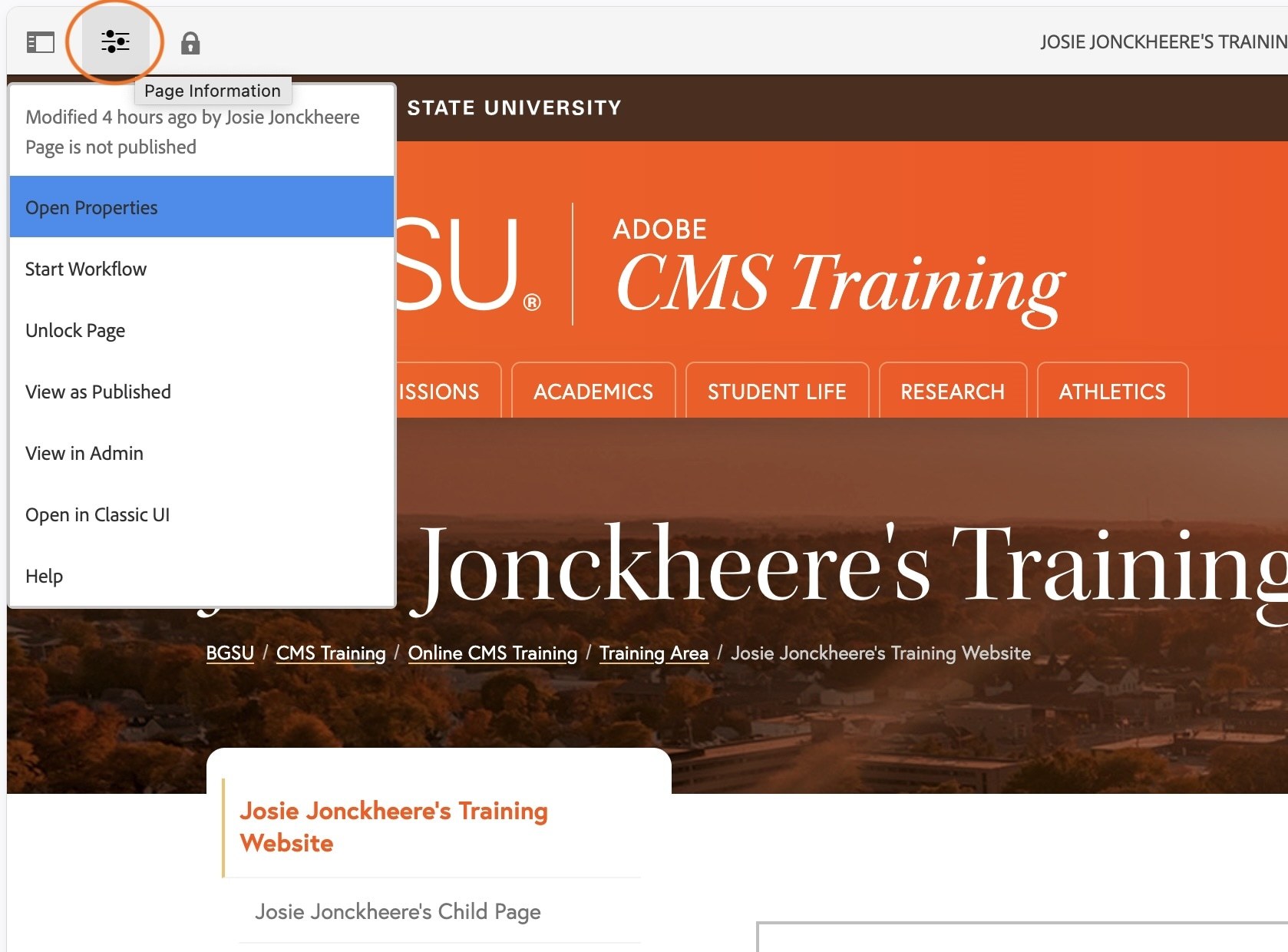
Of the options listed, the three you will focus on are: Open Properties, Publish Page, and View as Published.
Drop Zones
Drop zones are the grey outlined boxes where components like text boxes and images can be added to the page.

Ways to add components to drop zones:
- Drag and drop components from the Side Panel into the drop zone where you would like it to be placed.
- To locate the list of components in the Side Panel, click the Side Panel icon.
- Click the second icon listed, which appears to be a square with a plus sign, that is the "Components List".
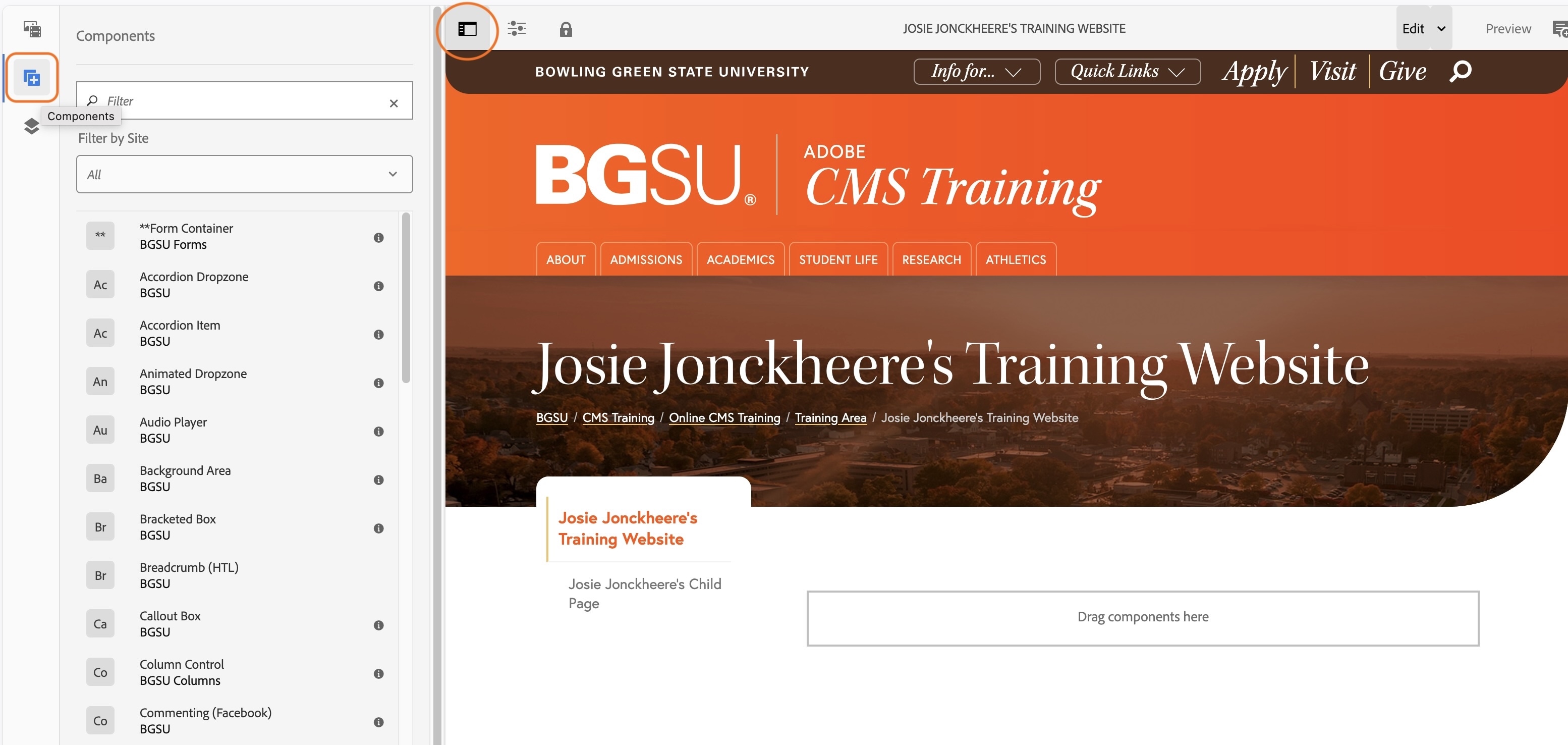
- If the component is compatible with the drop zones, that drop zone will have a blue line above the component area.

- If the component is NOT compatible with the drop zones, that drop zone will NOT have a blue line above the component area.

Configuring a Drop Zone
After adding a component to a drop zone, some type of placeholder will always show, indicating that you’ve added the component successfully. These will usually disappear after configuring the component. If a component has some areas filled out but is still asking to be configured, that usually means not every item that needs to be filled out has been.
Activity 11: Page Properties
This is where you can define the required properties for a page. These can vary depending on the nature of the page.
- Click the "Page Information" icon in the top left corner.
- Click "Open Properties" in the dropdown
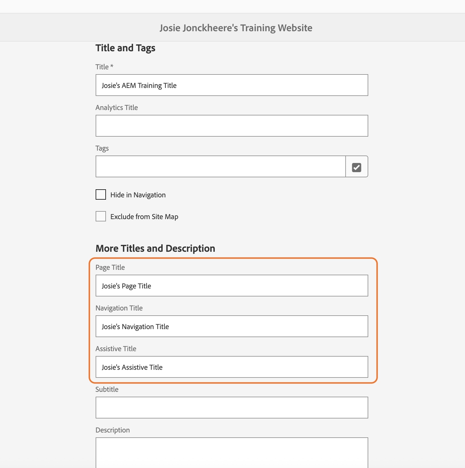
- Under "Title and Tags" in the Title field, type First Name's AEM Training Title in the Title field. Ex. Josie's AEM Training Title
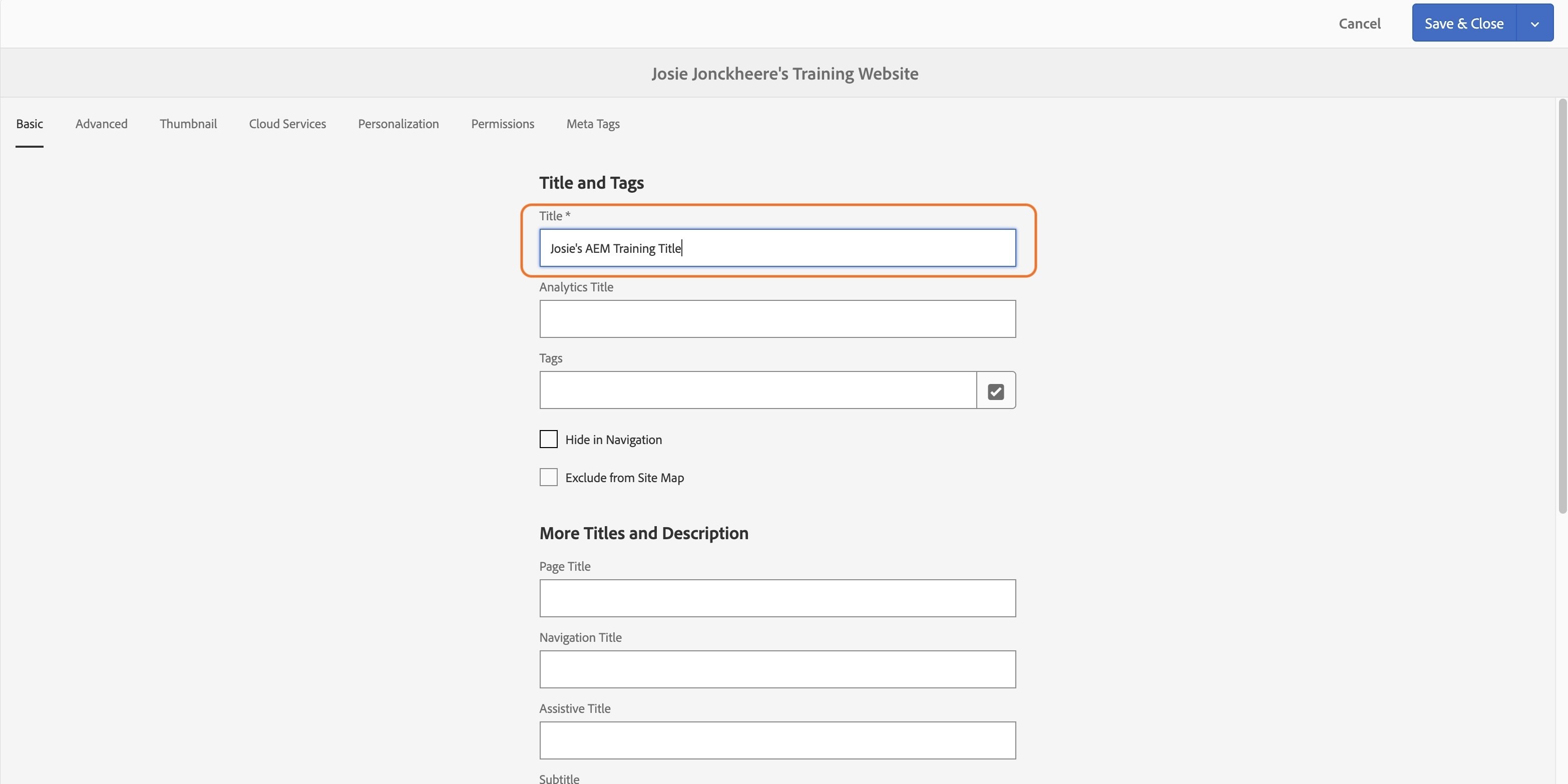
- Under "More Titles and Description", in the Page Title field Type Your First Name's Page Title. Ex. Josie's Page Title.
- In the Navigation Title field, type Your First Name's Navigation Title. Ex. Josie's Navigation Title. This changes the name in the left navigation.
- A use case for this would be if you had a page called Frequently Asked Questions, but wanted to use FAQs in the navigation to save space.
- In the Assistive Title field, type Your First Name's Assistive Title. Ex. Josie's Assistive Title.
- An assistive title provides additional context for people using screen readers. If multiple links on a page have the same visible text (such as "Students"), the assistive title helps distinguish between them by providing a more descriptive name that is announced by assistive technology.
Example:- Visible link: Students
- Assistive title: Students – Undergraduate Admissions
- An assistive title provides additional context for people using screen readers. If multiple links on a page have the same visible text (such as "Students"), the assistive title helps distinguish between them by providing a more descriptive name that is announced by assistive technology.
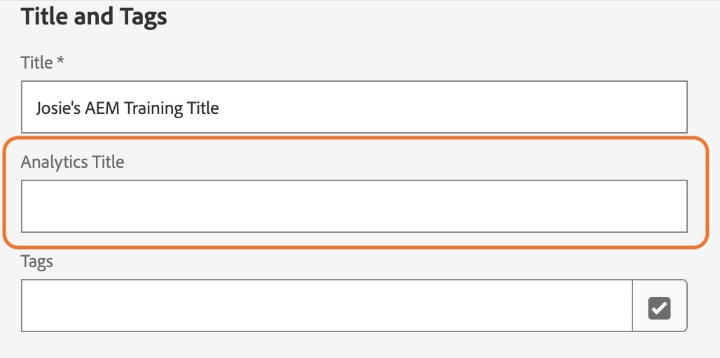
The Analytics Title may be populated already or may be blank. It is important that you DO NOT add or modify this field.
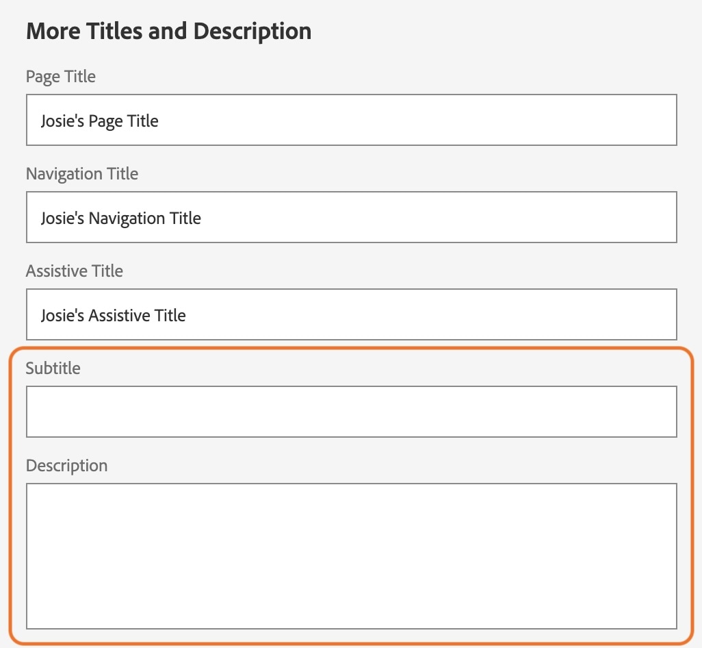
The subtitle and description are optional fields. These are most commonly used for social media purposes. When sharing a URL on Facebook, Facebook will automatically pull in this information from the page. The description is also used on BGSU's news web pages for teaser content and is what shows up underneath a website name in Search engine results. Character suggestion: 150-200 words.
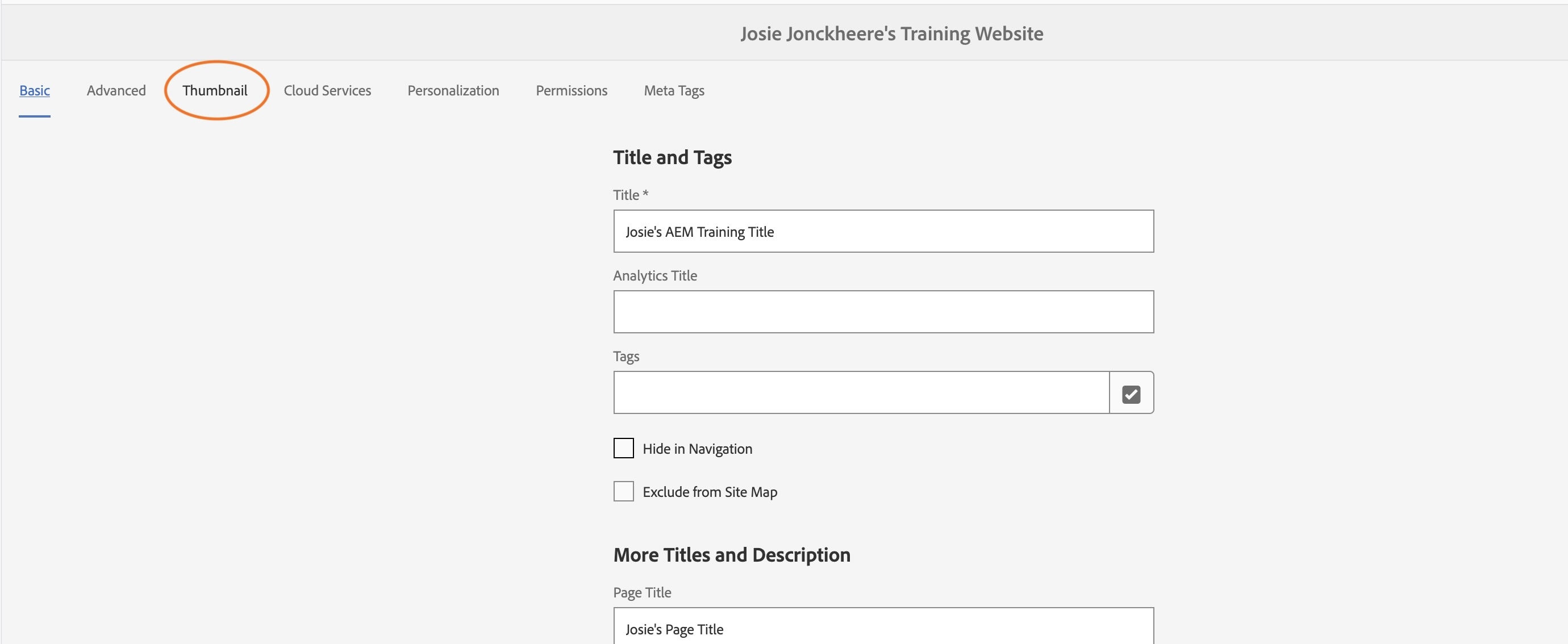
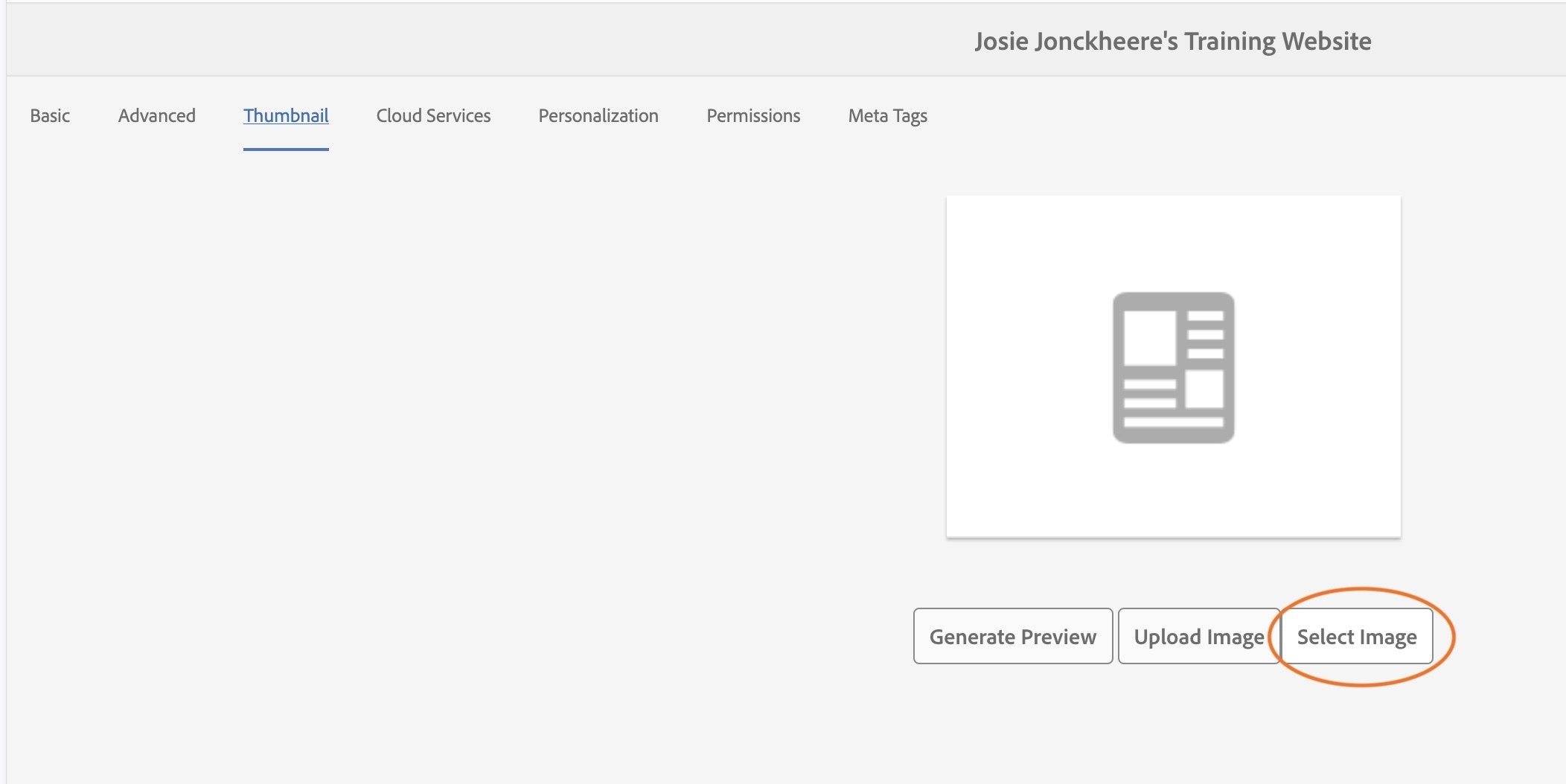
- Click on the Thumbnail tab, or the third tab in the tabbed menu in the dialog box.
- Select the "Select Image" button.
- In the pop-up window, in the search bar at the top, type mascots-at-football-game
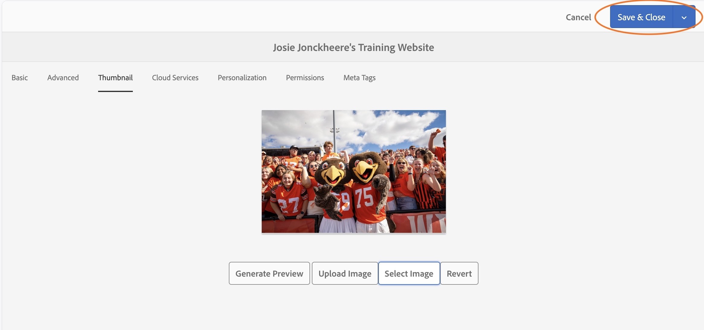
- Select one of the photos, so that it highlights blue with a white checkmark overlay. This will be the social image that will be pulled if you were to share the URL into Facebook or X.
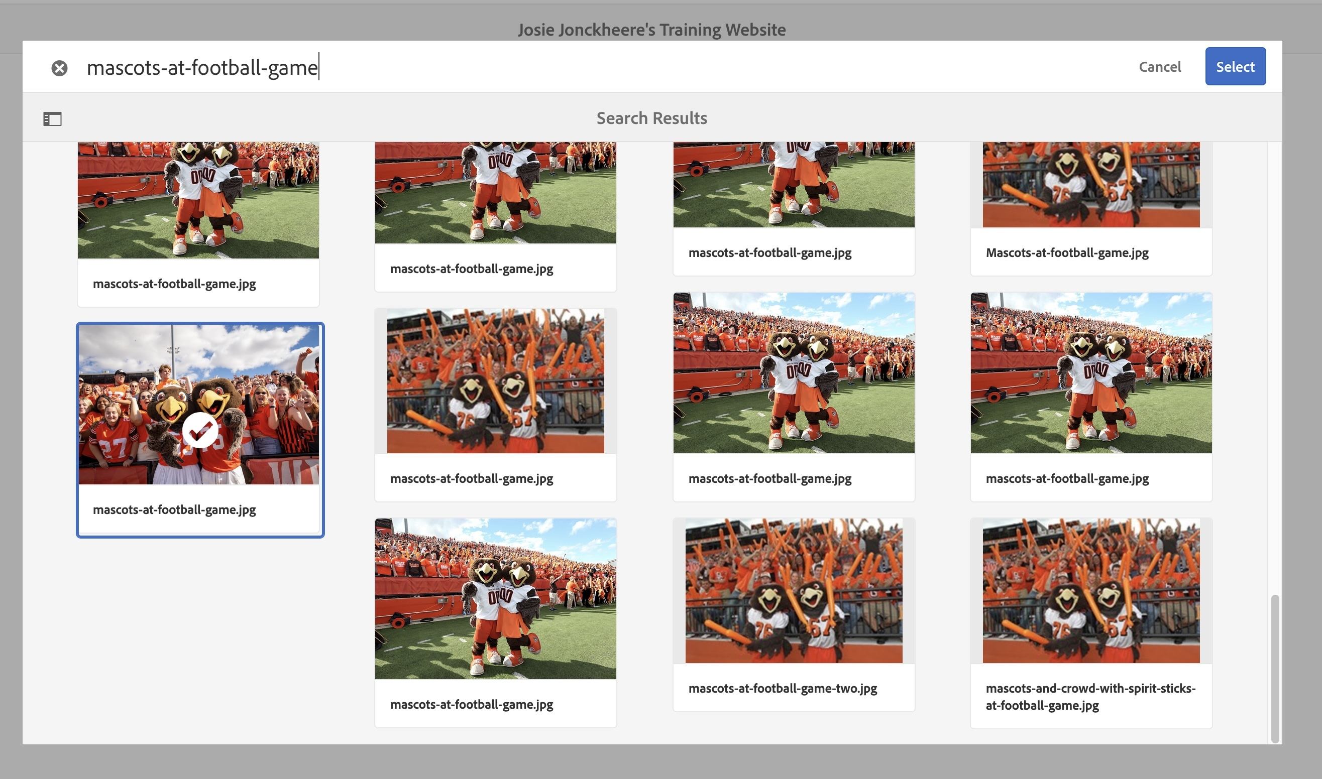
- Select the blue "Select" button in the top right corner.
- Select the blue "Save & Close" button at the top right corner.
Activity 12: Text Component - Inline Edit Mode
The text component is one that you will likely use on every webpage. It has robust features built into it that will offer a variety of styling to a page. It is set up similarly to many text editing applications with options for styling including bold, italicize, and left, right and center alignment options.
- Click on the first dropzone on the page - to the right of the left navigation.
- Click the plus sign.
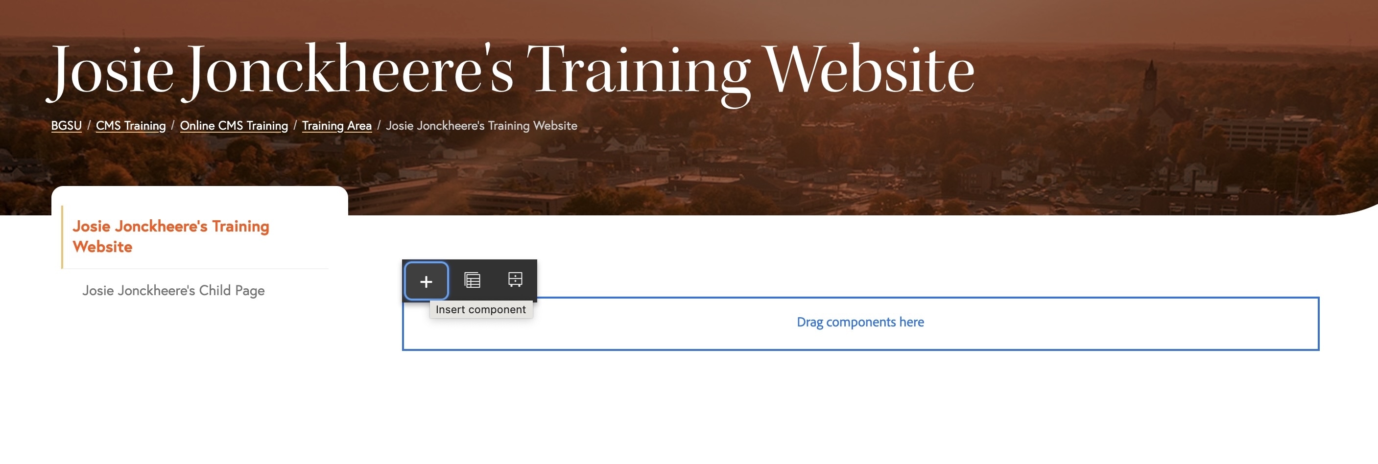
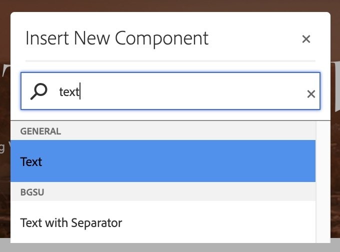
- Search "Text" in the Search box at the top of the dialog box.
- Click "Text" in the general section of the dialog box. You will see a paragraph placeholder appear.
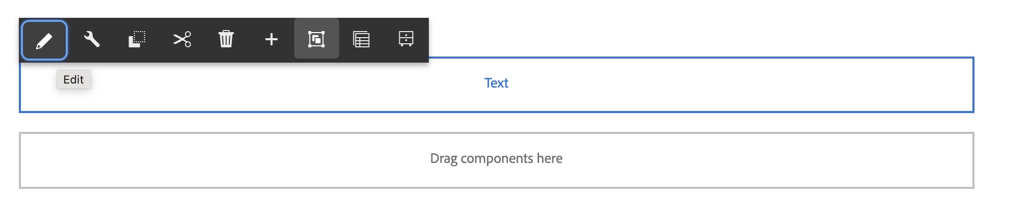
If your text component only shows a paragraph icon (shown below) and doesn't let you click on it, refresh your browser.

- Click on the component to edit the text component.
- Select the pencil icon.
- Copy the text below:
This is (insert name)'s training page.
This page serves as a training exercise for Adobe Experience Manager (AEM) Touch UI at Bowling Green State University. Through this guided, hands-on training, users learn how to edit, format, and manage web content using AEM. The exercises on this page are designed to reinforce best practices for page structure, component usage, and consistent styling across the BGSU website.
As part of this training, users practice creating links to both internal BGSU pages, such as the About BGSU page, and external websites, such as Youtube. External links should open in a new browser tab to help users maintain their place on the BGSU website.
- Paste the text into the text component by pressing Command + V (Mac) or Ctrl + V (Windows)
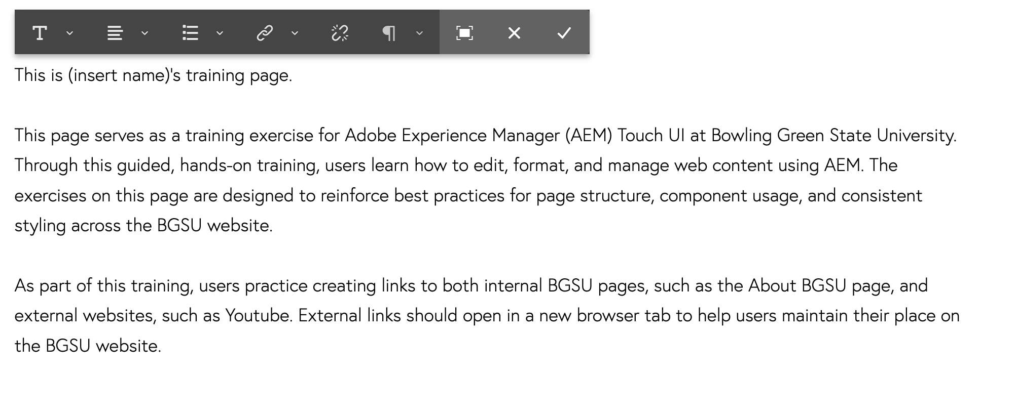
- Place your cursor after the first sentence and press Enter to separate the paragraphs.
- Repeat this step for the next paragraph as well so your text looks like the screenshot below.
- In the first sentence you just pasted in, replace (insert name)'s with your name.
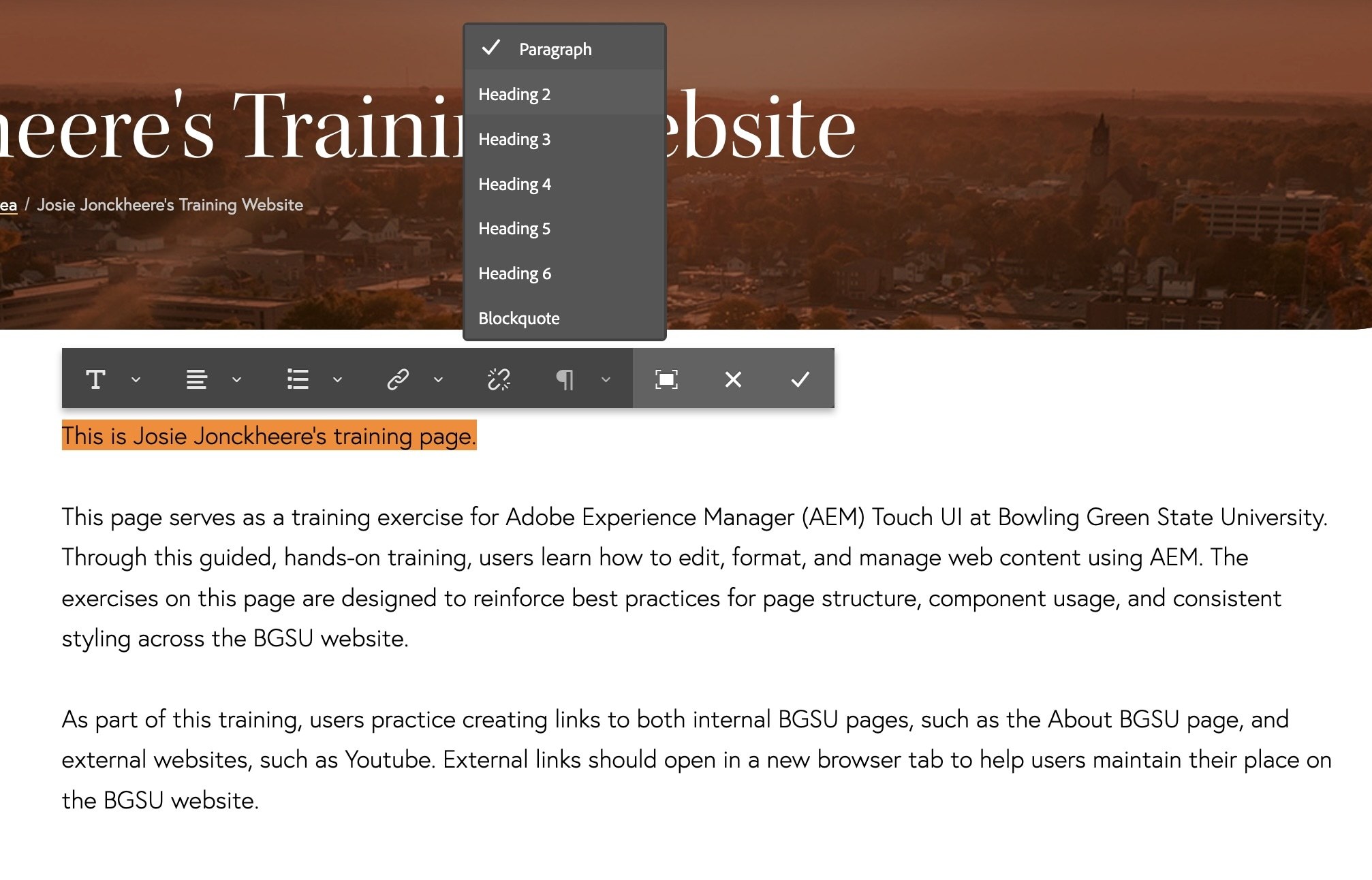
Example: This is Josie Jonckheere's training page. - Highlight the entire first sentence, "This is Josie Jonckheere's training page".
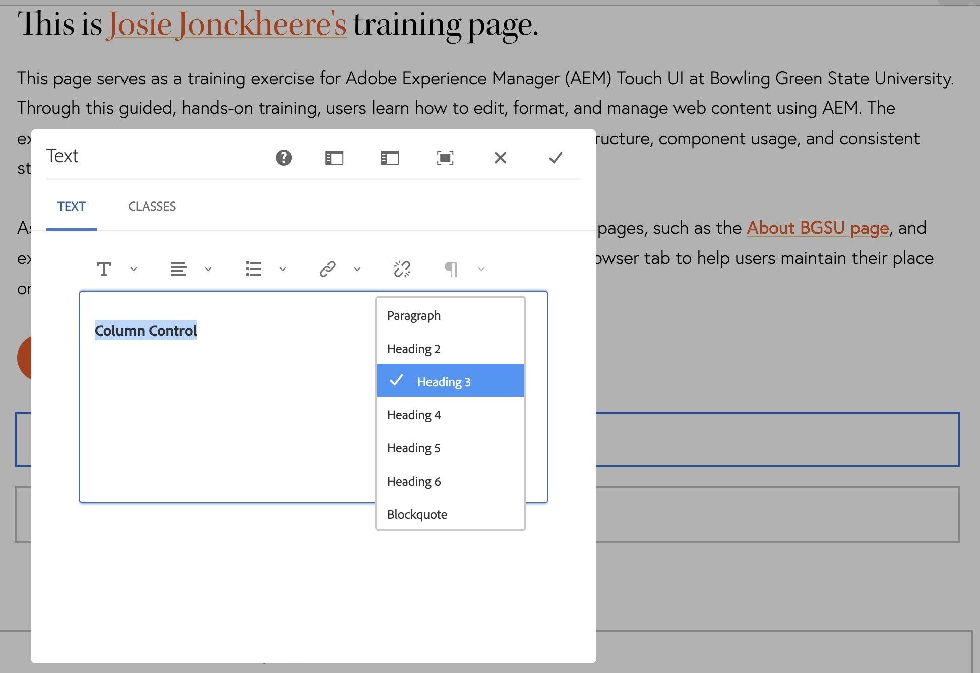
- In the text toolbar, there is a Format option that is set to (¶) Paragraph, click on this drop-down.
- Select Heading 2.
HTML defines six levels of headings. The heading elements are H1, H2, H3, H4, H5, and H6 with H1 being the highest (or most important) level and H6 the least. The main title in the page banner will be set to an H1 automatically. It is important to use headings correctly and not just for styling purposes. Assistive technology, such as a screen reader will use headings to determine which sections of the page are most important and need to be read first.
- Highlight your name in the heading.
- Click the hyperlink button in the text toolbar. A dialog box will appear.
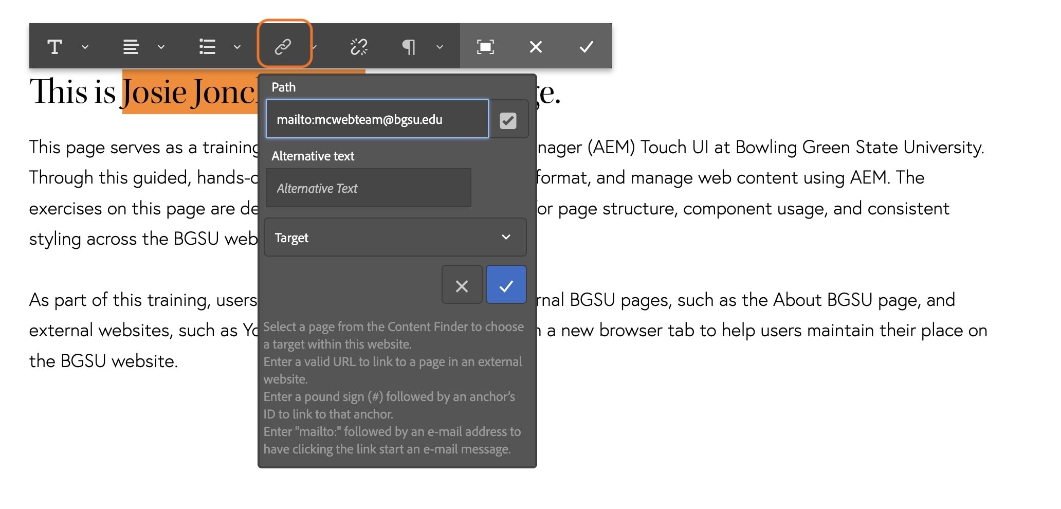
- Type "mailto:" followed by your email address in the path feild in the dialog box.
Example: mailto:mcwebteam@bgsu.edu. This will make your name a link that will open in an email client. - Click the blue checkmark icon.
- Now highlight the text in the last paragraph: "About BGSU page" and click on the hyperlink icon again.
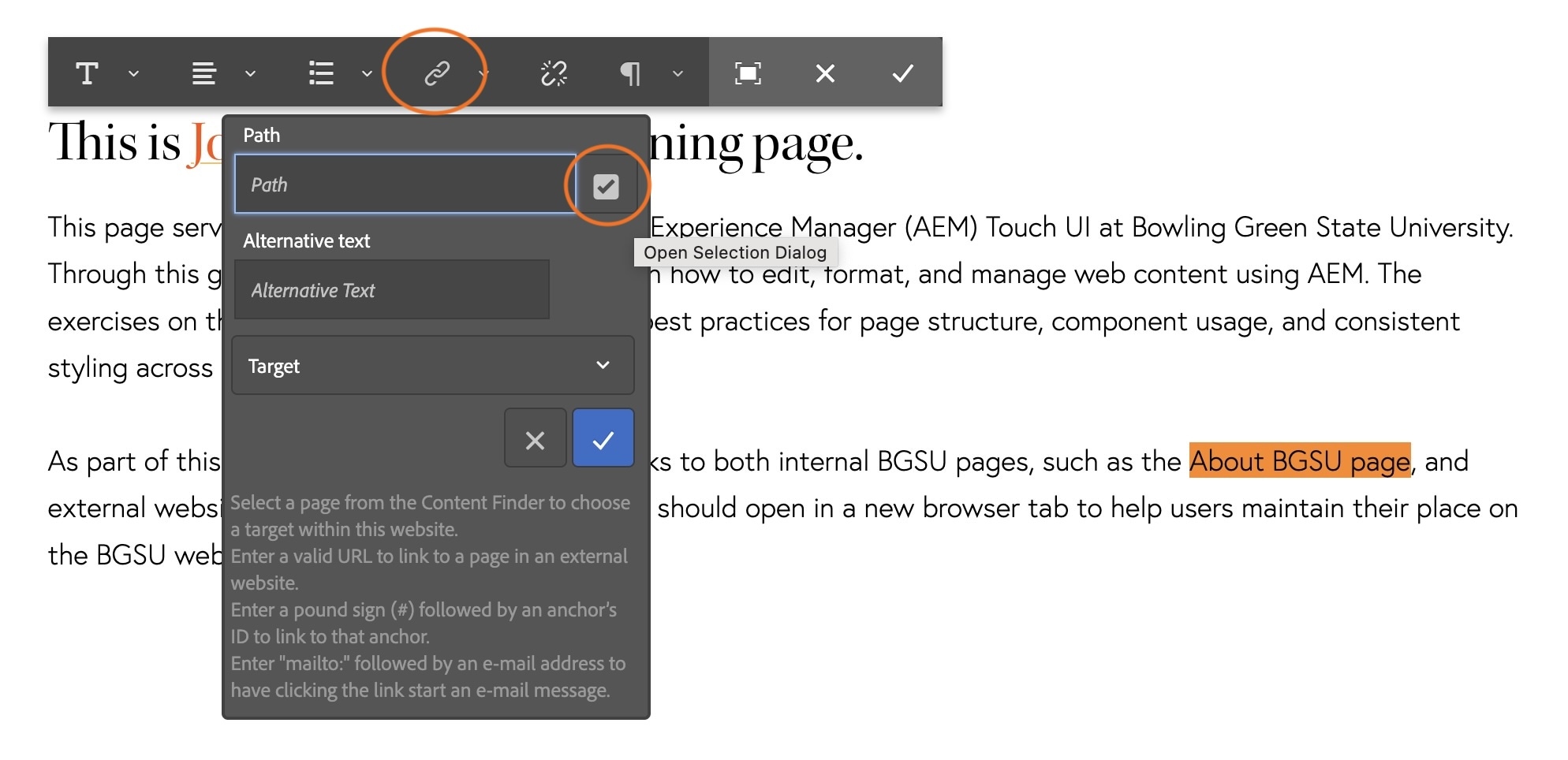
- Click on grey checkbox next to the "Path" field.
- Navigate through the pages to find the About BGSU page by clicking on the grey arrows and following this path: Bowling Green State University > Bowling Green State University > About BGSU
- Select the About BGSU page by clicking on the icon before the title so the blue overlay and checkmark appear
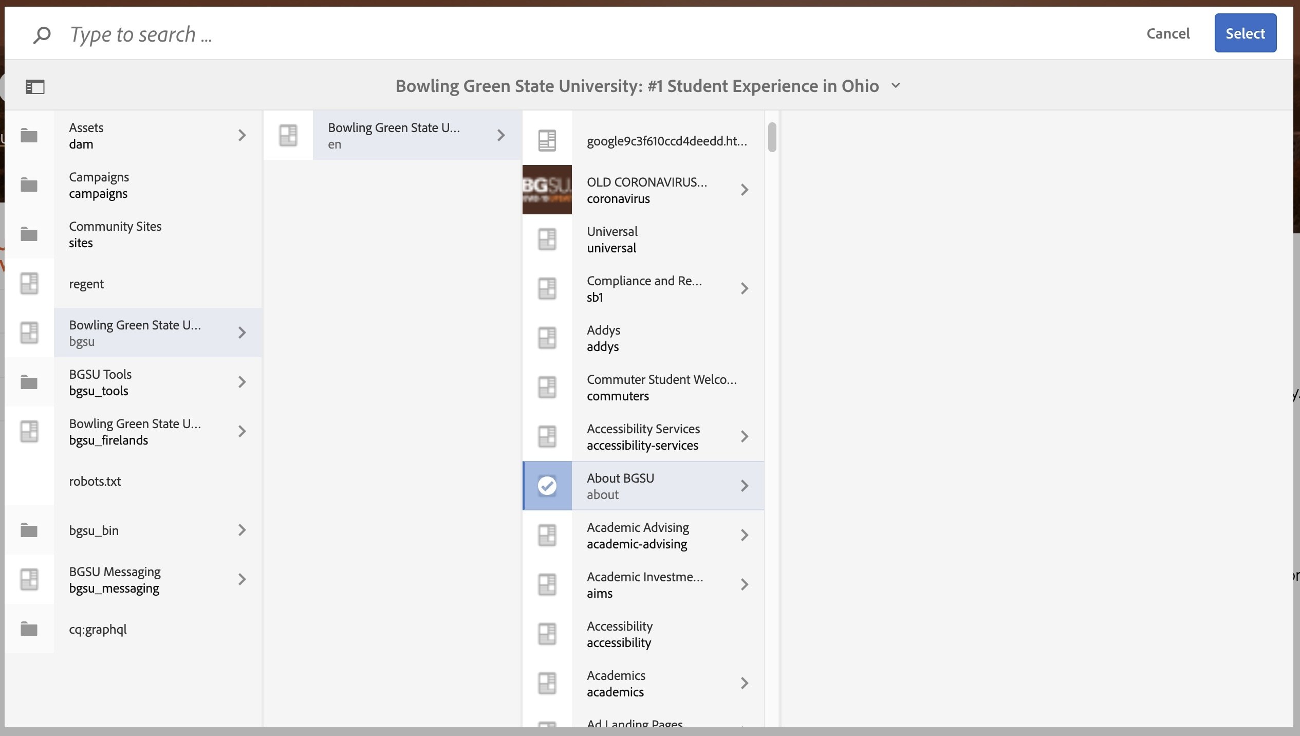
- Click the blue Select button in the top-right corner. The path field should read: /content/bgsu/en/about
This is called a relative link. This means that the page is an internal link and housed within AEM/BGSU's website. It is important to use the grey checkmark in the path field when linking to internal pages. AEM recognizes these and will adjust them if a page is ever moved or renamed. If the full URL or absolute link is used and the page is renamed or moved at a later date, it will cause a broken link. - The Alternative Text field is not necessary for every link, but when you have multiple links on a page using the same link text going to different destinations, you can differentiate them using alternative text. For example, if this page had multiple “About BGSU” links, but they linked to different web pages (one linked to the main about page and another linked to an Admissions About page), you should insert a more descriptive alternate text so that assistive technologies can read that descriptor to the user so they know where the link will go to.
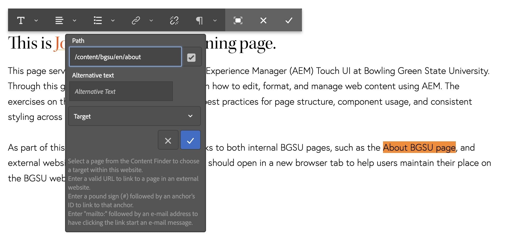
- Click the blue checkmark button at the bottom of the dialogue box.
Great job! You have created your first hyperlinks!
Activity 13: Text Component Continued
- Click once to select the text component with your copy from Activity 14, the component will be outlined in blue with a toolbar.
- Click the pencil icon in the toolbar to edit the text again.
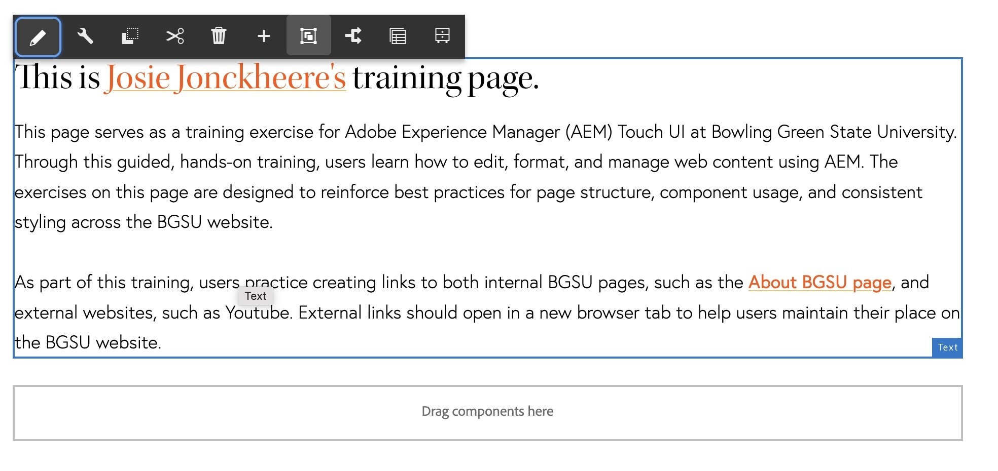
- Highlight the word Youtube
- Click the hyperlink button in the text toolbar.
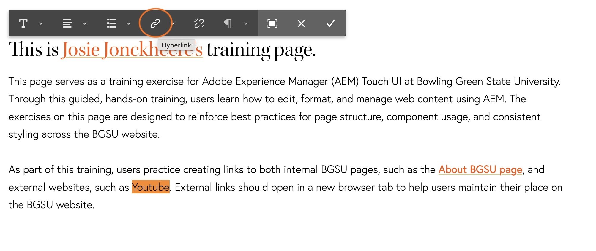
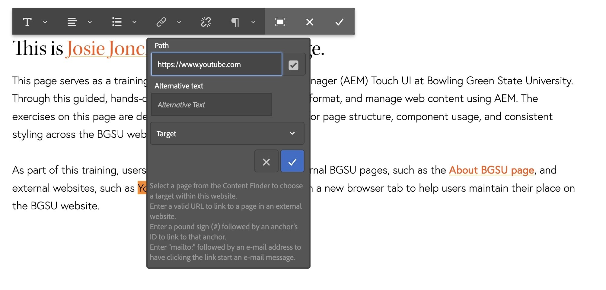
- Type "https://www.youtube.com" in the link in the path field. This is an external link and not housed within the BGSU website so it is okay to use the full or absolute URL.
- Click the blue checkmark icon.
- Then click the grey checkmark in the text component toolbar to save your changes.
- Click in the dropzone below your text component and add another text component.
If the dropzone doesn't appear on your page, refresh your browser.
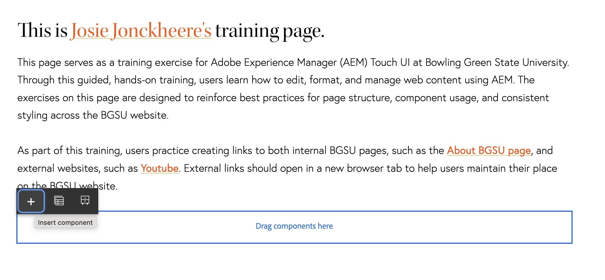
- Click on your new text component
- Click the pencil icon to edit
- Type the following into your text component: View the CMS Training Guide
- Highlight this line of text
- Click the hyperlink button
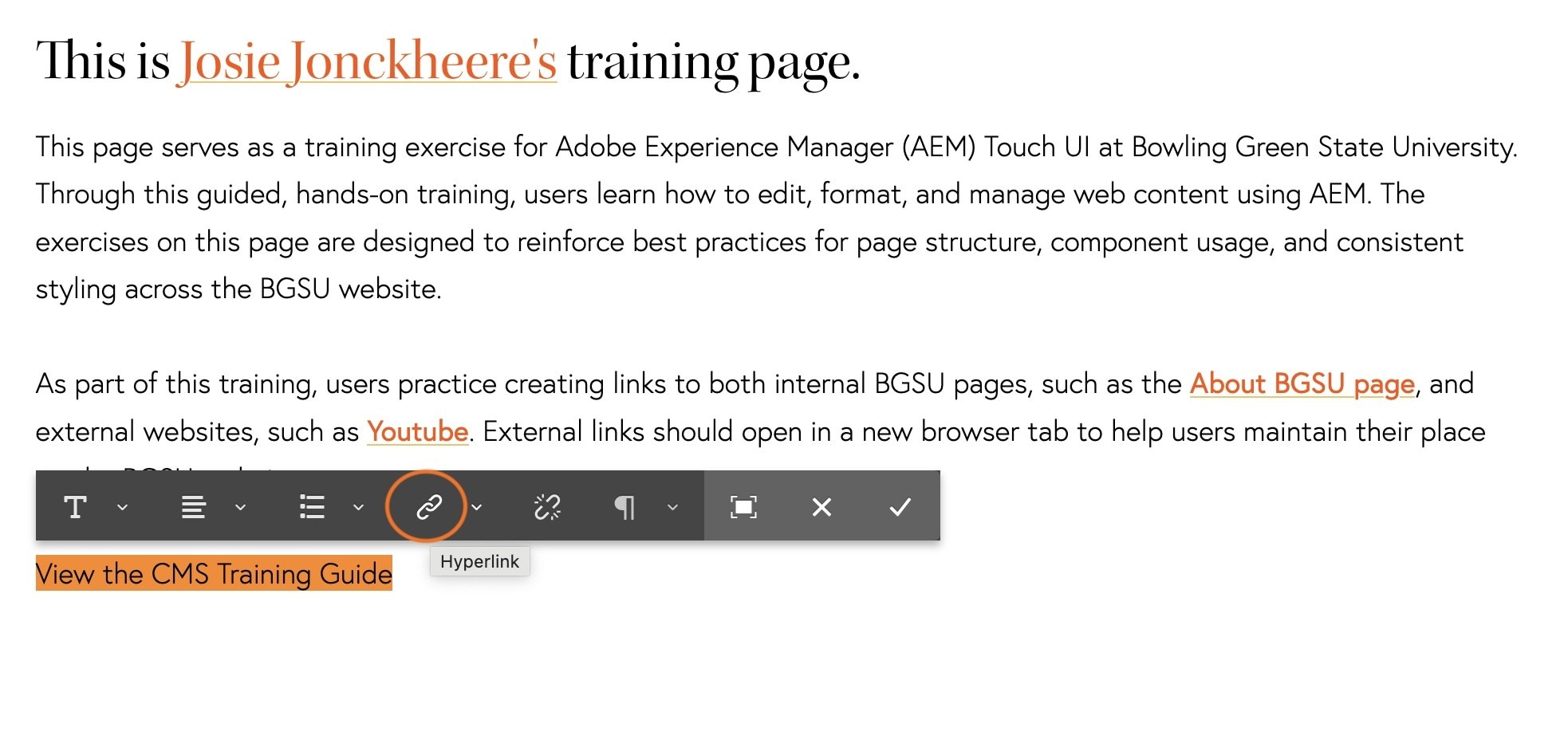
- Click the grey checkbox to open the navigator
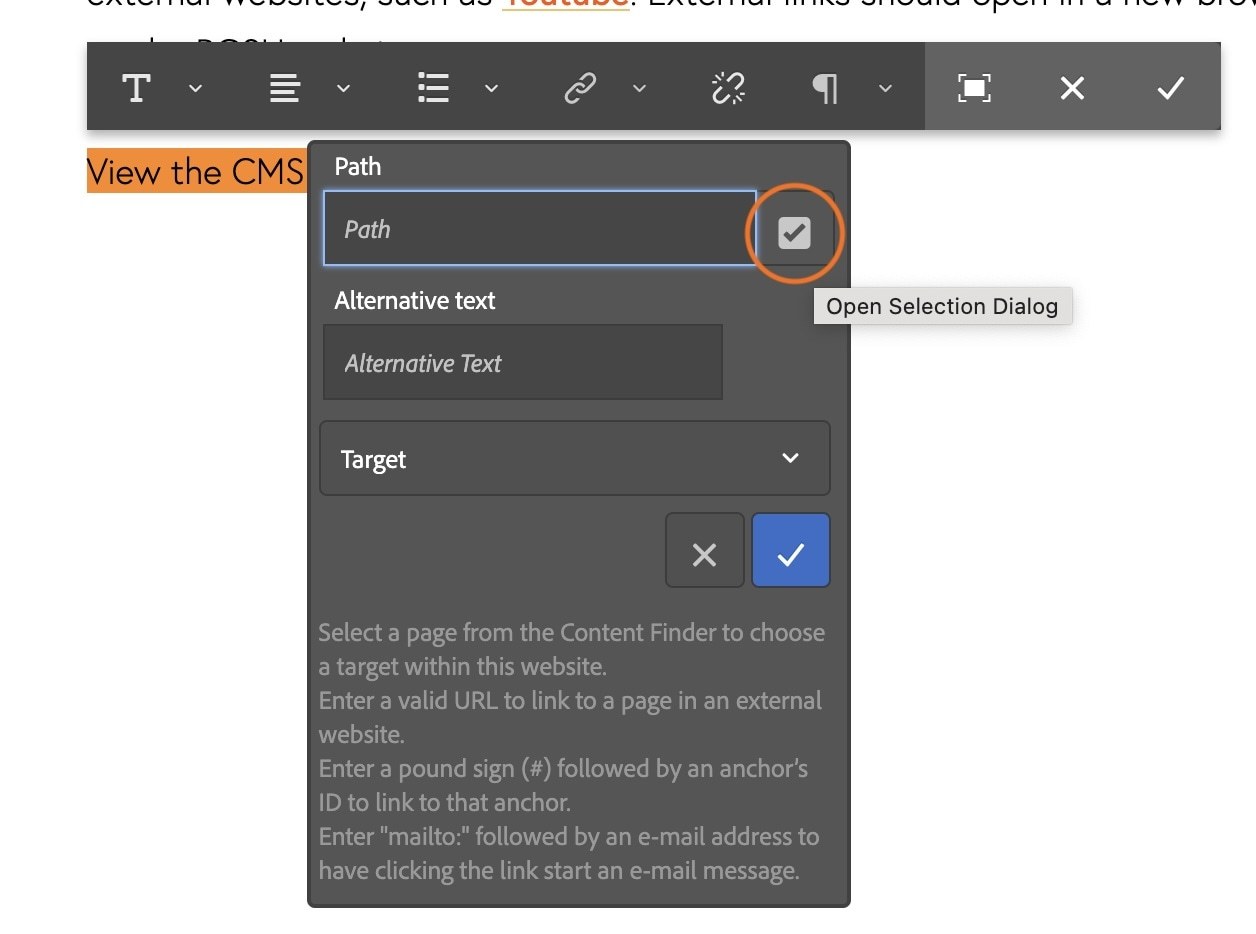
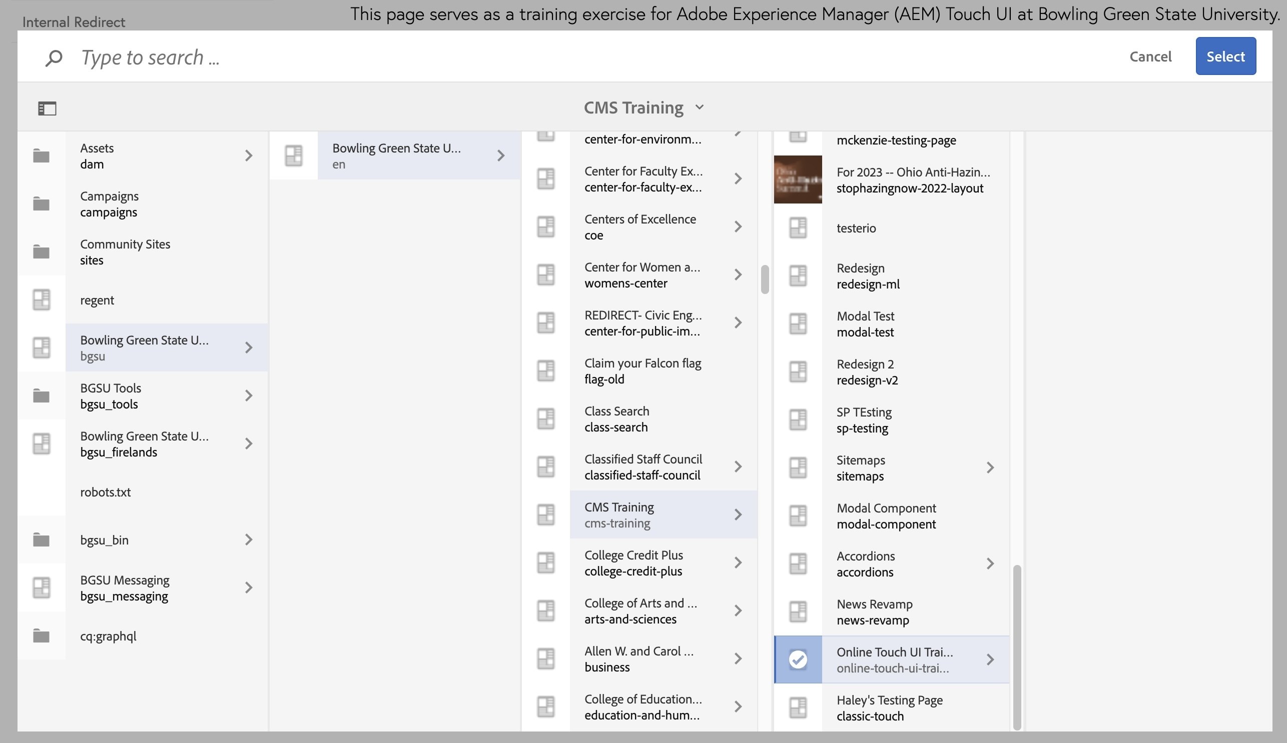
- Locate the CMS Touch UI training guide by following this path:
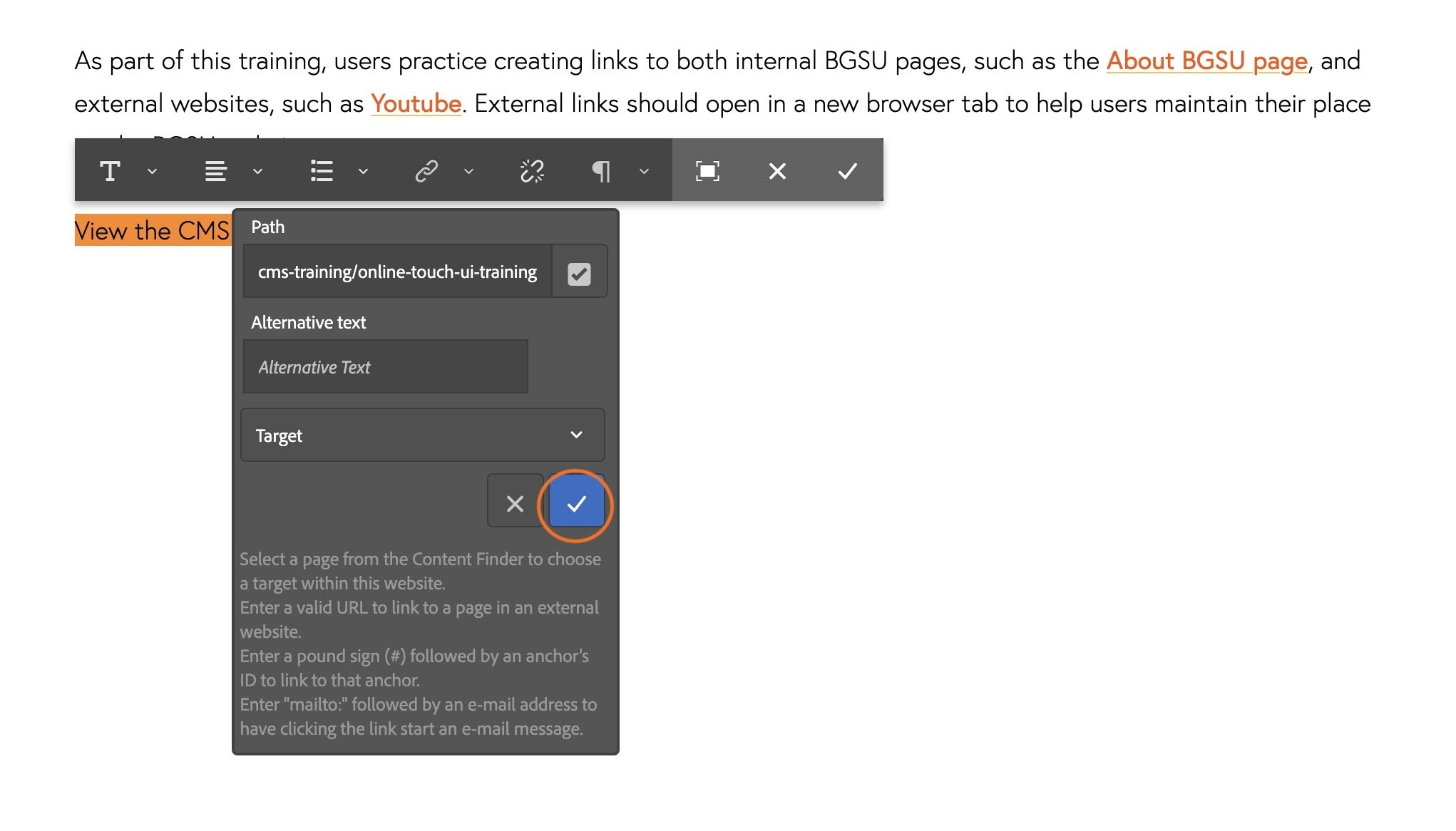
Bowling Green State University > Bowling Green State University > CMS Training > Online Touch UI Training - Click the blue "Select" button
- Click the blue checkmark to apply the hyperlink to the text.
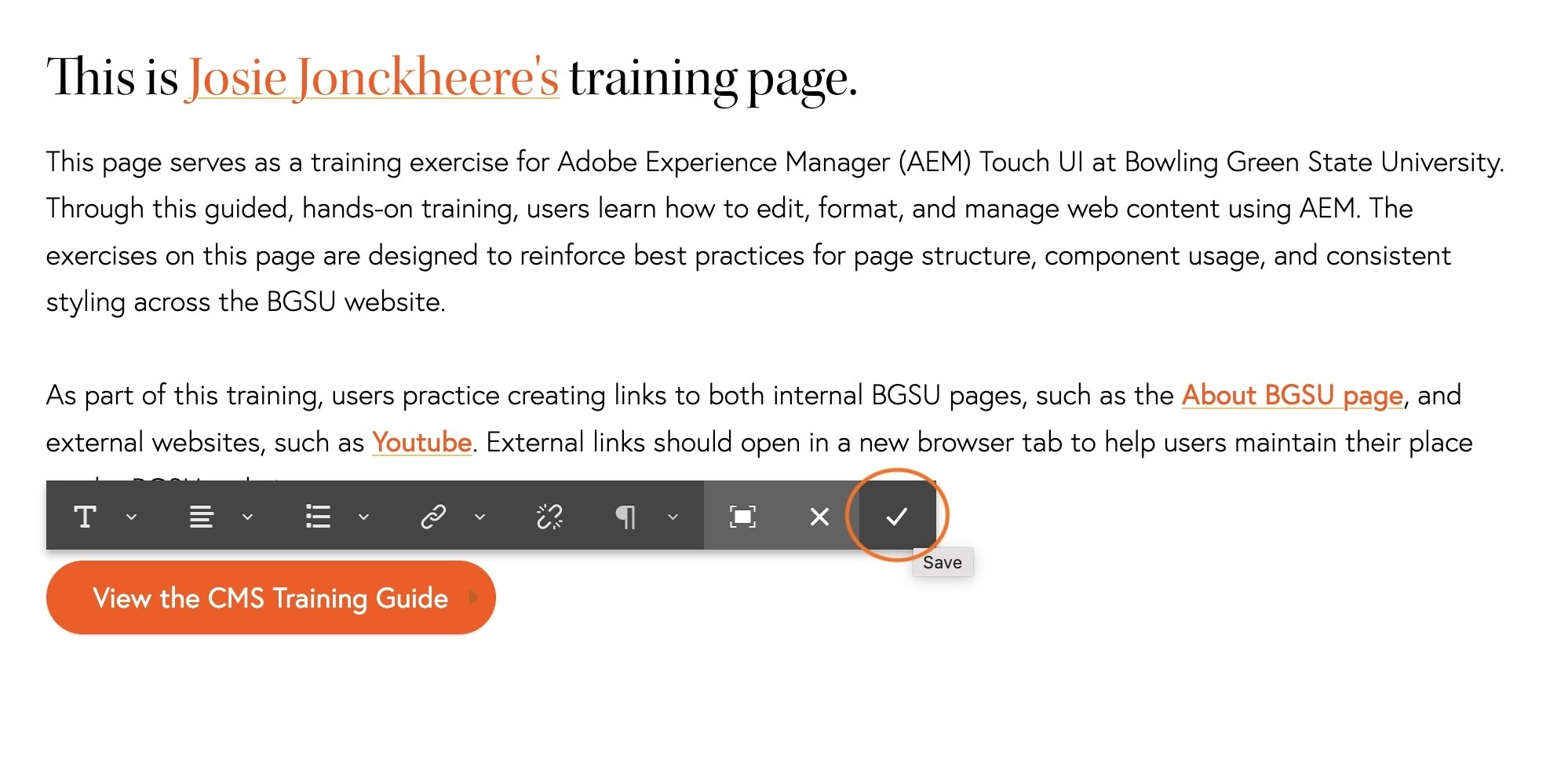
- Click on the icon to the left of the X in the text component toolbar. If you hover, it will say "fullscreen"
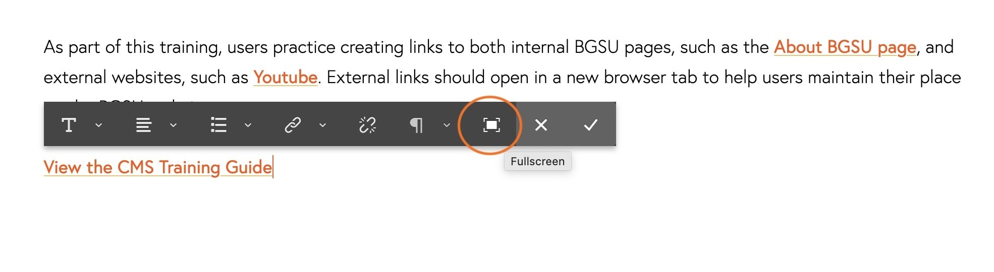
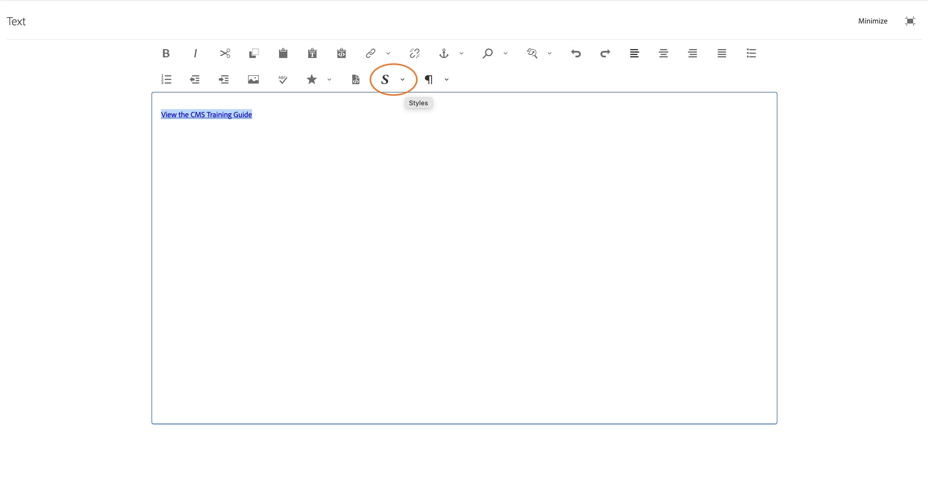
- On the screen that appears, highlight your full linked text.
- Click the dropdown arrow next to the S icon.
This will open the styling options
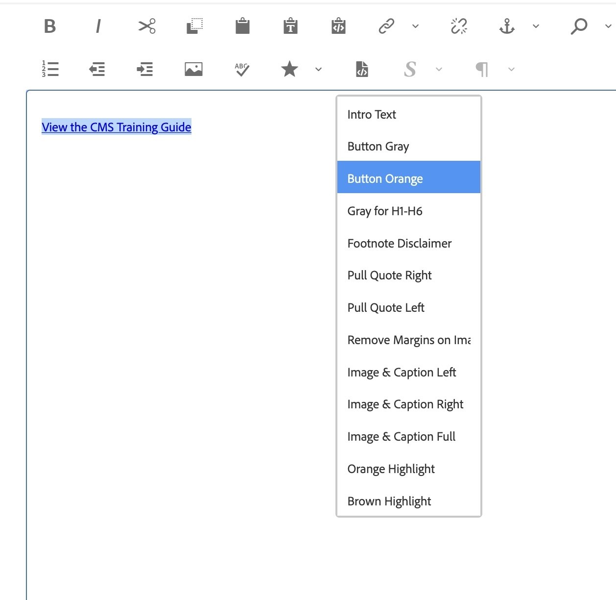
- Select Button Orange from the dropdown list.
This will apply a button styling to your link.
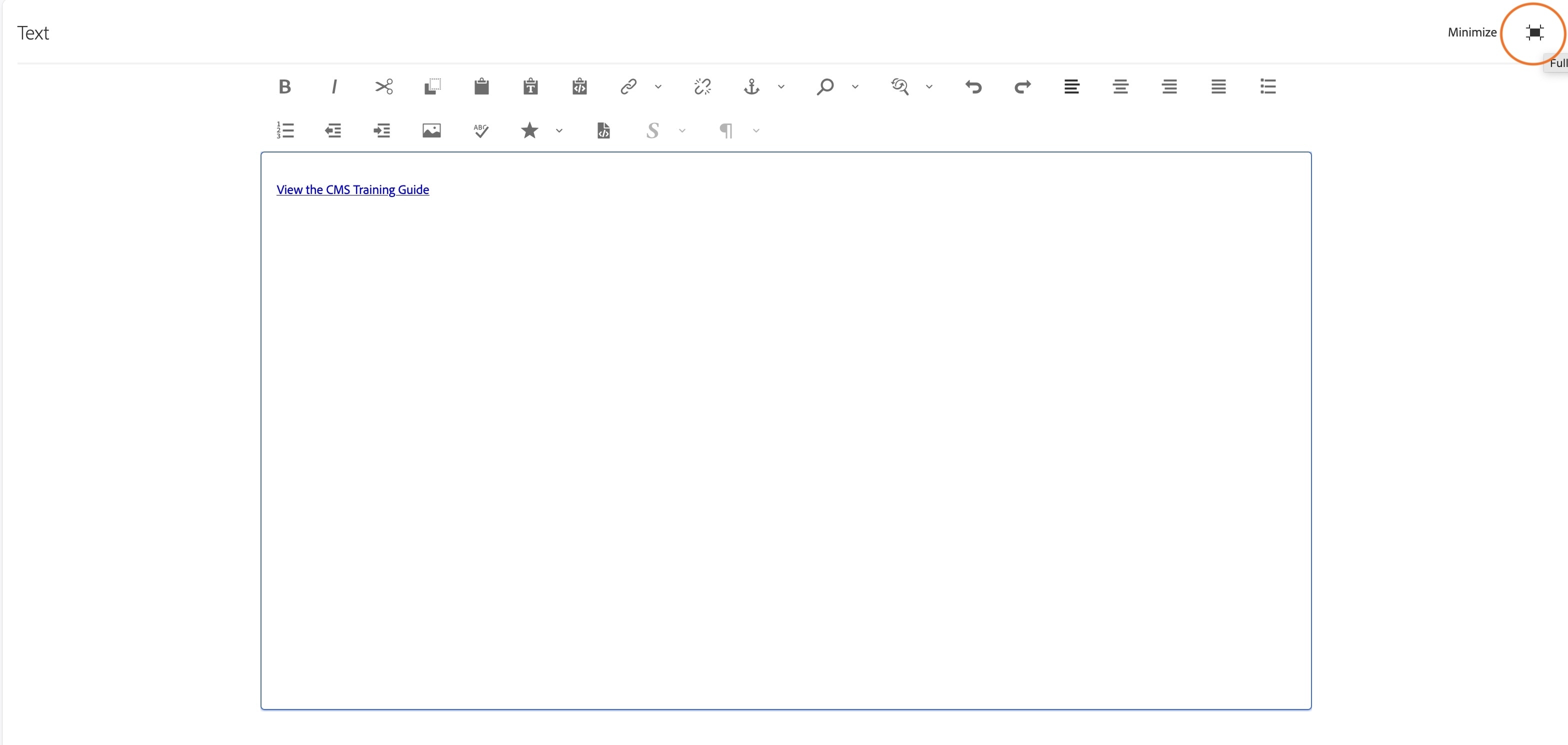
- You may not see your changes show up in full screen mode
- Click on the minimize icon in the top right corner to exit the fullscreen editor
- You will now see that your text appears inside an orange button.
- Click the grey checkmark to save your changes.
Activity 14: Column Control Component
- Below the button you just made, insert a new text component and create a title with an H3 heading format that says: Column Control
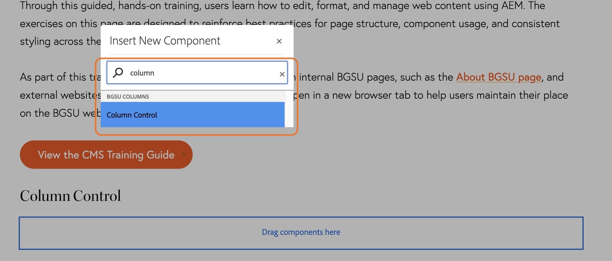
- In the dropzone below your new heading, insert a new component.
- In the search field type column and the column control component will appear.
- Click on the component to add it to the page.
- Click on the text that says Please Configure the Column Control Component
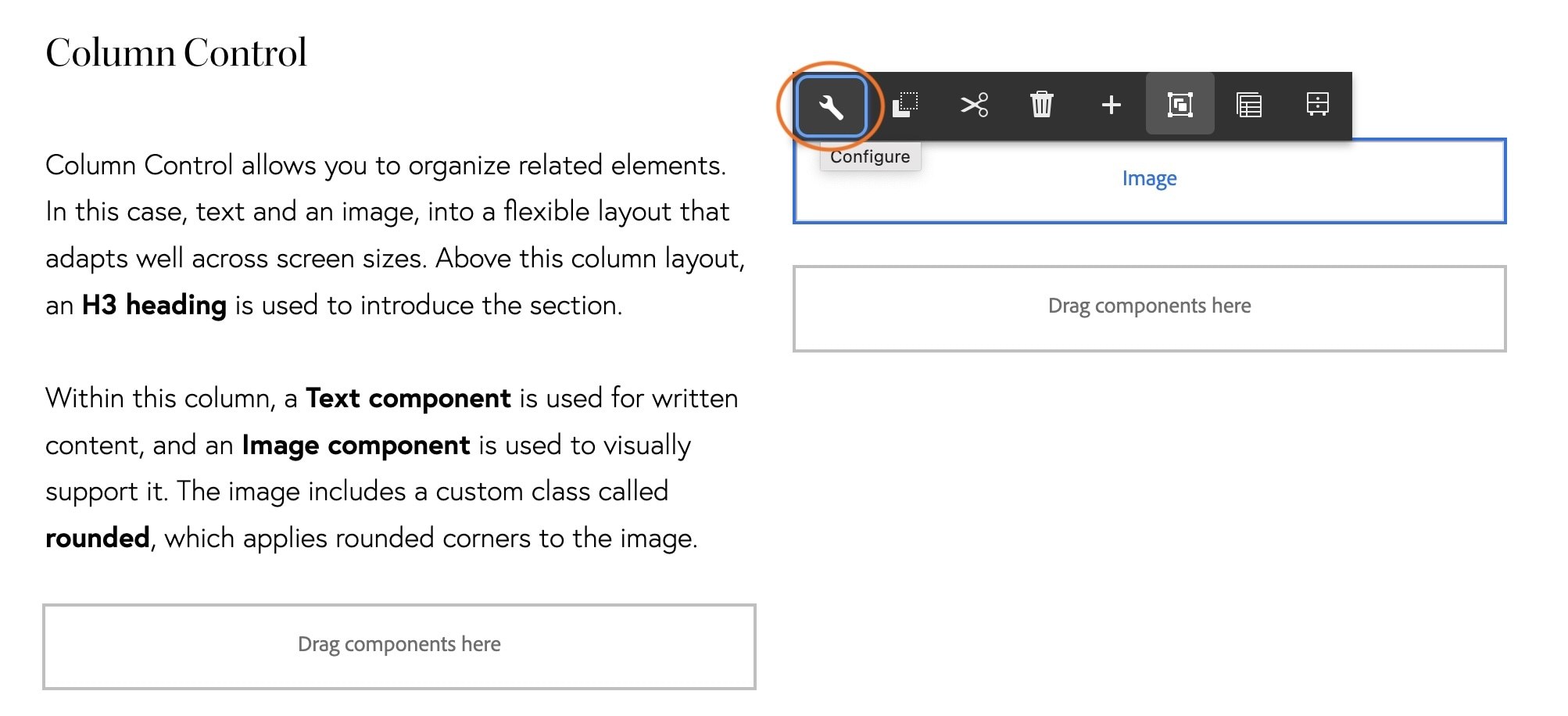
- Click the wrench icon in the toolbar that appears
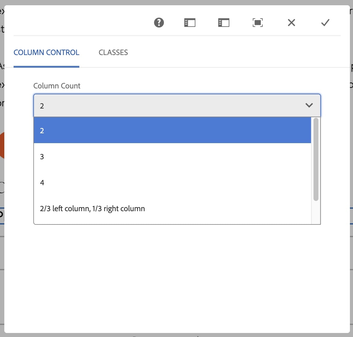
- In the dialog box that pops up, click the dropdown to see the options you have for columns.
- For the purpose of this training, we will keep the default 2 column option.
- Click the grey checkmark.
You will now see two small dropzones below your Column Control heading.
- In the first column (on the left) add a text component and paste in the following text and then click the checkmark to save:
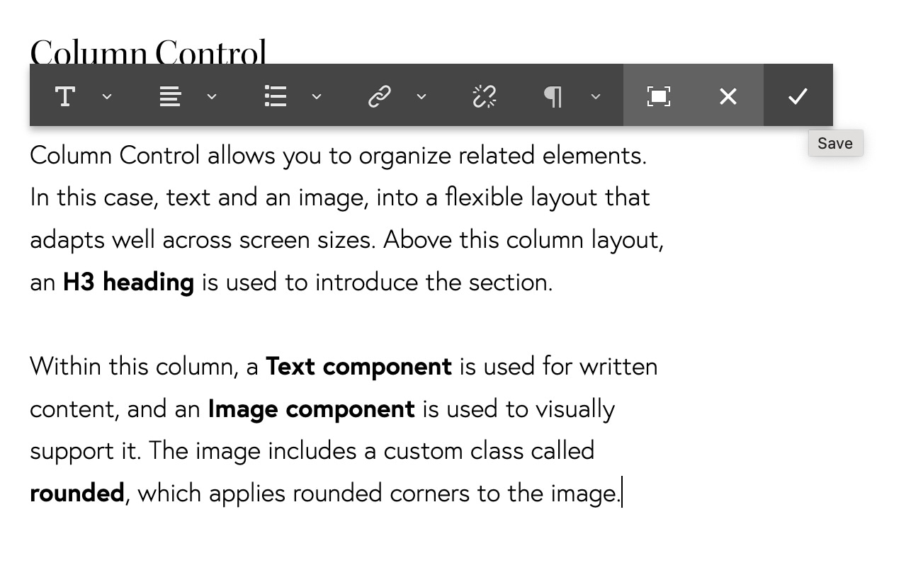
Column Control allows you to organize related elements. In this case, text and an image, into a flexible layout that adapts well across screen sizes. Above this column layout, an H3 heading is used to introduce the section.
Within this column, a Text component is used for written content, and an Image component is used to visually support it. The image includes a custom class called rounded, which applies rounded corners to the image.
- In the second column (on the right) insert a new component.
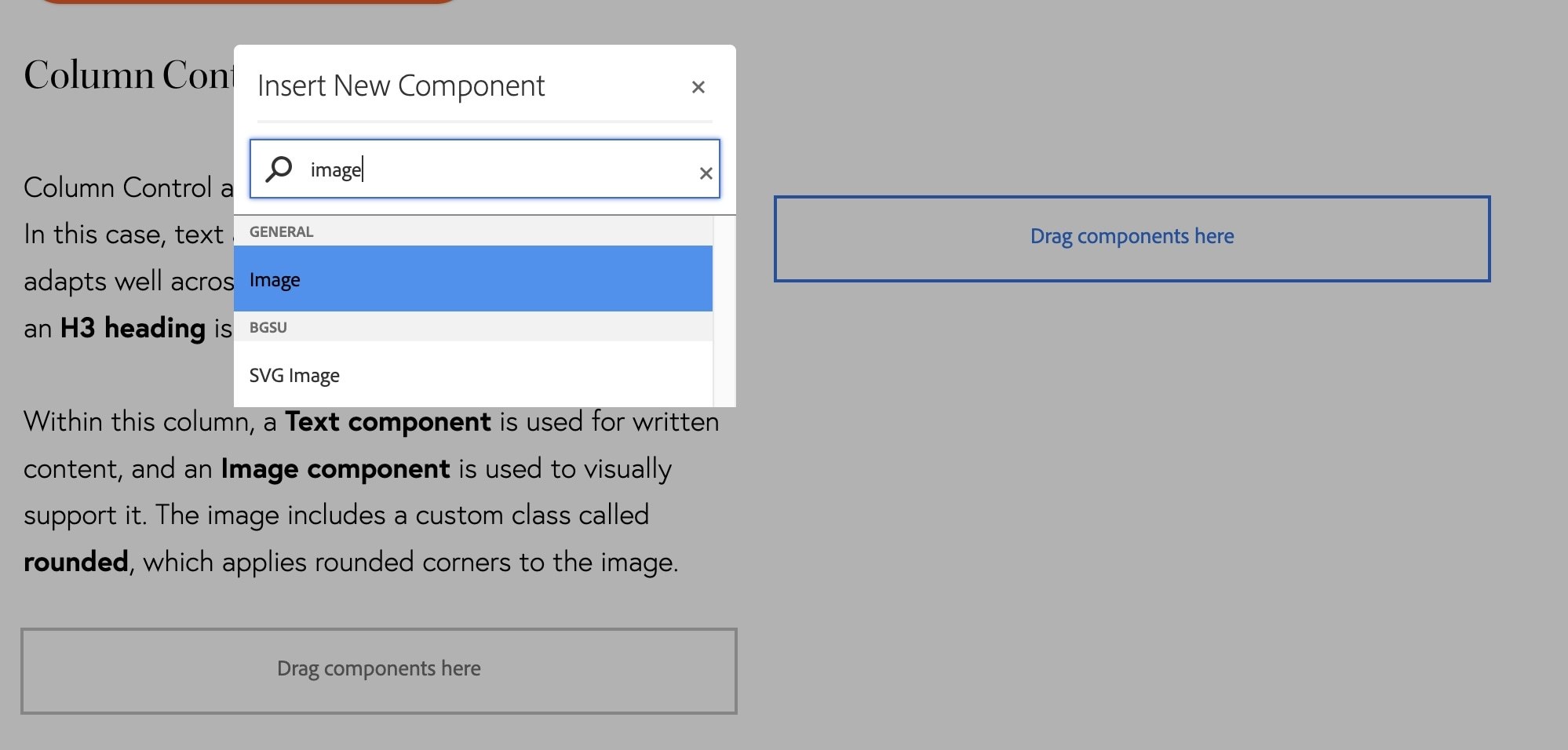
- In the search box that appears, search for and click on the Image component under the General category.
Before we configure the image component, we need to locate our folder of images in the side panel.
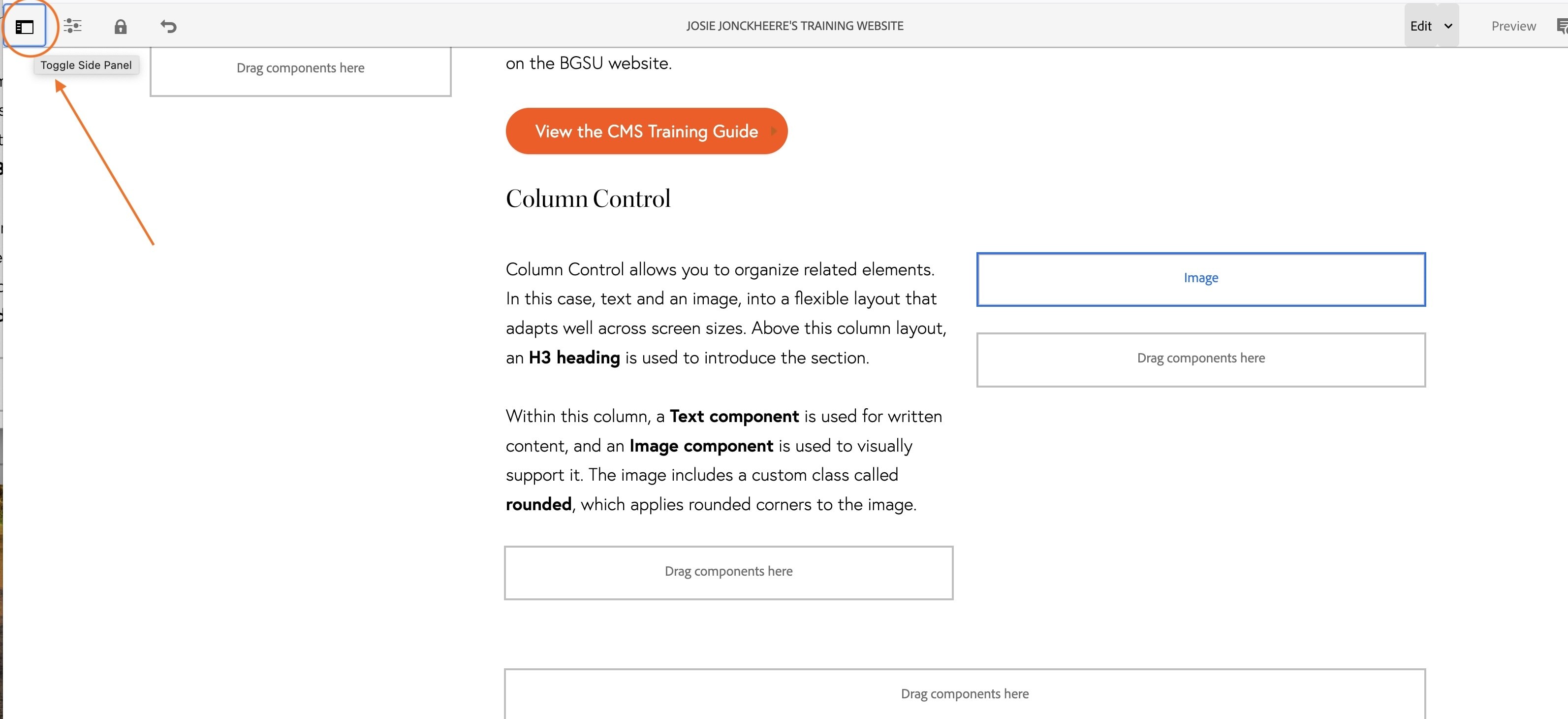
- In the top left corner of the screen there is an icon that looks like a microwave, click on it to open the side panel.
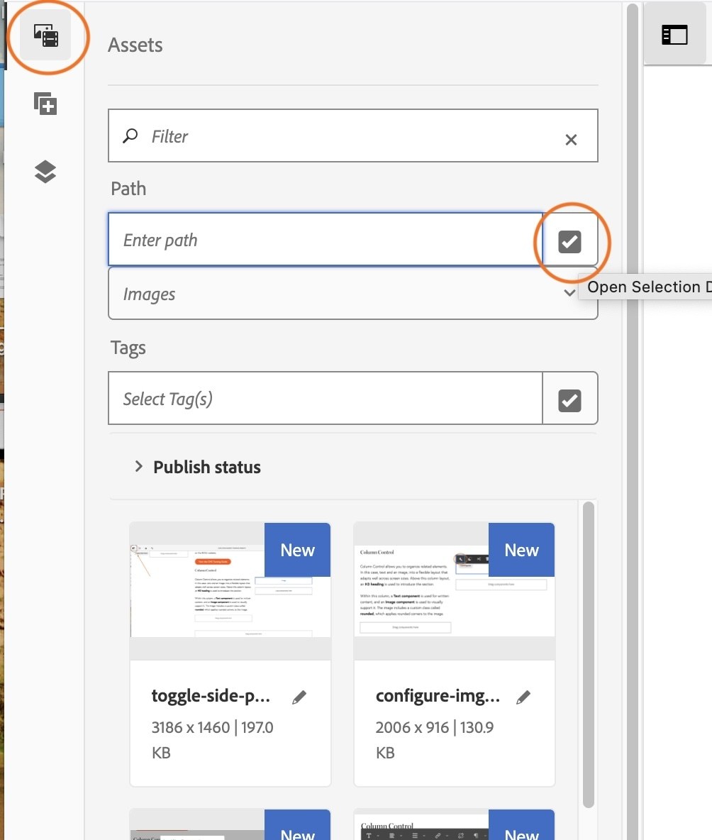
- In the side panel, make sure you select the Assets icon at the top left corner (this icon looks like an image and a film reel).
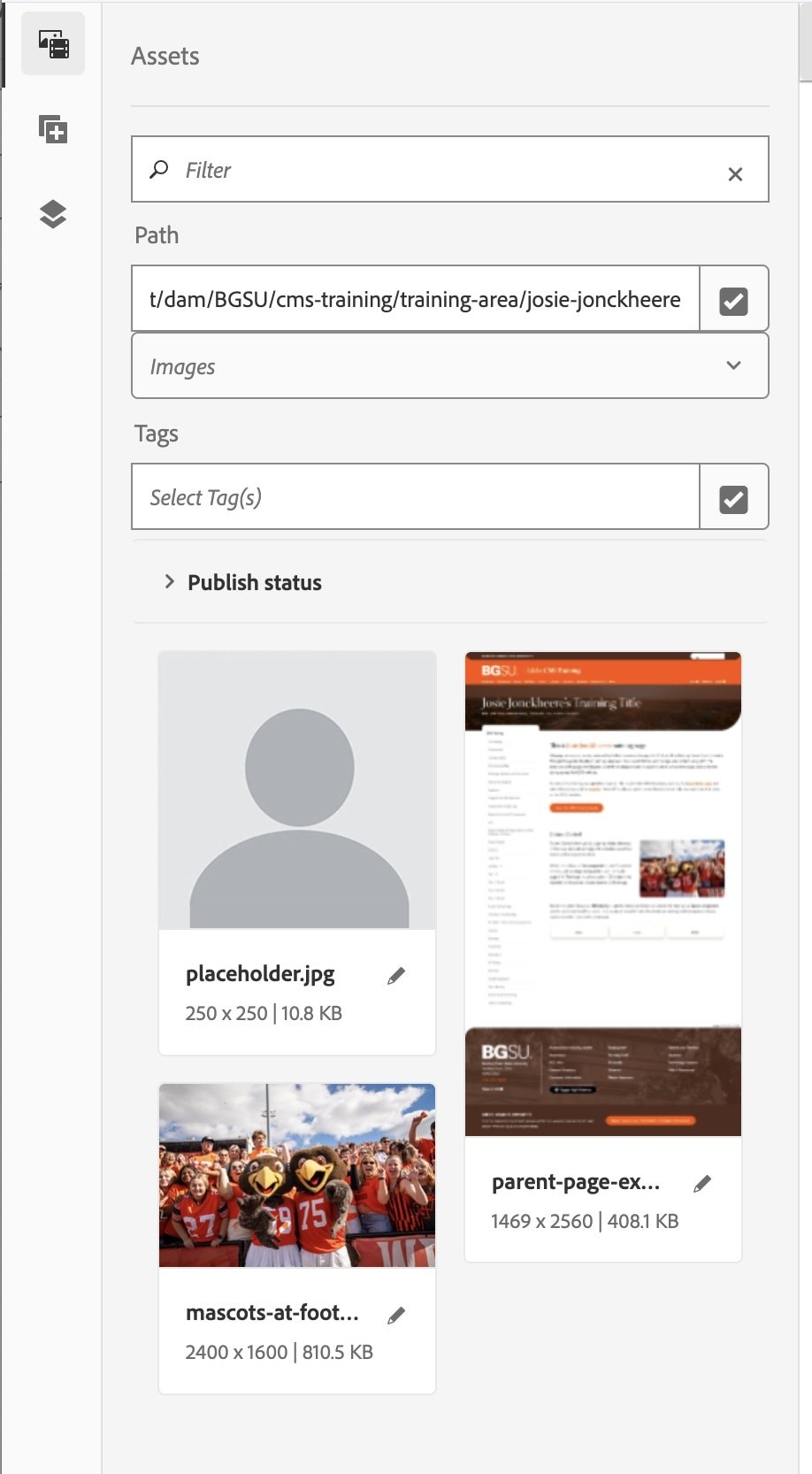
- Then select the grey checkmark next to the Path search box.
This is how we will navigate to the images you uploaded at the beginning of the training.
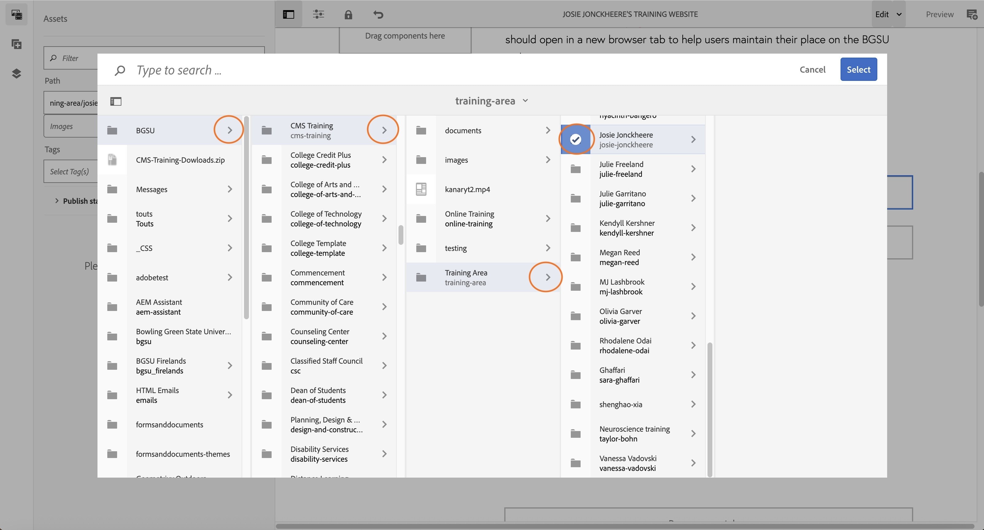
- In the dialog box that appears, navigate to your named folder in the dam by following this path: BGSU > CMS Training > Training Area > YOUR NAME
- Then select the folder icon before your name so it highlights blue with a checkmark overlay
- Click the blue Select button
You will now see the images you uploaded in the side panel.
- Click on your image component you added to your page and select the wrench icon to configure the component.
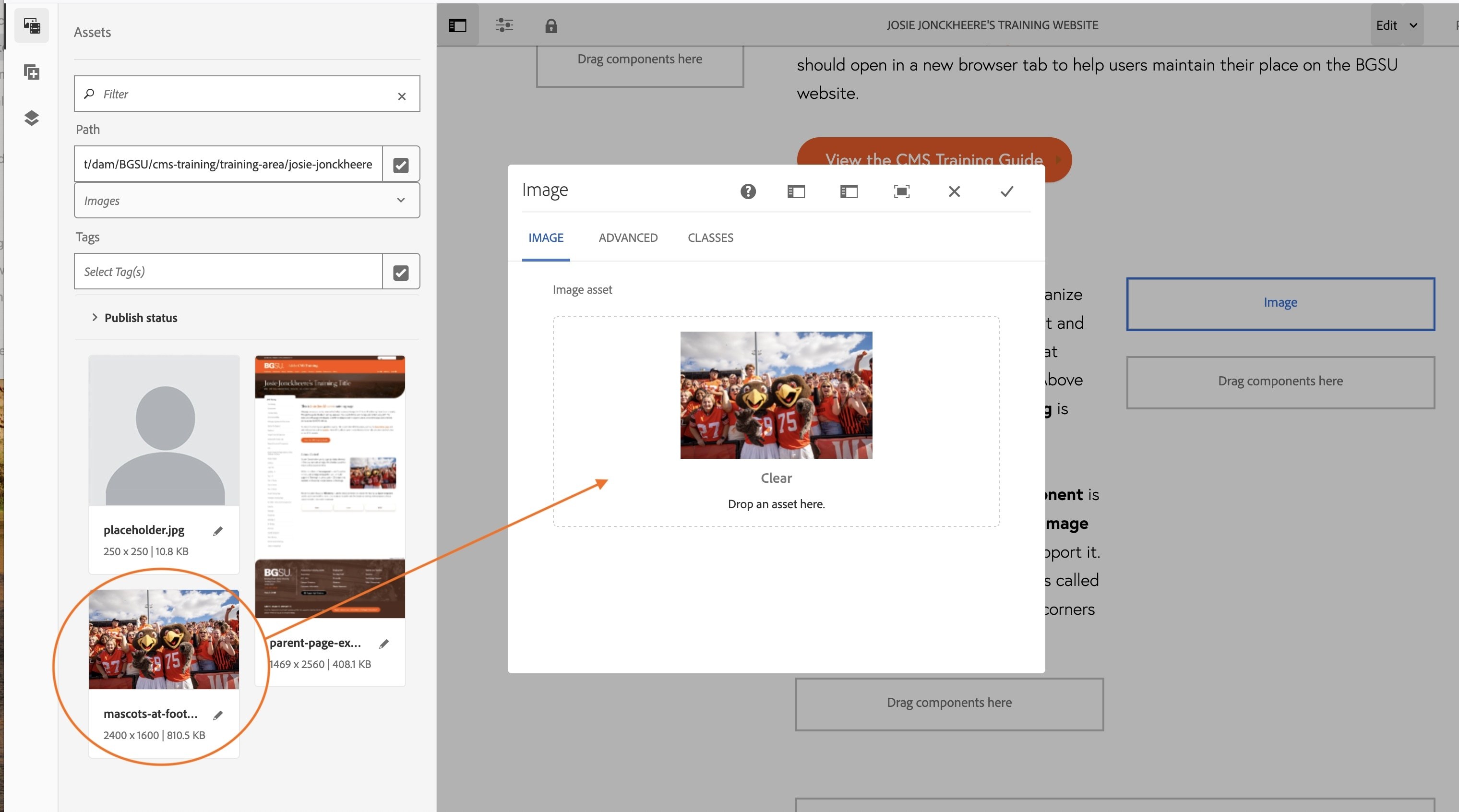
- Click and drag your mascots-at-football-game.jpg image into the Image asset dropzone.
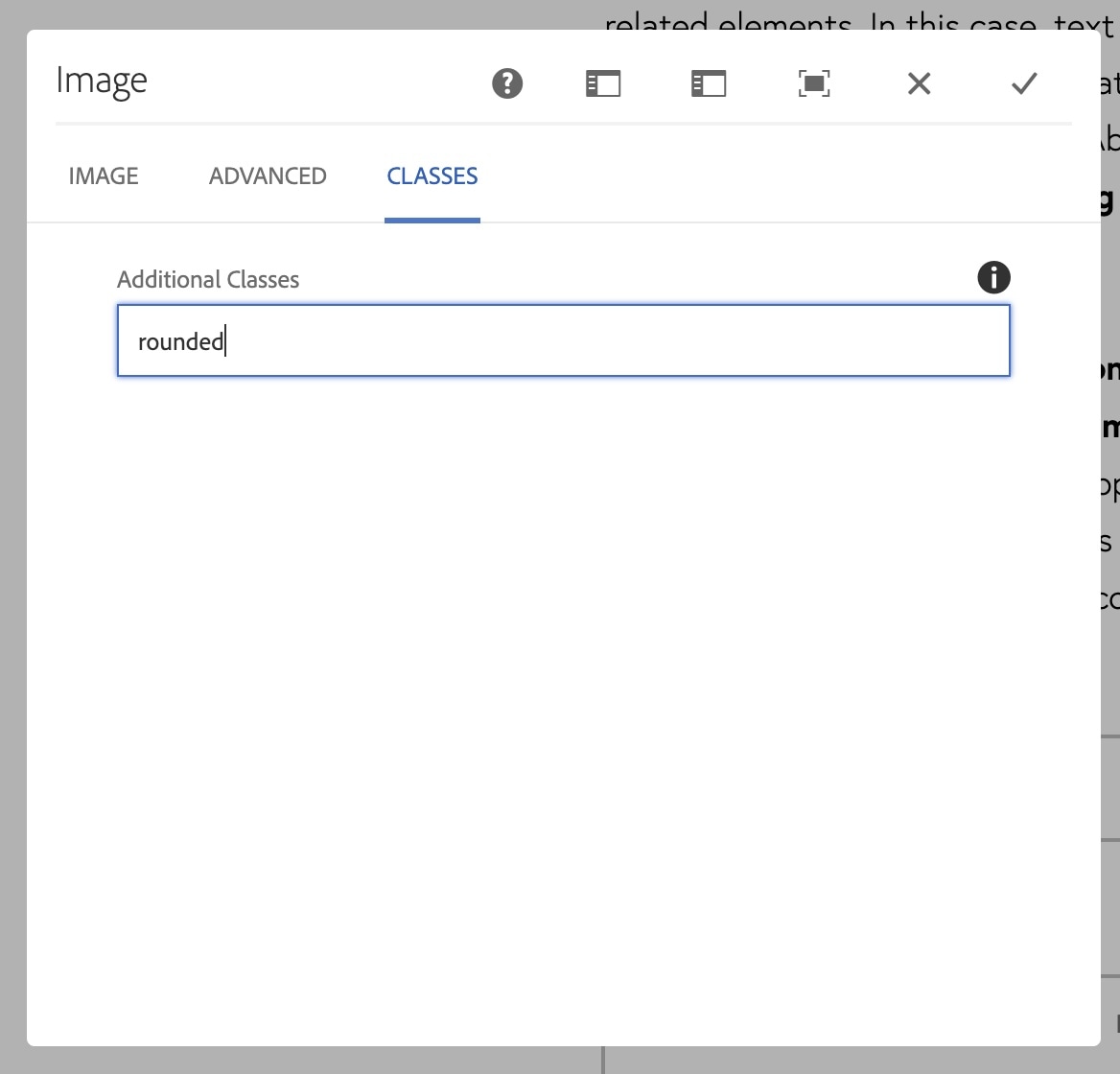
- Before closing the image component, click on the tab that says CLASSES
- In the Additional Classes box, type rounded
(make sure it is all lowercase. This adds a class to your image that rounds the corners of the image). - Now click the grey checkmark to save your changes
Activity 15: Tool List Selector Component
This component allows you to create up to six buttons
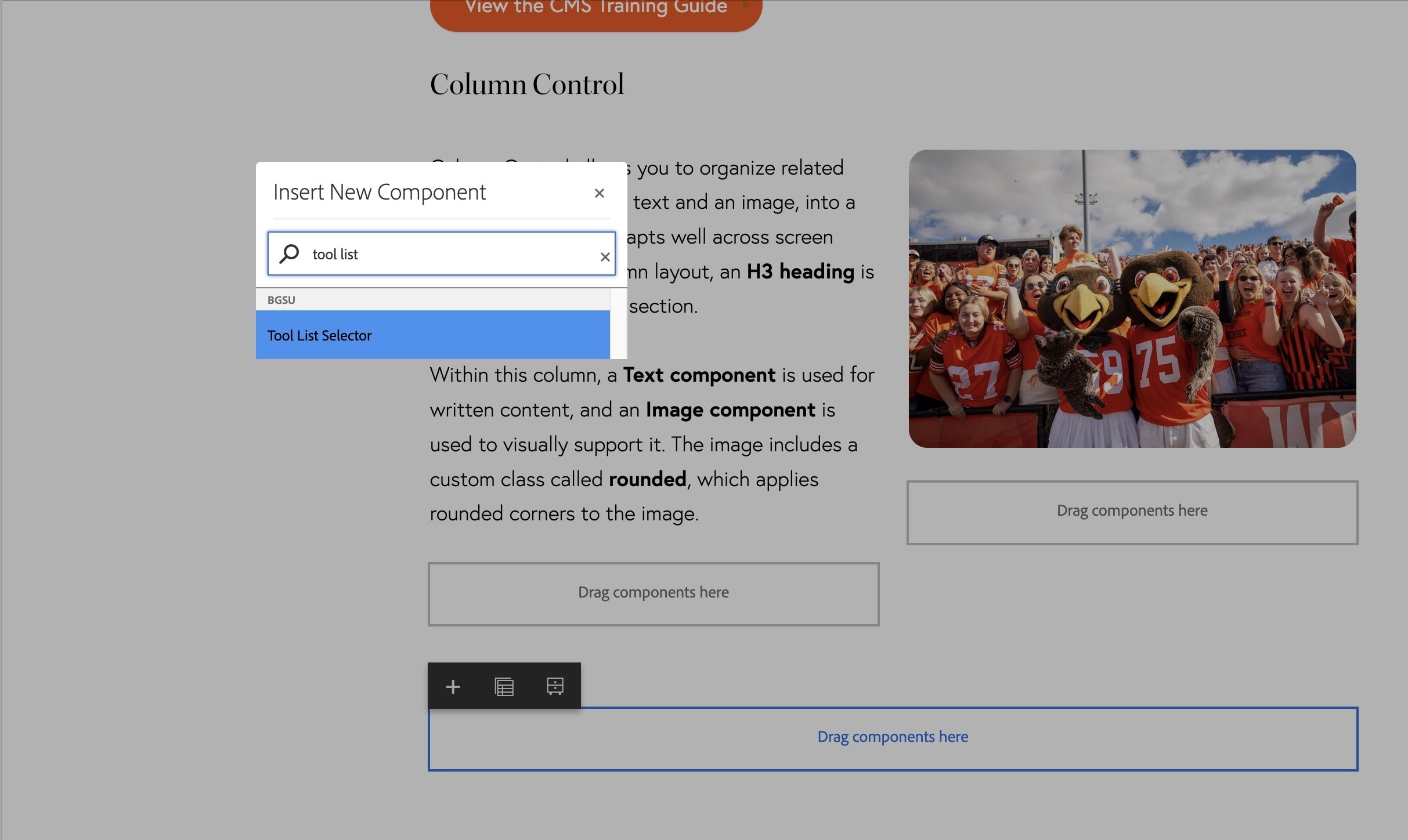
- Double click on the dropzone below the two column dropzone you just created.
- In the Insert New Component search box, type "Tool List Selector".
- Select Tool List Selector.
- Double-click on "Please Configure Tool List".
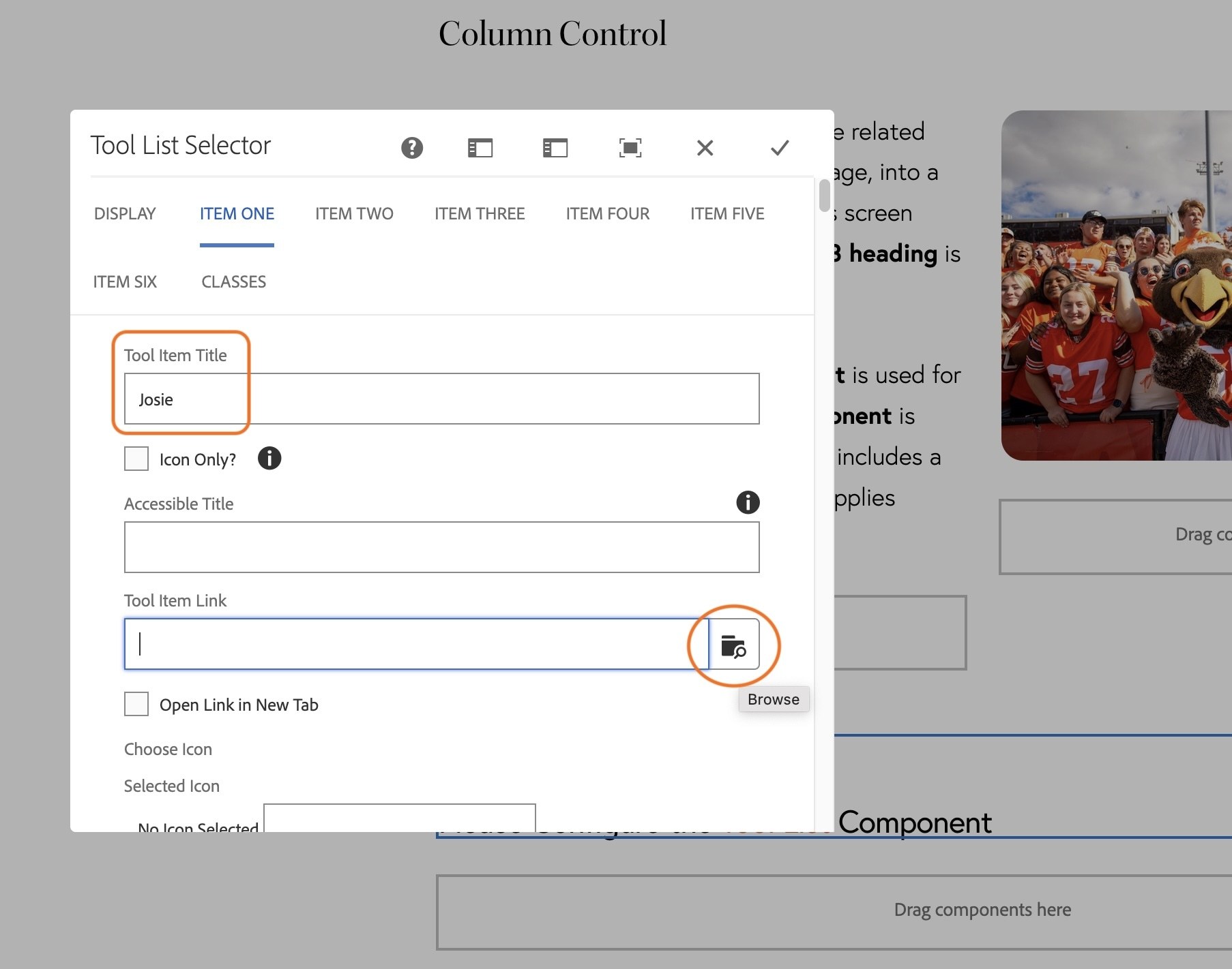
- Choose "Horizontal" in the "Display Type" field. The component will not show up if you do not select a display type.
- Click on the ITEM ONE tab.
- In the Tool Item Title, type your first name.
- Next to the Tool Item Link field, click the Browse Icon.
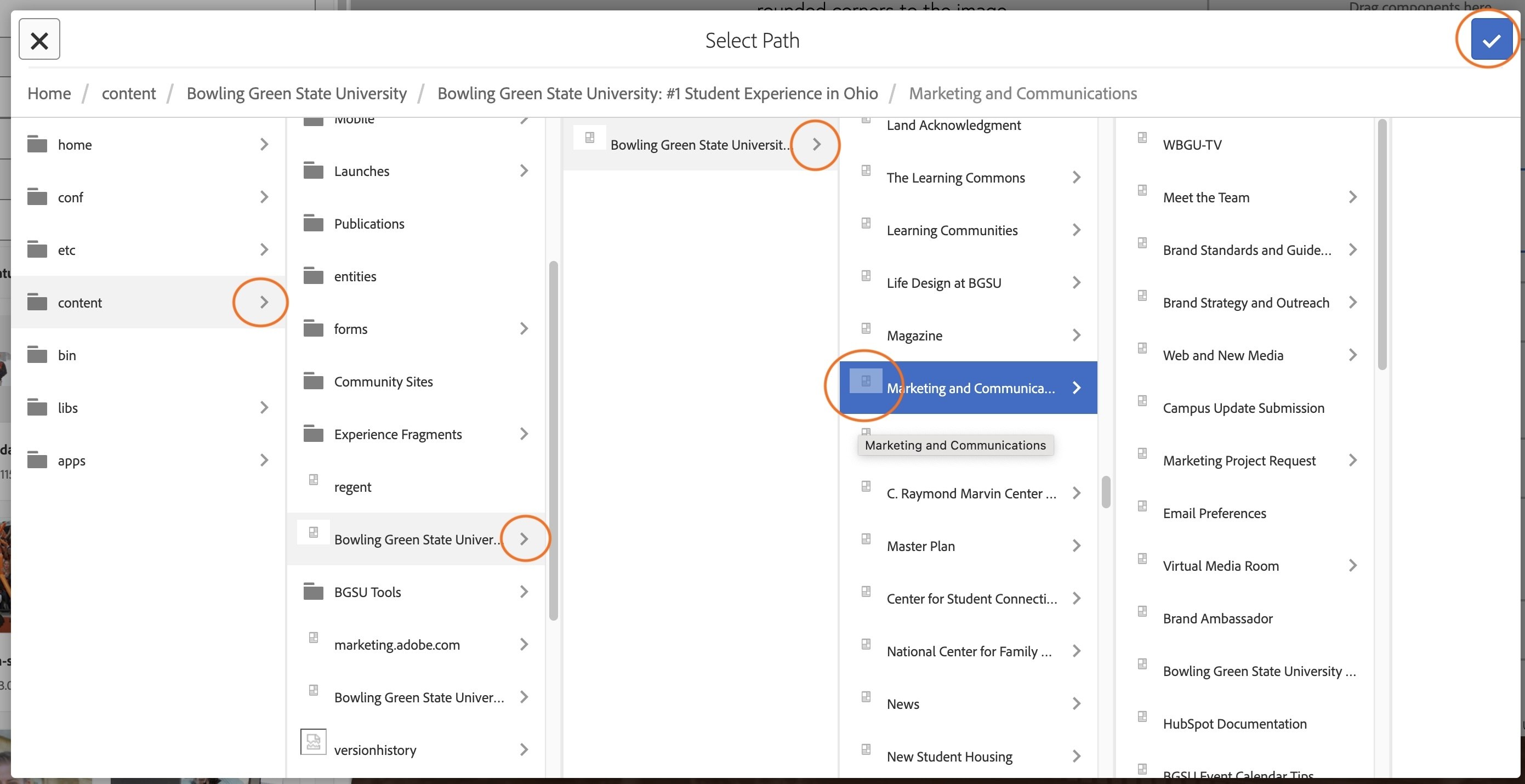
- Navigate to and click on your department's page by following the path: Home > content > Bowling Green State University > Bowling Green State University > the name of your department.
- Make sure the department highlights blue.
- Click the blue checkmark at the top-right corner of the dialogue box.
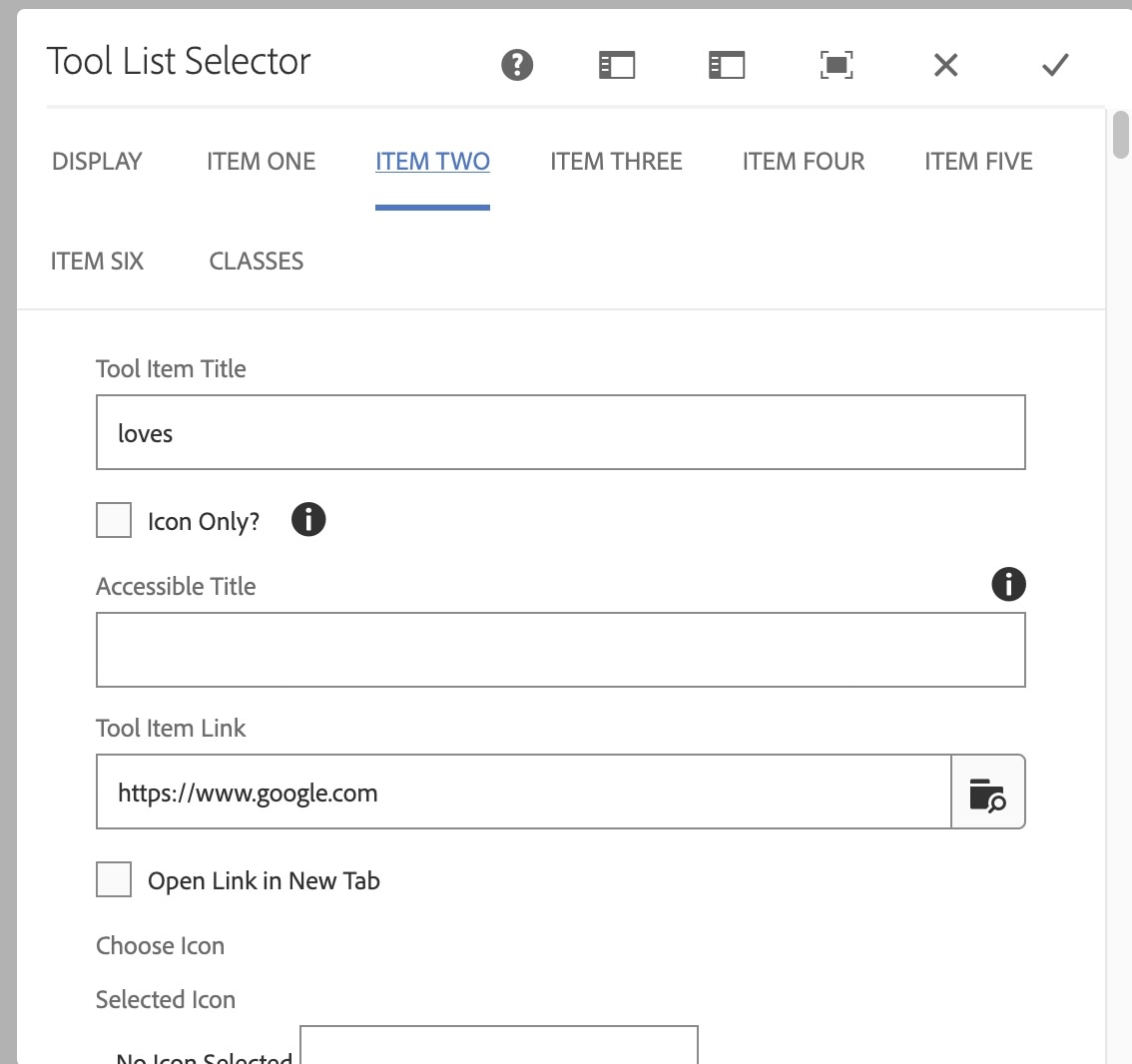
- Click on the Item Two tab.
- Type Loves into the title field.
- Type https://www.google.com into the "Tool Item Link" field. This is an absolute URL so you can use the full URL.
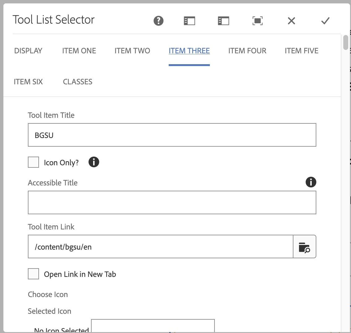
- Click on the Item 3 tab.
- Type BGSU in the title field.
- In the "Tool Item Link", use the magnifying glass to link to the BGSU home page - Home > content > Bowling Green State University > Bowling Green State University
(This is a relative URL so it should not have https://bgsu.edu/) - Click the blue checkmark at the top-right corner of the dialogue box to save your home page selection.
- Finally click the grey checkmark at the top right corner of the Tool List Selector component to save your work.
Activity 16: Background Area Component
Let's add one final component to your main page.
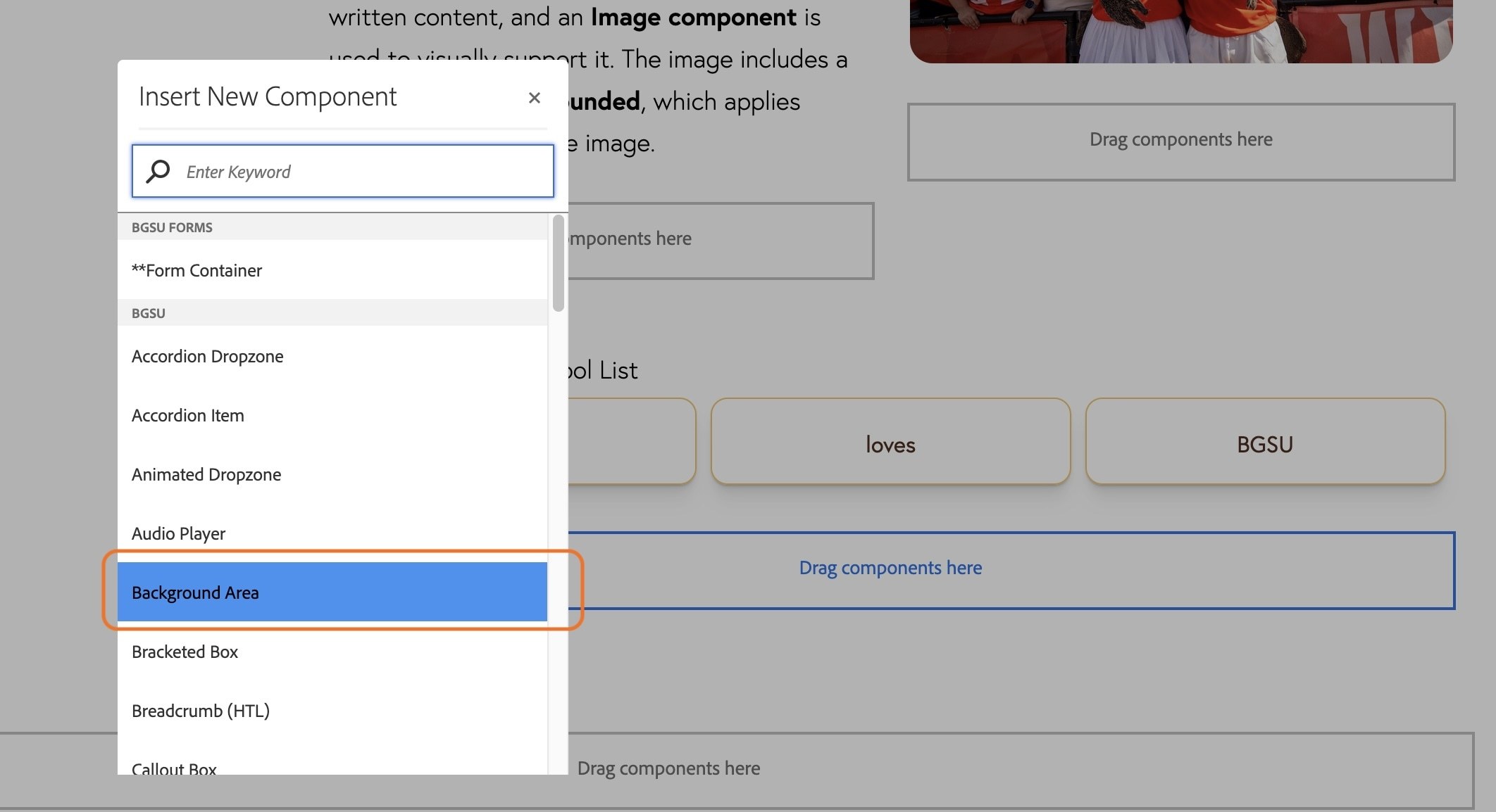
- Double click on the dropzone below your tool list selector component
- Select the Background Area Component.
- Double-click on the text that says Double click to edit the Background Area Component.
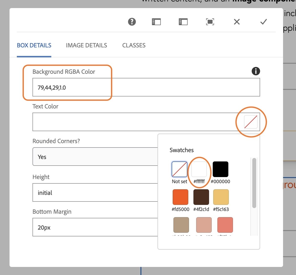
- In the dialog box that appears, change the Background RGBA color to BGSU Brown: 79,44,29,1.0
You can find the RGB color codes for all the BGSU colors on The Official Identity Colors page.
- Change the text color to white by clicking the square to the right of the Text Color field. This will open a box with BGSU colors to choose from.
- Click the grey checkmark at the top right of the dialog box to save your work.
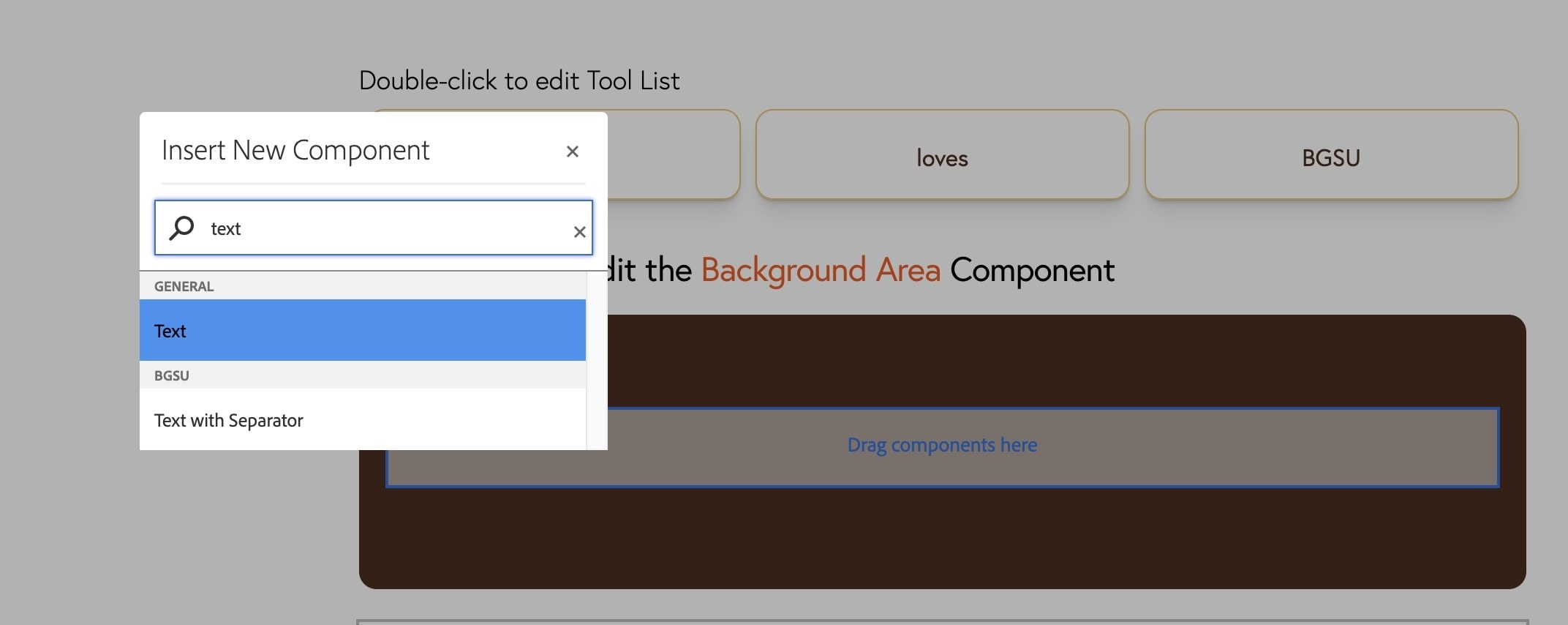
- Double-click the dropzone within the brown background area to add a new component within it.
- Search for text and click on the Text component under the General section.
- Double-click the text component to open the editor
- In the text box type or copy/paste the following text:
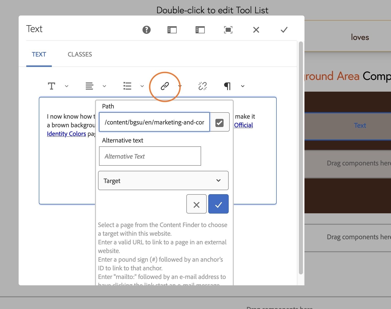
I now know how to add a Background Area component to a page and make it a brown background using the University's official color, found on the Official Identity Colors page.
- In the sentence you just pasted, select the text Official Identity Colors and click the link icon in the toolbar.
- Copy this link and paste it in the path field: /content/bgsu/en/marketing-and-communications/bgsu-graphic-standards-manual/the-official-identity-colors.html
This is an internal page, so it must use the relative link path (/content/bgsu/en) not the absolute link path (https://www.bgsu.edu/)
- Click the blue checkmark to save your link, and the grey checkmark in the top right corner to save the Text component
Activity 17: Viewing live page
You have built your first full page in the CMS!
Reminder: The page is not live yet.
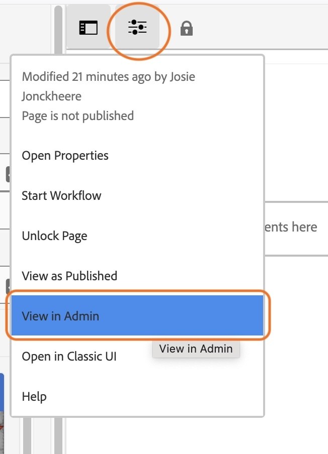
- In the top left corner of the page toolbar, select the Page Information icon.
- In the dropdown, click View in Admin
You will be brought back into the CMS page navigator.
- Click the icon before your CMS training page
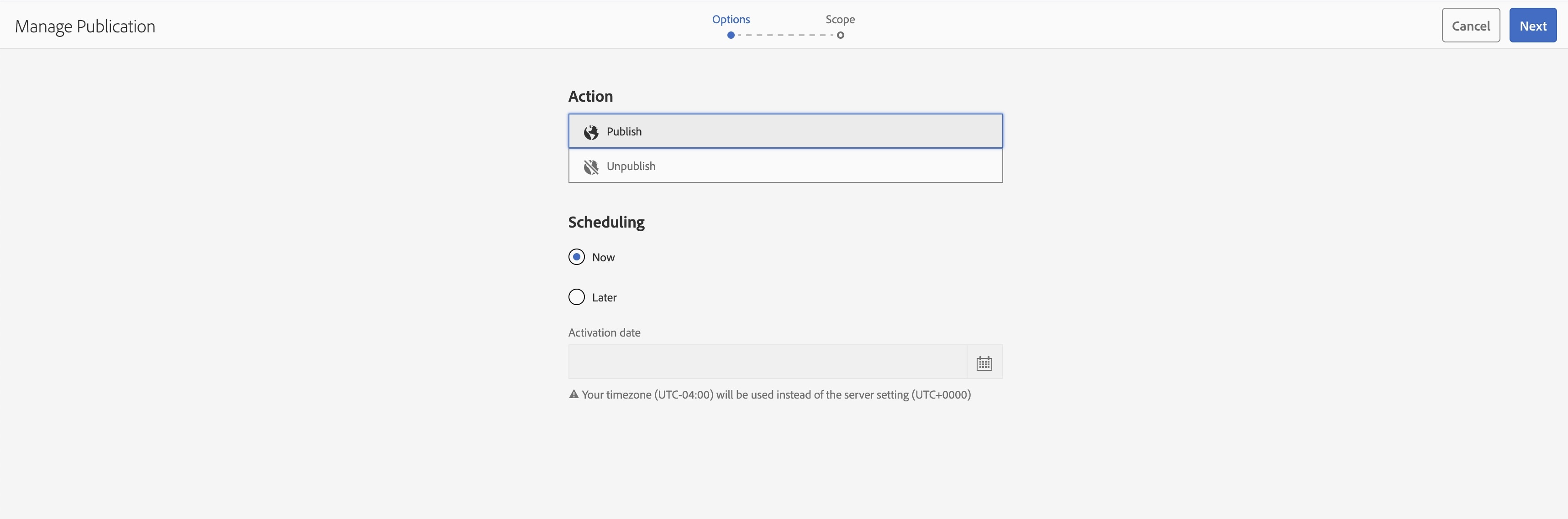
- Click Manage Publication in the top toolbar
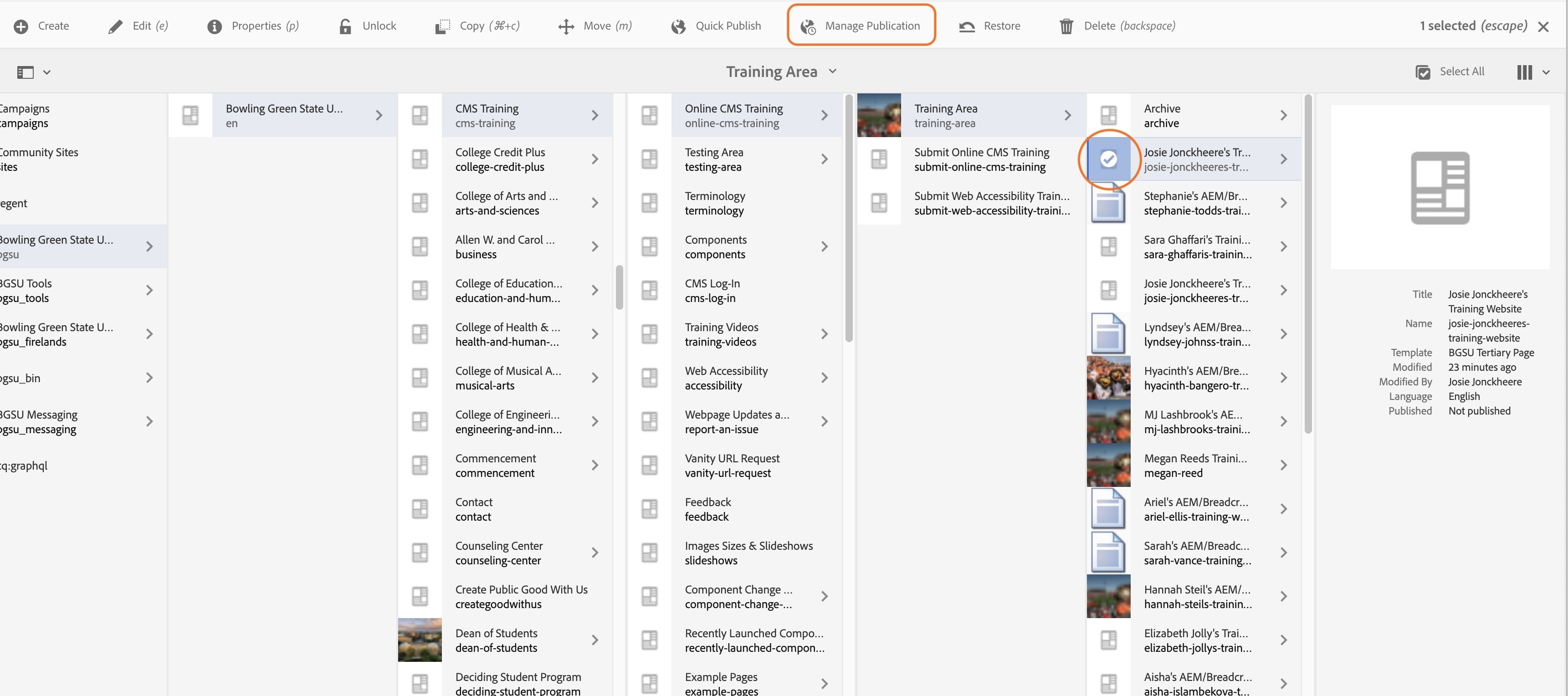
- On the options page, make sure Publish and Now are selected
- Click the Blue next button
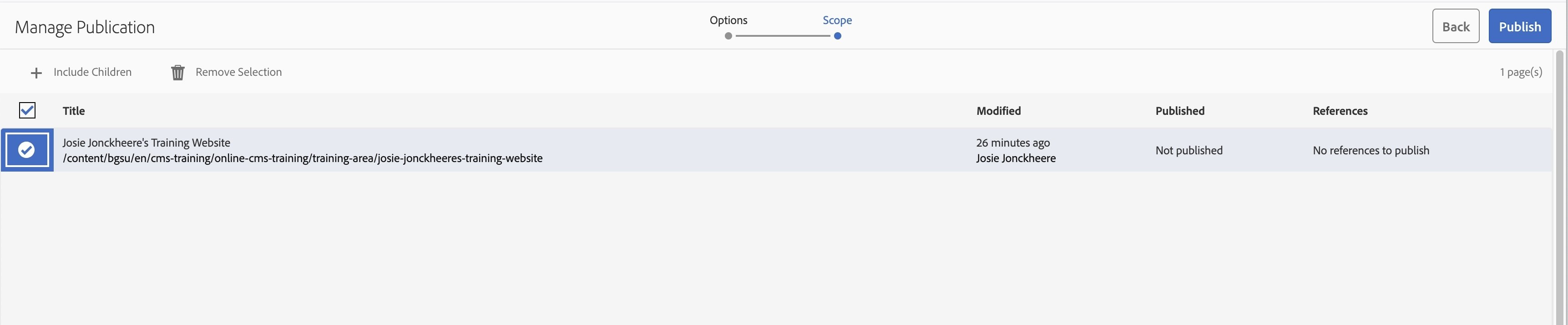
- On the Scope page, select the icon before your page name so it highlights blue with a checkmark
- Click the blue Publish button
- You should see a green success message at the top of your screen after publishing.
Now let's view your live page!
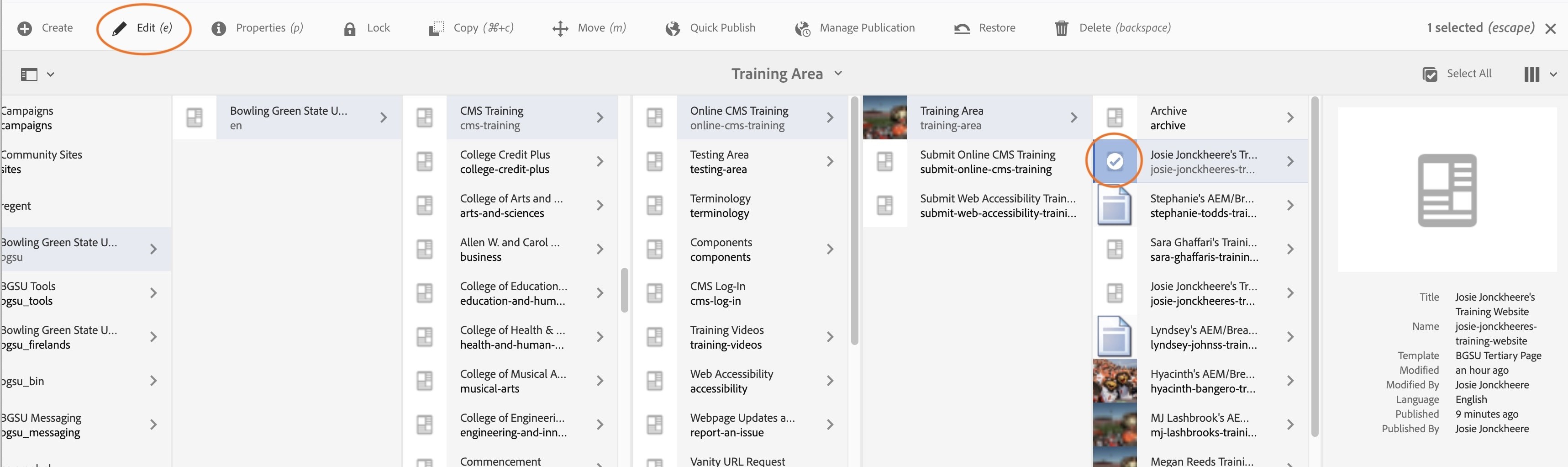
- With the icon before your page name selected, click Edit in the top toolbar.
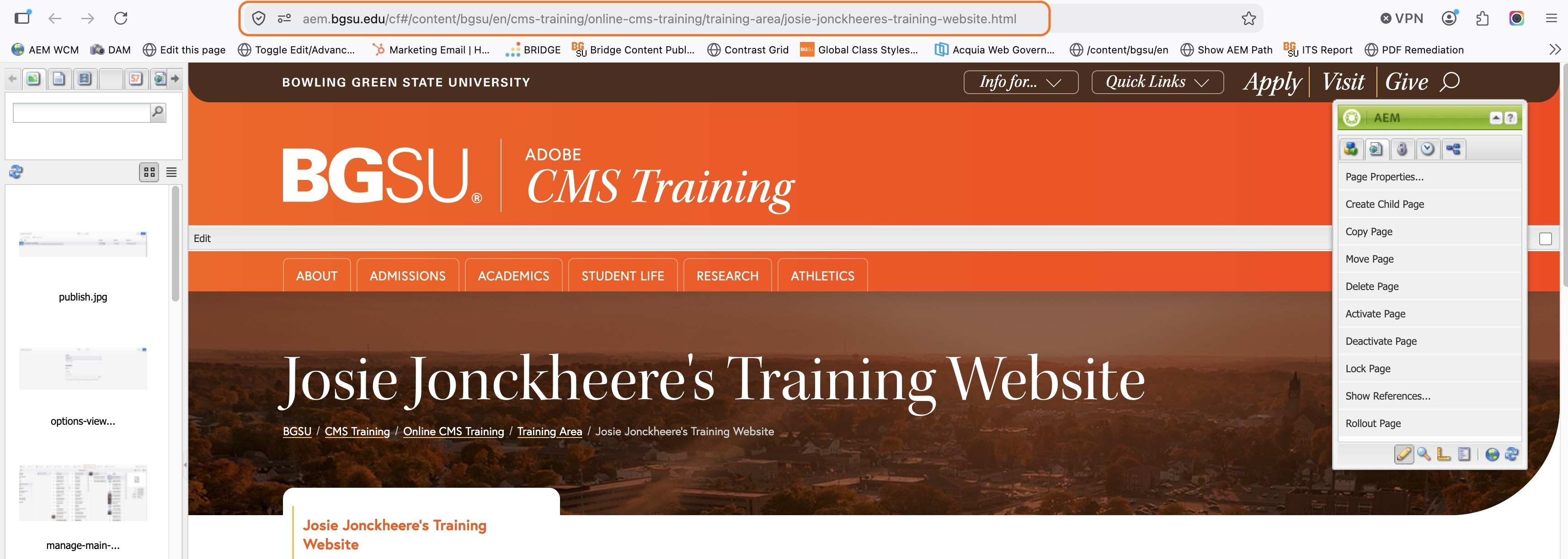
With your page now open, you can update the url to switch to the live page.
Your URL should look something like: https://aem.bgsu.edu/cf#/content/bgsu/en/cms-training/online-cms-training/training-area/josie-jonckheeres-training-website.html
- At the beginning of the URL replace aem. with www.
- Highlight and delete this part of the url: cf#/content/bgsu/en/
Your URL should now look like this, Ex: https://www.bgsu.edu/cms-training/online-cms-training/training-area/josie-jonckheeres-training-website.html
- Click enter on your keyboard.
You are now viewing your Live training page!
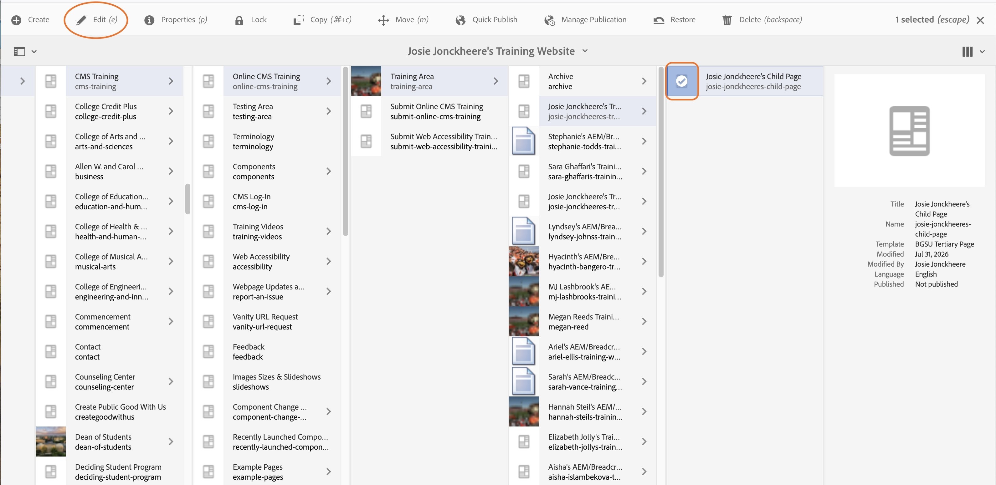
Activity 18: Editing a Child Page
- Navigate to your child page in the web content manager: Bowling Green State University > Bowling Green State University > CMS Training > Online Training > Your Name Training Website > Your Name Child Page
- Click on the icon next to the page title, "Your Name Child Page", so that it highlights blue.
- In the toolbar at the top of the page, click "Edit".
As a reminder,
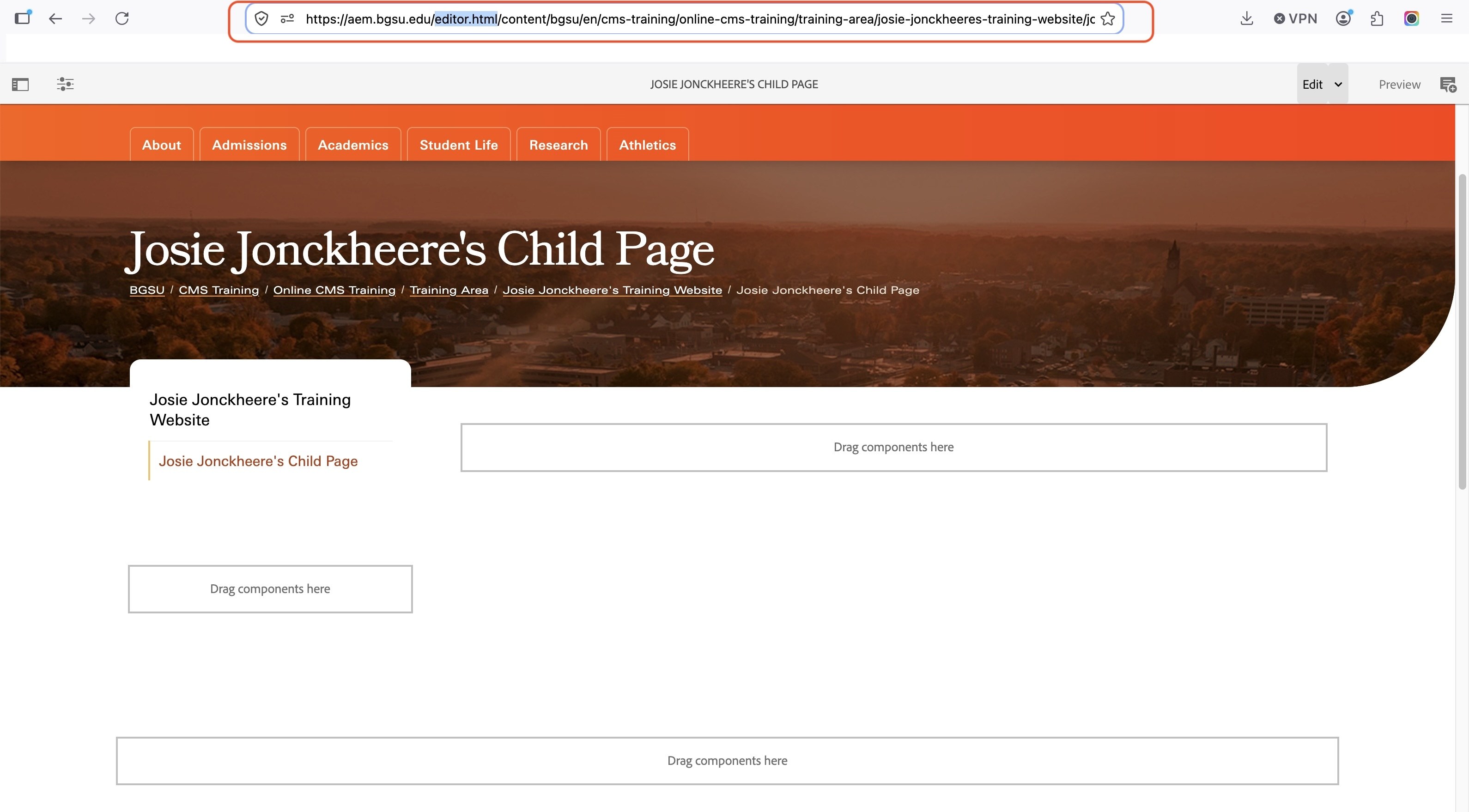
The URL should be structured like this:
https://aem.bgsu.edu/editor.html/content/bgsu/en/cms-training/online-cms-training/training-area/josie-jonckheeres-training-website/josie-jonckheeres-child-page.html
- if you are seeing:
- https://aem.bgsu.edu/cf#/content/bgsu/en/cms-training/online-cms-training/training-area/josie-jonckheeres-training-website.html
- The cf# in the URL needs to be changed to editor.html
- After you complete that change, the page should be open in the correct editing mode shown below.
Activity 19: Callout Box Component
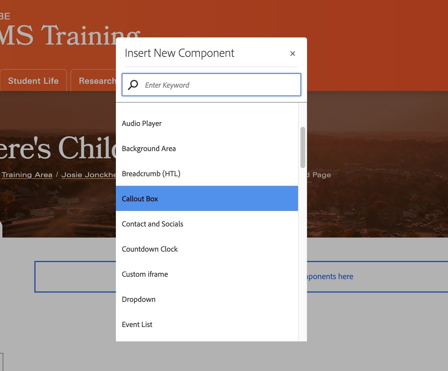
In the top dropzone on the page, just below the header image, insert a Callout Box component.
- Click on the dropzone
- Click the plus icon in the toolbar that appears
- Choose the Callout Box component from the list
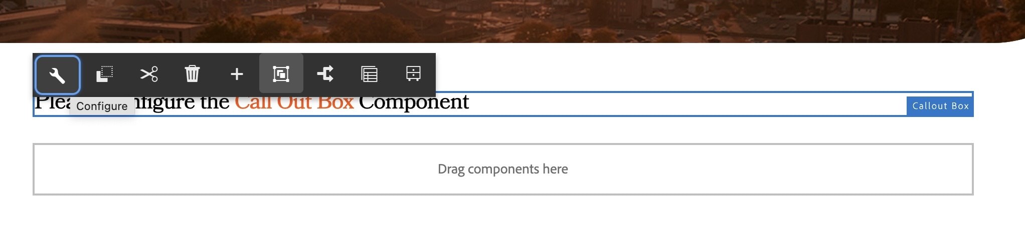
- Click on the text that says Please Configure the Callout Box Component
- Click the wrench icon in the toolbar that appears
- If the full toolbar does not appear, refresh your page and try again.
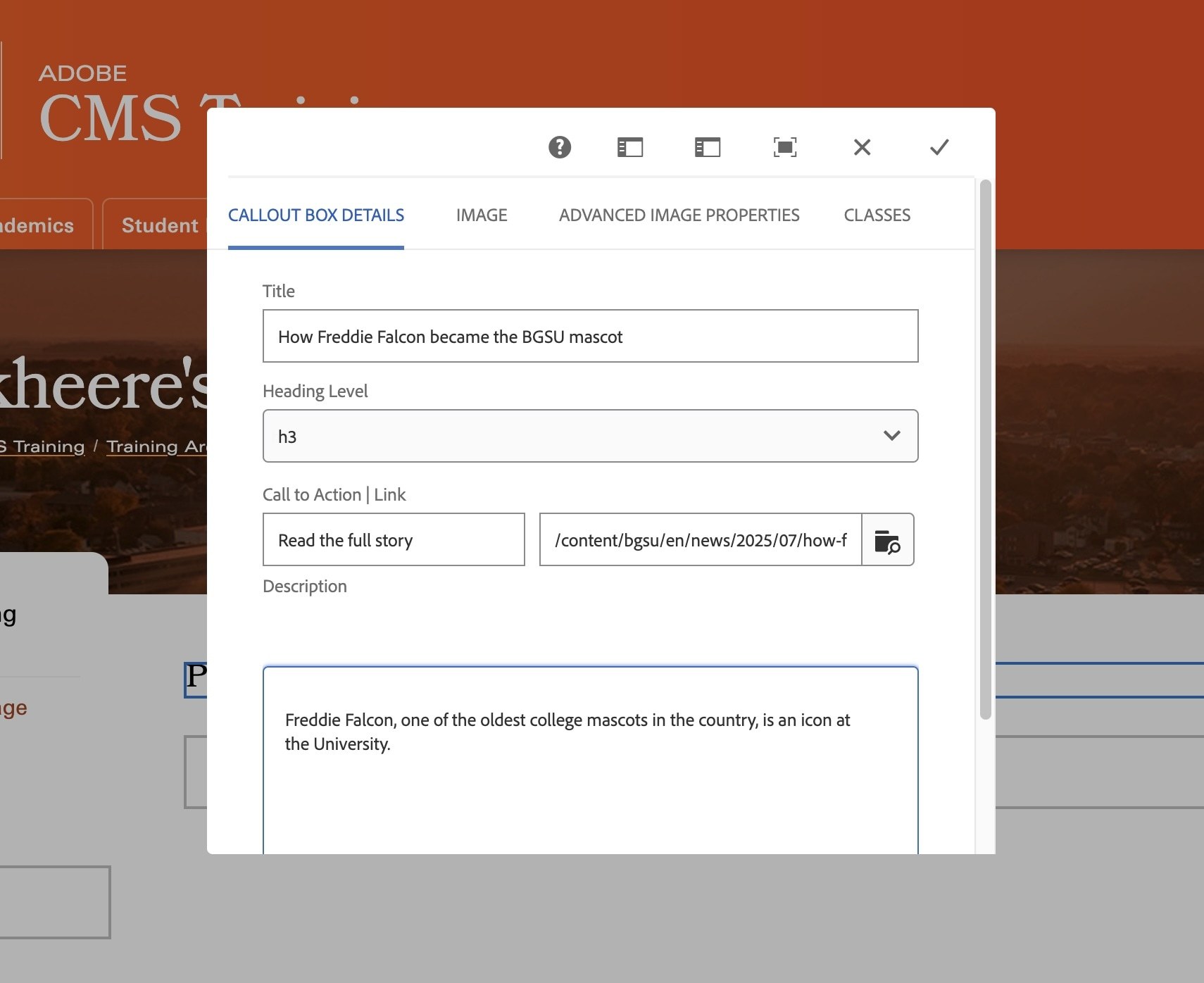
- In the Title field, type: How Freddie Falcon became the BGSU mascot
- In the Call to Action field, type: Read the full story
- In the Link field next to it, you can paste this relative link to the BGSU news story about Freddie Falcon: /content/bgsu/en/news/2025/07/how-freddie-falcon-became-the-bgsu-mascot.html
- OR you can navigate to the news story link by clicking the folder icon and following this path: Content > Bowling Green State University > Bowling Green State University > News > 2025 > July > How Freddie Falcon became the BGSU mascot
(Notice how the relative link path follows the same structure as the AEM page navigation) - In the Description box, type: Freddie Falcon, one of the oldest college mascots in the country, is an icon at the University.
- Click the grey checkmark in the top right corner of the component.
- You will notice that nothing changed on your page. This is because the callout box component requires an image in order to work.
- Before we open the component back up, toggle the side panel in the editing screen by clicking the Toggle Side Panel icon in the top left corner of your screen:

- With the side panel open, configure your callout box component again by clicking on it and selecting the wrench icon from the toolbar
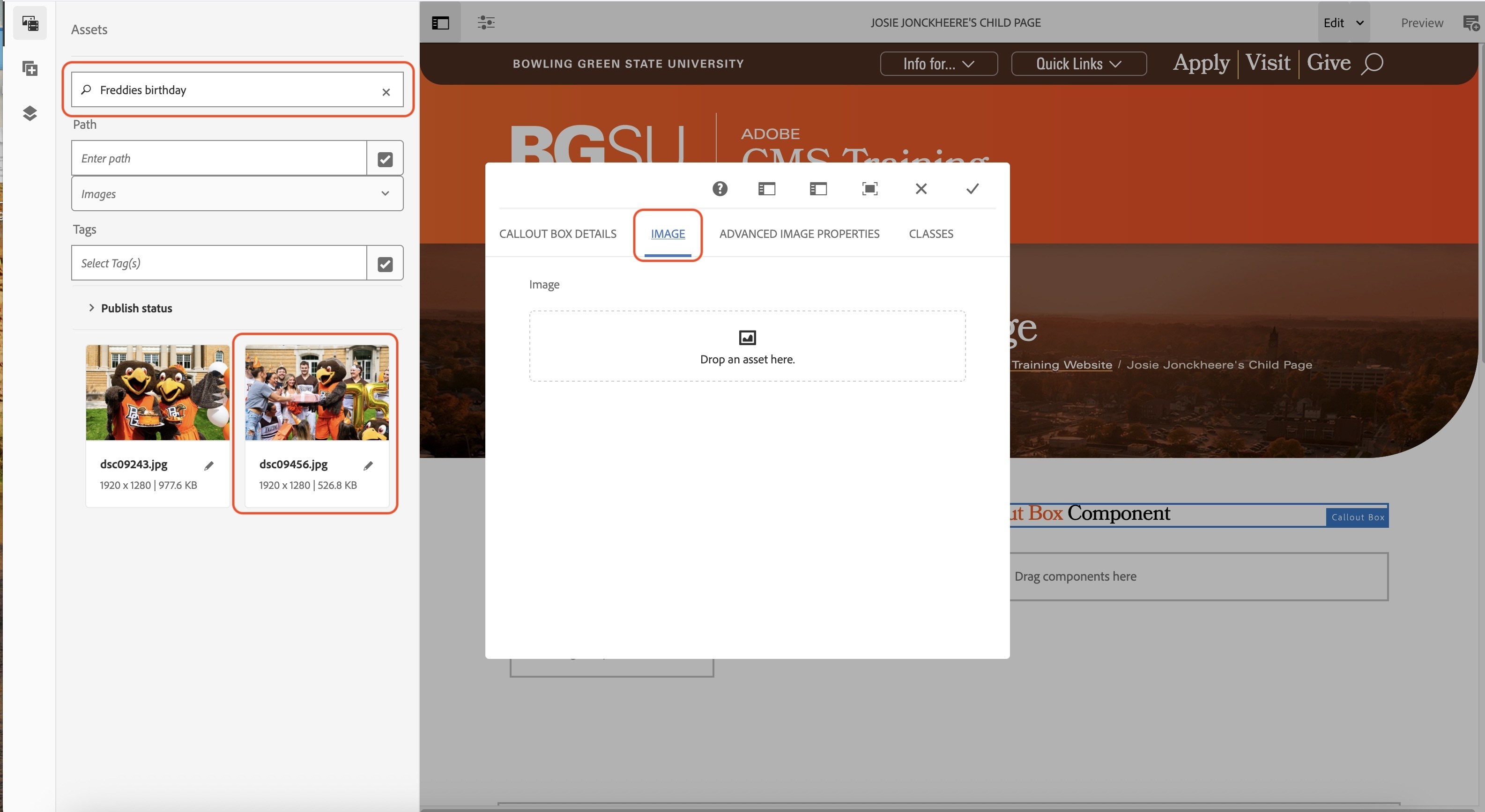
- Click the IMAGE tag within the callout box component
We need to locate the image that is used in the header of the News story we are linking to about Freddie Falcon.
- In the side panel search field, type: Freddies birthday
- From the images that appear, click and drag the photo of Freddie Falcon being handed a present into the image field of your callout box component.
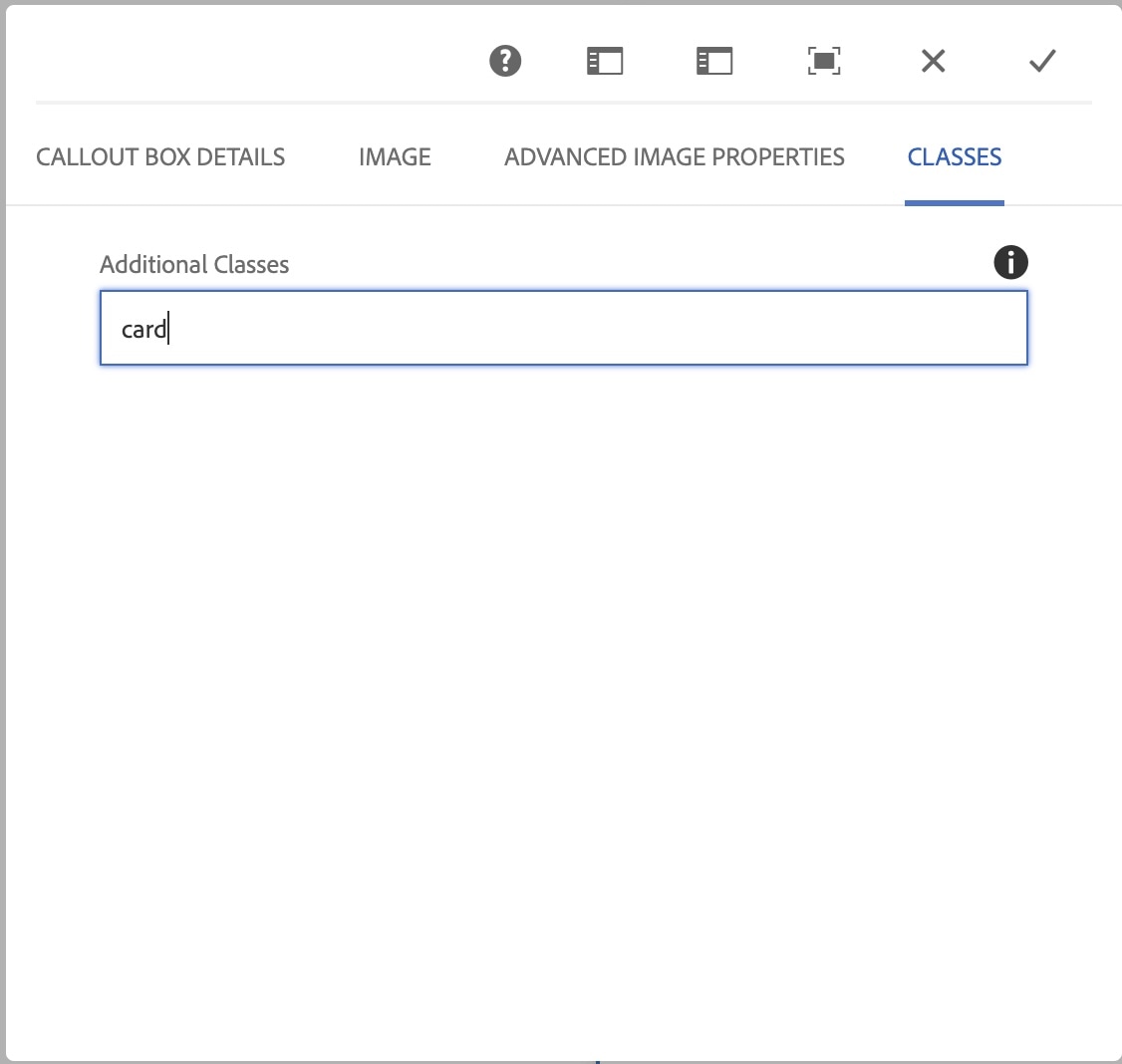
- Click on the CLASSES tab
- In the text field, type: card
- Click the grey checkmark to save your component
- You can now close your side panel by clicking the Toggle Side Panel icon once more.
Activity 20: Accordion Item Component
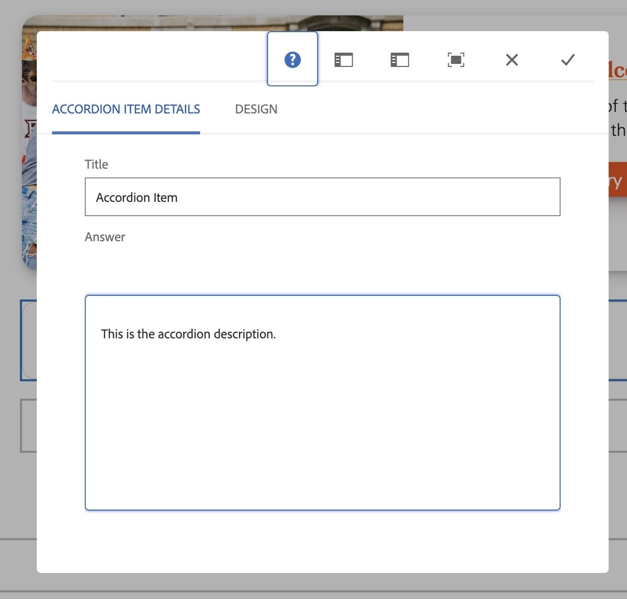
On your child page, in the dropzone below the callout box component we just added,
- Click on the dropzone
- Click the plus (+) icon
- Select the Accordion item component
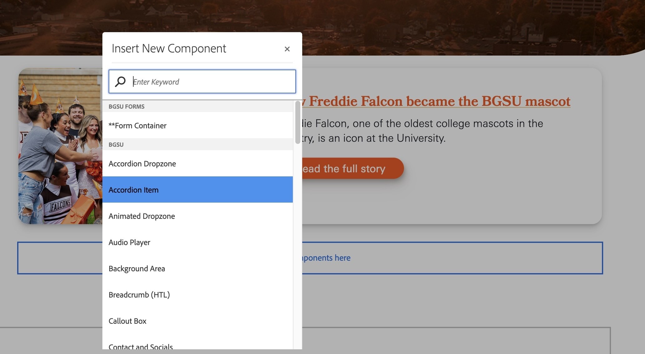
- Click on the text that says Please configure the Accordion Item Component
- Click the wrench icon from the toolbar that appears
- In the Title field, type Accordion Item
- In the Answer field, type: This is the accordion description.
- Click the grey checkmark to save your component
Activity 21: Staff Profile Component
On your child page, in the dropzone below the accordion component we just added,
- Click on the dropzone
- Click the plus (+) icon
- Select the Staff Profile component
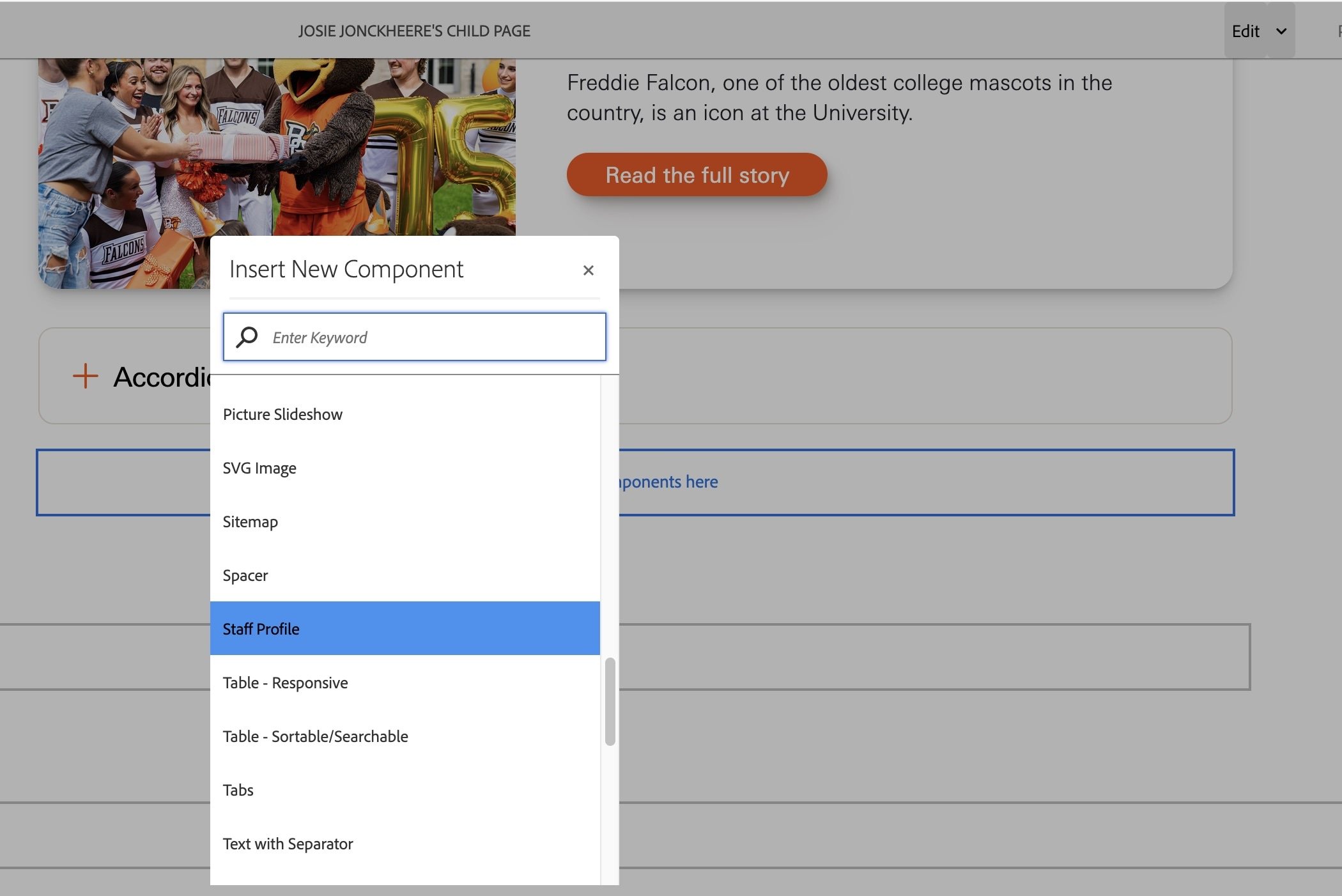
- Click on the text that says Please configure the Staff Profile Component
- Click the wrench icon from the toolbar that appears
- In the Name field, type your name.
- In the Position field, type your position title.
- In the Email field, type your email.
- Click the grey checkmark to save your component
- You will notice that nothing changed on your page. This is because the Staff Profile component requires an image in order to display.
- Before we open the component back up, toggle the side panel in the editing screen by clicking the Toggle Side Panel icon in the top left corner of your screen:
- With the side panel open, configure your Staff Profile component again and navigate to the Image tab at the top of the component.
- In the side panel filter field, type avatar
- Scroll until you see the grey icon of a person
- Click and drag the image into the image tab.
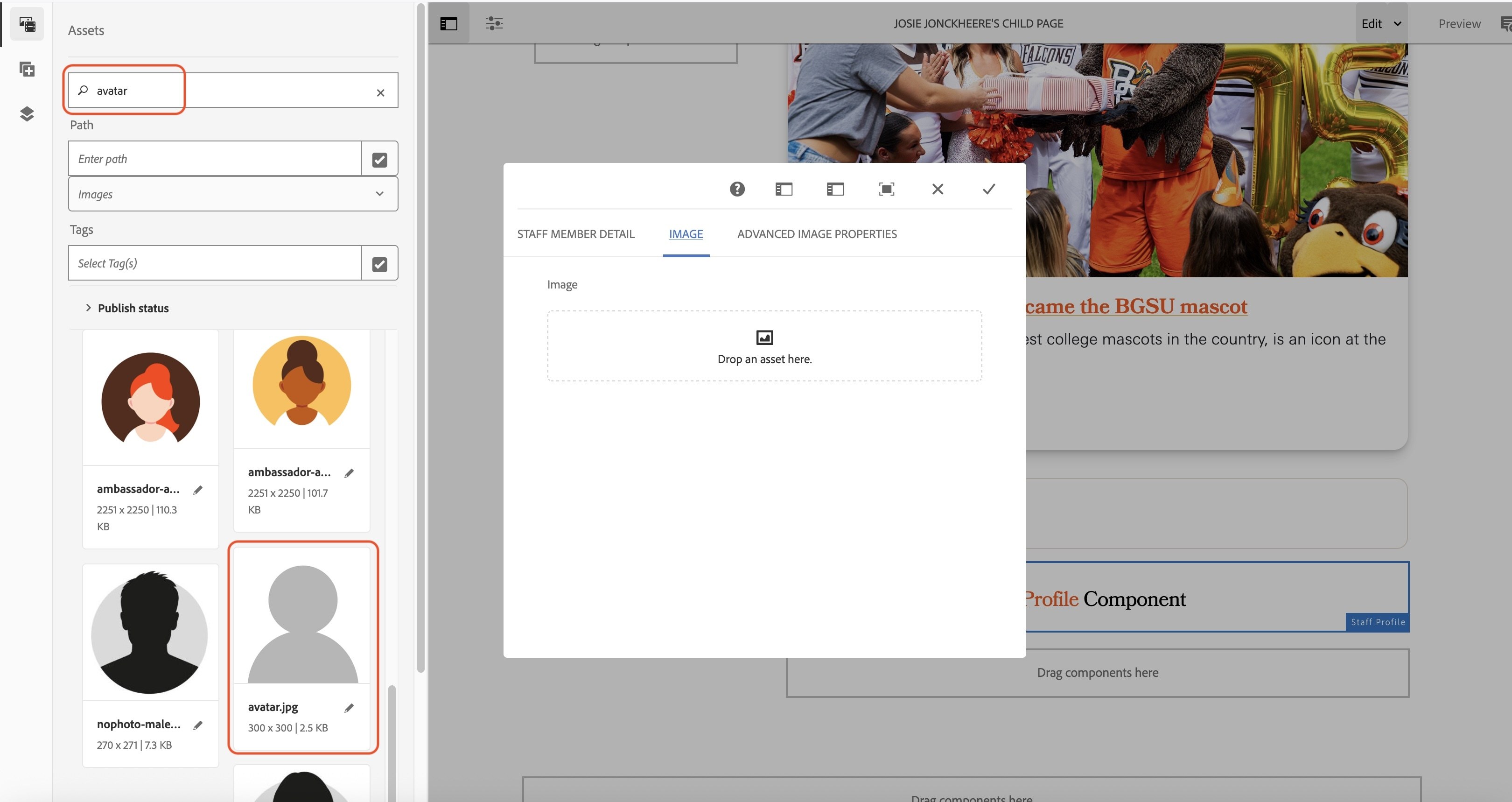
- Click the grey checkmark to save your component.
- You can now close the side panel.
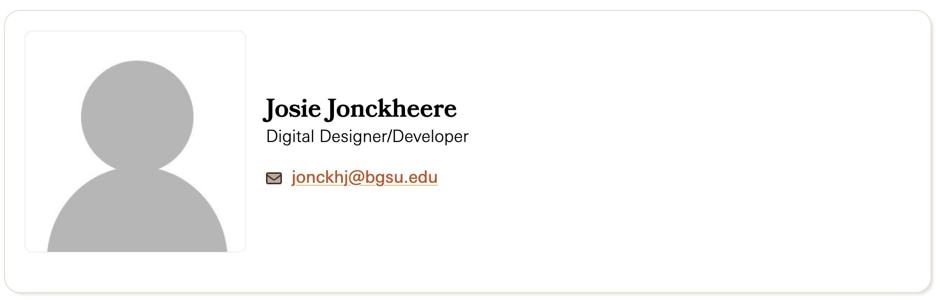
- Your staff profile component should resemble the image below.
Activity 22: Contact and Socials component
On your child page, in the dropzone below the staff profile component we just added,
- Click on the dropzone
- Click the plus (+) icon
- Select the Contact and Socials component
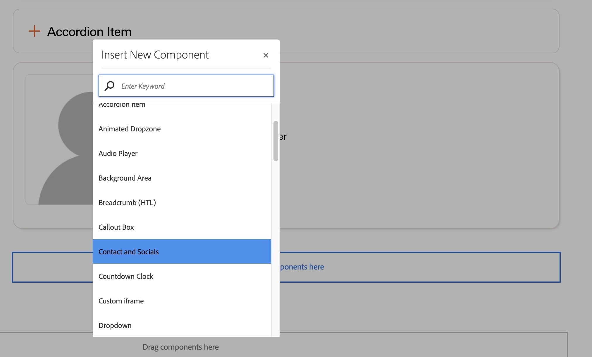
- Click on the text that says Please configure the Contact and Socials Component
- Click the wrench icon from the toolbar that appears
- In the Title/Heading field, type Ask a question
- In the Name/Title field, type Marketing and Brand Strategy Web Team
- In the Email field, type mcwebteam@bgsu.edu
- Scroll to the bottom of the component field options and find the Link Text | Link fields
- For the Link Text type Request website updates or site fixes
- For the Link, copy and paste this link into the field: https://forms.bgsu.edu/231345728843966
- Click the grey checkmark to save your component
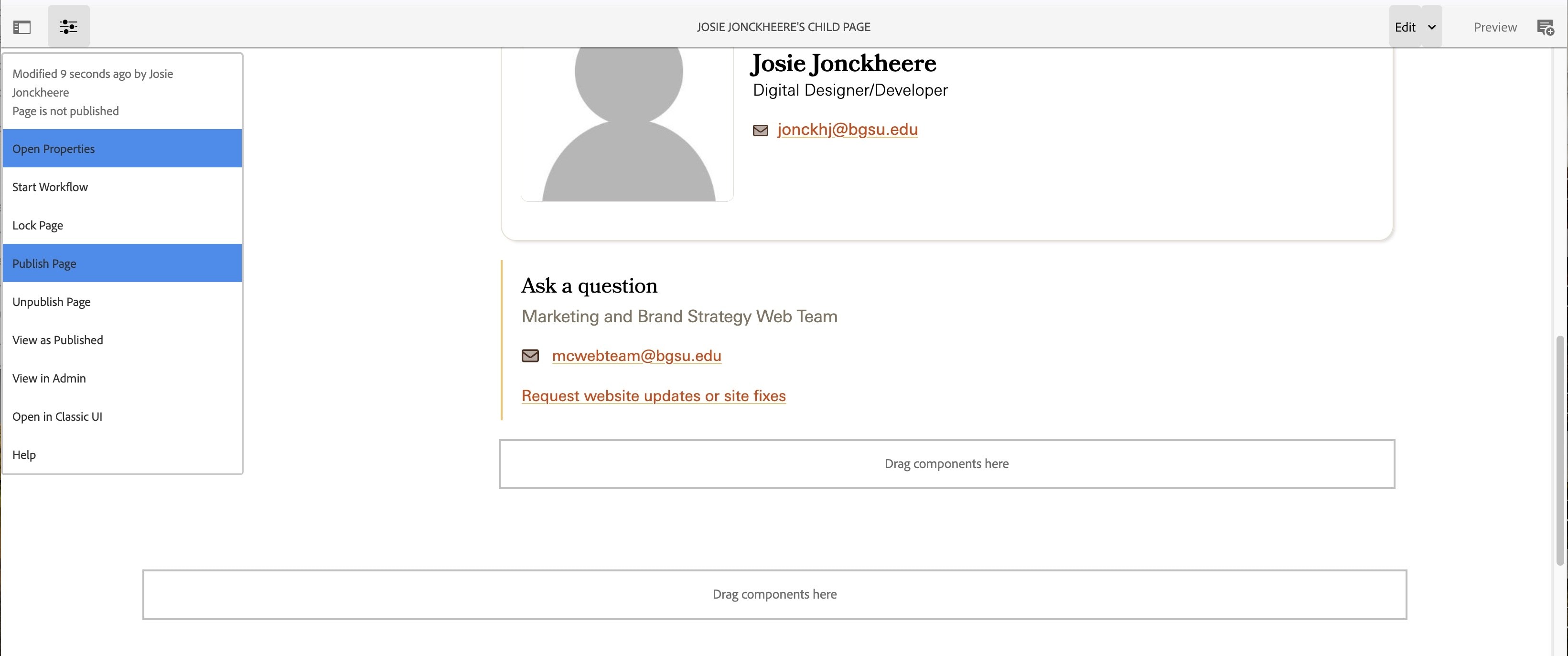
- Your component should look like the image below.
- You can use this link to submit questions to our web team if you need help with anything.

Activity 23: Activating Child Page
- Open the properties by clicking the Page Information icon in the top left part of your screen
- Click Publish Page
- Your child page is now activated and live on the website.
To view your live page, click in the url field of your browser and update this bolded part of your url:
https://aem.bgsu.edu/editor.html/content/bgsu/en/cms-training/online-cms-training/training-area/josie-jonckheeres-training-website/josie-jonckheeres-child-page.html
to
https://www.bgsu.edu
Click enter and you should be taken to the live page.
The final url should resemble this: https://www.bgsu.edu/cms-training/online-cms-training/training-area/josie-jonckheeres-training-website/josie-jonckheeres-child-page.html
Updated: 08/25/2026 07:13PM